
Most British art and design educators find that traditional colour theory lessons often leave students disengaged, limiting their grasp of complex relationships between hues. Dynamic, tactile tools like the Kolormondo globe make a real difference across European classrooms. By embracing three-dimensional visual aids, teachers ignite curiosity and help students master colour harmony through active exploration. Discover clear strategies for integrating the Kolormondo globe into your curriculum, making colour concepts both memorable and meaningful.
Table of Contents
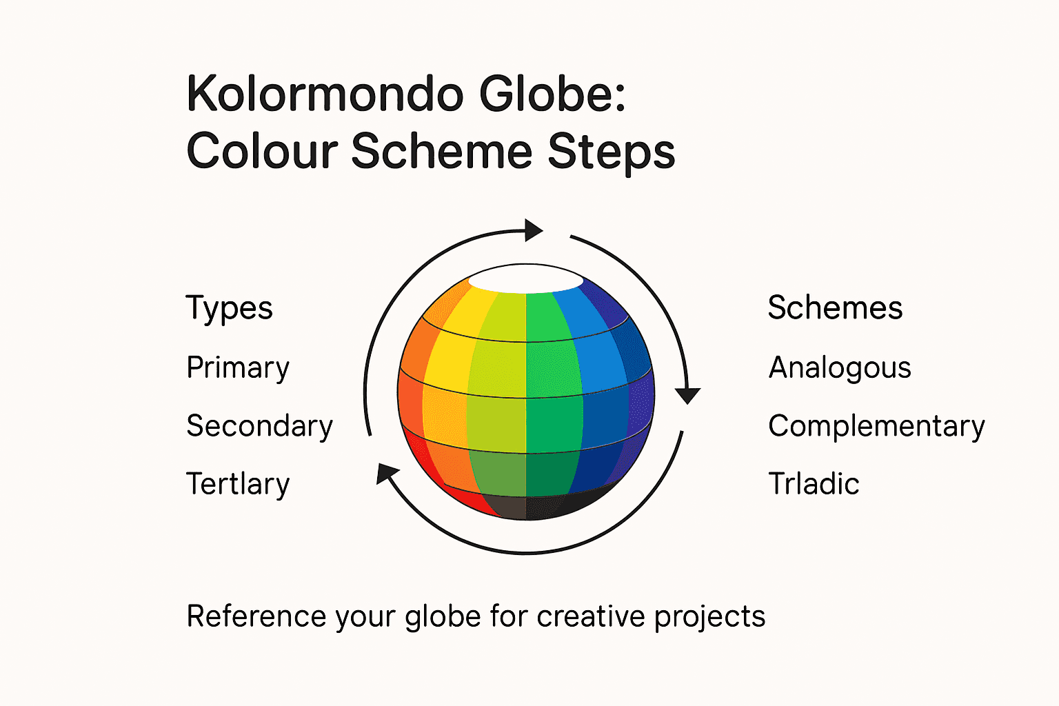
- Step 1: Set Up Your Kolormondo Globe For Hands-On Learning
- Step 2: Explore Primary And Secondary Colour Relationships
- Step 3: Experiment With Colour Mixing And Harmonies
- Step 4: Apply Colour Schemes To Creative Projects
- Step 5: Verify Results Using The 3D Globe As A Reference
Quick Summary
| Key Point | Explanation |
|---|---|
| 1. Properly set up the globe | Unpack your Kolormondo globe carefully to appreciate its features for effective learning. |
| 2. Explore colour relationships actively | Rotate the globe to observe dynamic interactions between primary and secondary colours for better understanding. |
| 3. Experiment with colour mixing | Use the globe to practice mixing complementary and analogous colours for enhanced artistic skills. |
| 4. Apply colour schemes thoughtfully | Select and implement different colour schemes based on your project goals for effective visual communication. |
| 5. Validate choices with the 3D globe | Systematically compare your colour selections against the globe to ensure coherence and accuracy in your designs. |
Step 1: Set up your Kolormondo globe for hands-on learning
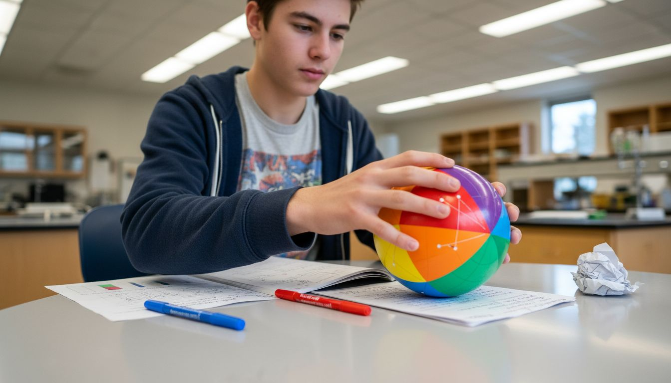
Learning colour theory becomes an immersive experience when you properly set up your Kolormondo globe. This hands-on tool transforms abstract colour concepts into a tangible, three-dimensional exploration that will revolutionise your understanding of chromatic relationships.
Begin by carefully unpacking your Kolormondo globe, ensuring you handle its precision-engineered components with care. Visualising colour in 3D requires understanding the globe’s unique spatial design. Gently rotate the globe on its axis, observing how colours are positioned relative to one another. Your globe likely includes a central axis and rotating mechanisms that allow you to explore colour interactions from multiple perspectives.
The key is to manipulate the globe systematically, exploring how primary, secondary, and tertiary colours blend and contrast across its surface. Pay special attention to the spatial relationships between different hues, noting how proximity and angle influence colour perception. Each rotation reveals new insights into colour harmony and complementary relationships.
Expert Tip: Always handle your Kolormondo globe with clean hands and store it in a cool, dry place to maintain its precision and vibrant colour accuracy.
Step 2: Explore primary and secondary colour relationships
Unveiling the intricate world of colour relationships transforms your understanding of visual composition. In this section, you will discover how primary and secondary colours interact dynamically across the Kolormondo globe, revealing the fundamental principles of chromatic harmony.
Begin by identifying the three primary colours red, blue, and yellow positioned strategically on your globe. These foundational hues cannot be created by mixing other colours and serve as the building blocks for all subsequent colour combinations. Colour theory tips for educators and artists emphasise understanding how these primary colours blend to create secondary colours.
As you rotate the globe, observe how secondary colours emerge when primary colours intersect. Green results from mixing blue and yellow, orange forms from red and yellow, while purple develops through red and blue combinations. The Kolormondo globe brilliantly illustrates these relationships, allowing you to visually track how colours transform and interact within a three-dimensional space.
Expert Tip: Experiment with rotating the globe at different angles to appreciate the subtle nuances in colour relationships and how lighting can dramatically influence colour perception.
Step 3: Experiment with colour mixing and harmonies
Unlocking the magic of colour harmonies requires thoughtful exploration and systematic experimentation. The Kolormondo globe becomes your personal laboratory for understanding how different hues interact and create visual symphonies that can transform artistic and design work.
Begin by selecting complementary colours positioned opposite each other on the globe. These colour pairs create maximum contrast and visual excitement. Creative uses for colour wheels in art and design demonstrate how understanding these relationships can elevate your visual compositions. Carefully rotate the globe to observe how these complementary colours influence each other creating dynamic visual tensions that can spark incredible creative possibilities.
Practise mixing analogous colours those adjacent to each other on the colour spectrum to develop a nuanced understanding of subtle colour transitions. Observe how slight variations in hue can produce dramatically different visual effects. By systematically exploring these relationships on your Kolormondo globe you will develop an intuitive sense of colour harmony that transcends traditional two dimensional colour wheel approaches.
Expert Tip: Document your colour mixing experiments by making quick sketches or digital colour swatches to track your discoveries and build a personal reference library of colour interactions.
Step 4: Apply colour schemes to creative projects
Transforming theoretical colour knowledge into practical creative applications demands a strategic approach. Inspiring examples of colour theory in art reveal how thoughtful colour selection can elevate any artistic endeavour from ordinary to extraordinary.
Begin by selecting a specific colour scheme based on your project goals. The Kolormondo globe allows you to explore multiple approaches such as monochromatic harmonies using variations of a single hue analogous colour families with adjacent colours or complementary palettes with opposite colour pairs. Professional artists and designers understand that each approach communicates different emotional and visual experiences depending on your intended creative outcome.
Practice applying your chosen colour scheme across different mediums sketch out potential compositions experiment with digital design tools or create physical artwork samples. The three dimensional nature of the Kolormondo globe provides unique insights into colour relationships that traditional flat colour wheels cannot capture enabling you to understand subtle nuances and interactions between different hues with unprecedented clarity.
Here is a helpful summary of colour scheme approaches enabled by the Kolormondo globe:
| Scheme Type | Visual Effect | Globe Exploration Strategy |
|---|---|---|
| Monochromatic | Subtle harmony, unified mood | Rotate to view variations of one hue |
| Analogous | Gradual transitions, cohesive look | Explore adjacent hues on the globe |
| Complementary | High contrast, visual energy | Locate and compare opposites |
| Triadic | Balanced, dynamic compositions | Identify colours spaced evenly |
Expert Tip: Create a personal colour reference journal documenting your favourite colour combinations and the specific emotional responses they evoke in viewers.
Step 5: Verify results using the 3D globe as a reference
Validating your colour choices requires a systematic approach that transforms theoretical understanding into practical application. What is a 3D colour wheel and why it matters illuminates the critical importance of comprehensive colour assessment beyond traditional flat representations.
Utilise the Kolormondo globe as your authoritative reference by systematically comparing your colour selections against its precise three dimensional colour mapping. Rotate the globe to examine how your chosen colours interact under different lighting conditions and viewing angles. Pay close attention to subtle shifts in perception nuanced colour relationships and how adjacent hues influence each other highlighting potential harmonies or unexpected tensions within your creative composition.
Document your findings by creating visual comparison notes recording how colours transform when viewed through the globe. Sketch quick colour reference charts annotate your observations and critically analyse how the three dimensional perspective reveals insights that conventional colour wheels cannot capture. This methodical verification process ensures your creative projects maintain visual coherence and intentional colour communication.
The following table compares conventional 2D colour wheels to the Kolormondo 3D globe for colour studies:
| Aspect | 2D Colour Wheel | Kolormondo 3D Globe |
|---|---|---|
| Spatial Relationships | Flat, limited perspective | Fully three-dimensional, immersive |
| Interaction Insight | Basic blending shown | Visualises hue, lightness, chroma |
| Creative Exploration | Restricted to surface mixing | Enables all-angle experimentation |
| Perception Accuracy | Can mislead in context | Offers realistic colour placement |
Expert Tip: Photograph your colour selections alongside the Kolormondo globe to create a permanent reference archive of your colour exploration and design research.
Enhance Your Colour Theory Mastery with Kolormondo’s 3D Globe
Struggling to grasp the complex relationships of colour theory through flat, traditional charts This article highlights the real challenge of understanding colour harmony and interaction in a truly immersive way The innovative Kolormondo globe offers a tactile and three dimensional approach to these concepts giving you hands-on experience that deepens your comprehension of primary, secondary and complementary colour relationships
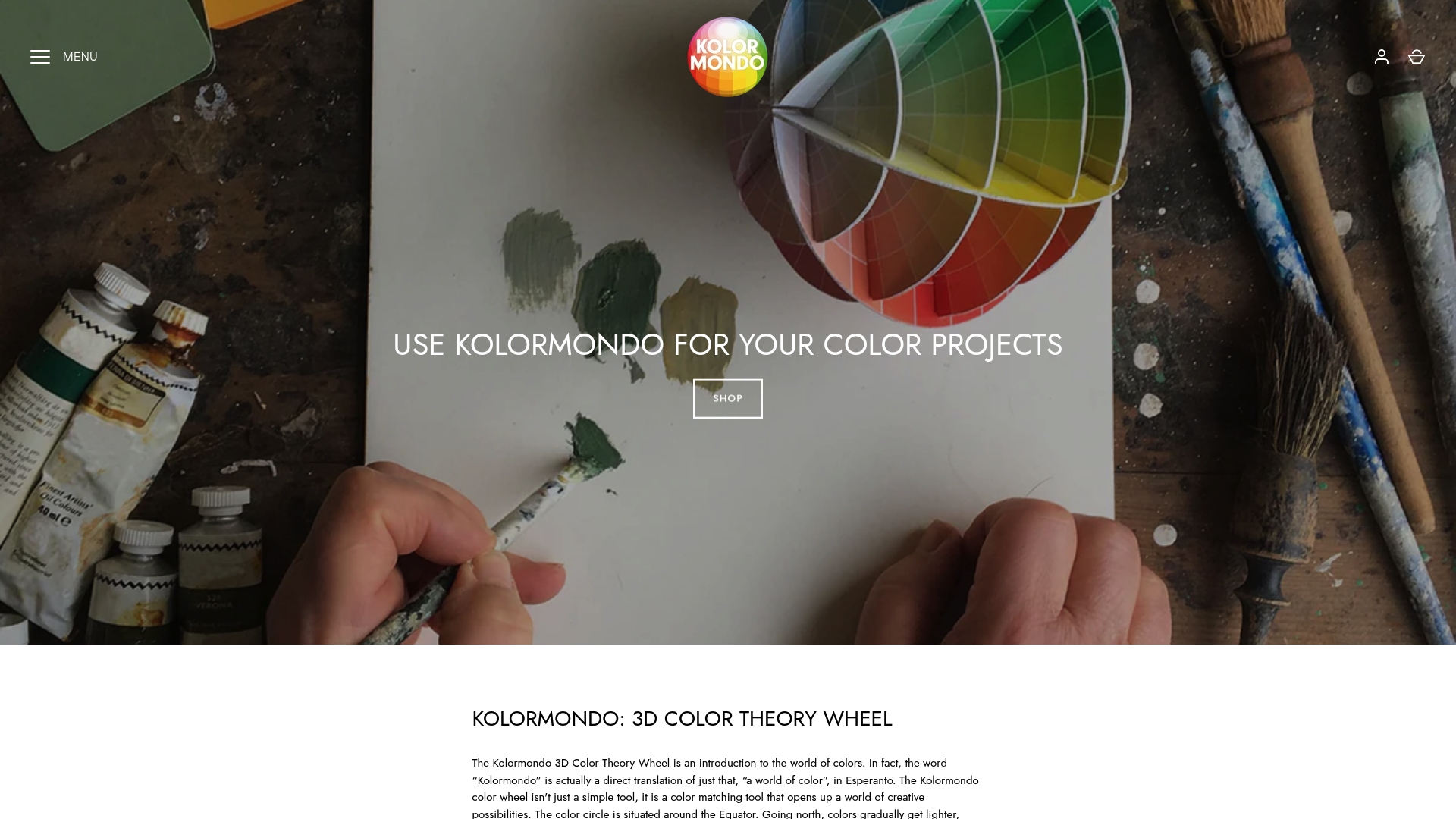
Explore our exclusive collection of Color Globe and color sphere - Kolormondo and discover how this unique teaching tool transforms your approach to colour study Whether you are an educator seeking dynamic lesson plans or an artist eager to refine your technique our Educational material and lesson plans - Kolormondo provide the perfect support Take the next step today visit Kolormondo.com and experience a new world of colour learning that empowers your creativity and sharpens your colour intuition
Frequently Asked Questions
How do I set up my Kolormondo globe for colour theory learning?
To set up your Kolormondo globe, unpack it carefully and ensure its components are handled with care. Rotate the globe on its axis to explore colour positions and relationships, experimenting with different angles to see how colours interact.
What are the primary colours on the Kolormondo globe?
The primary colours on the Kolormondo globe are red, blue, and yellow. These foundational colours cannot be created by mixing other colours, and they serve as the basis for understanding how to create secondary colours such as green, orange, and purple.
How can I experiment with colour mixing using the Kolormondo globe?
You can experiment with colour mixing by selecting complementary colours located opposite each other on the globe. Rotate the globe to observe how these colours influence one another and create vibrant visual contrasts.
What is the importance of colour schemes, and how can I apply them using the Kolormondo globe?
Colour schemes help communicate different moods and themes in a project. Use the Kolormondo globe to explore various schemes—monochromatic, analogous, and complementary—by rotating it to find the colours that work best for your creative goals.
How can I verify my colour choices with the Kolormondo globe?
To verify your colour choices, systematically compare them with the colours on the Kolormondo globe. Rotate the globe to see how your colours appear under different lighting conditions and angles, ensuring visual coherence in your artistic projects.
What tools can I use to document my colour experiments with the Kolormondo globe?
You can document your colour experiments by creating sketches, digital colour swatches, or comparison charts. Record your findings and observations as you explore colour relationships, building a reference library for future projects.
Recommended
Find similar articles
color theory step by step
