
Most british art students struggle to fully grasp colour theory with traditional paper charts. This challenge affects classrooms from Canada to Australia, making hands-on visualisation tools more valuable than ever. By integrating tactile resources such as the 3D Kolormondo colour globe, educators unlock new ways to demonstrate complex colour relationships and boost engagement. Discover how a multi-dimensional approach supports clear understanding for both beginners and advanced learners in today’s global design education.
Table of Contents
- Defining Colour Wheels In Design Practice
- Comparing Flat Vs. Three-Dimensional Models
- Core Principles: Harmony, Contrast, And Balance
- Real-World Applications Across Creative Fields
- Common Pitfalls And Limitations For Designers
Key Takeaways
| Point | Details |
|---|---|
| Colour Wheels as Reference Tools | Colour wheels serve as essential tools for understanding colour relationships, aiding in the creation of visually appealing designs. |
| Flat vs. Three-Dimensional Models | Three-dimensional colour models provide deeper insights into colour interactions, enhancing design sophistication over traditional flat models. |
| Core Principles of Colour Design | Mastering colour harmony, contrast, and balance is crucial for creating effective visual narratives and enhancing emotional impact. |
| Common Pitfalls | Designers must avoid oversimplified approaches to colour application, considering factors such as context, accessibility, and perceived colour differences. |
Defining Colour Wheels In Design Practice
A colour wheel represents a circular visual tool that maps the fundamental relationships between colours, serving as a critical reference point for artists and designers worldwide. Understanding colour theory through systematic representations allows professionals to develop strategic approaches to colour selection and harmony.
Traditionally, colour wheels display primary colours (red, yellow, blue) strategically arranged with secondary and tertiary colours to demonstrate complex chromatic interactions. These precision-engineered tools enable designers to analyse colour temperature, understand complementary relationships, and create visually compelling palettes that communicate specific emotional and aesthetic messages. Modern iterations have expanded beyond traditional red-yellow-blue models to incorporate digital colour systems like RGB, reflecting evolving technological design practices.
Designers utilise colour wheels as analytical instruments, helping them decode intricate colour relationships such as complementary, analogous, and triadic colour schemes. By exploring systematic colour relationships, creative professionals can develop nuanced strategies for colour selection that transcend basic aesthetic choices and delve into profound visual communication principles.
Pro Design Tip: Always approach colour wheel selection with your specific project’s emotional and communicative goals in mind, treating the wheel as a strategic tool rather than a rigid template.
Comparing Flat Vs. Three-Dimensional Models
Traditional flat colour wheels have long served as fundamental tools for designers, presenting colours in a straightforward circular arrangement. However, these two-dimensional representations inherently limit the comprehensive understanding of colour complexity, offering only a simplified perspective of chromatic relationships.
Three-dimensional colour models represent a significant evolutionary leap in colour theory visualisation. Unlike flat wheels, these innovative models capture nuanced colour variations by incorporating multiple dimensions such as hue, lightness, and saturation. This approach allows designers and artists to explore colour with unprecedented depth, revealing subtle shade variations that traditional flat wheels cannot adequately communicate.

The primary distinction between flat and three-dimensional colour models lies in their representational capabilities. Flat wheels typically display basic colour relationships using primary, secondary, and tertiary colours arranged in a circular format. Conversely, three-dimensional models provide a more holistic representation, demonstrating how colours interact across different brightness levels and intensities. This sophisticated approach enables professionals to understand colour behaviour more comprehensively, supporting more intricate design and artistic decisions.
Pro Design Tip: When selecting a colour representation tool, consider your specific project requirements and choose a model that provides the most nuanced and precise colour insights.
Here’s a comparison of flat and three-dimensional colour models to highlight their practical differences for designers:
| Aspect | Flat Colour Wheels | Three-Dimensional Models |
|---|---|---|
| Visual Structure | Circular, two-dimensional | Multi-axis, spatial arrangement |
| Range of Colour Detail | Basic hues and blends | Nuanced lightness, saturation |
| Analysis Depth | Surface-level relationships | Complex chromatic interactions |
| Application Complexity | Suitable for basic projects | Ideal for advanced design work |
Core Principles: Harmony, Contrast, and Balance
Colour harmony represents a fundamental design principle that transforms visual compositions from mere collections of hues into sophisticated, emotionally resonant experiences. Designers strategically employ colour relationships to create aesthetic unity, leveraging established colour wheel schemes that include complementary, analogous, triadic, and monochromatic configurations.
The interplay between contrast and balance determines the visual impact of a design. Colour contrast serves as a critical mechanism for directing viewer attention and creating visual hierarchy, enabling designers to manipulate emotional responses and guide user perceptions. By intentionally juxtaposing colours with different intensities, temperatures, and saturations, creative professionals can generate dynamic visual narratives that communicate beyond mere aesthetic appeal.
Mastering these core principles requires understanding how colours interact psychologically and visually. Harmonious colour schemes create a sense of cohesion and tranquillity, while strategic contrast introduces energy and focal points. Designers must balance these elements carefully, considering factors such as cultural context, emotional intention, and the specific communicative goals of their visual project.
Pro Design Tip: Always test your colour combinations in multiple contexts and lighting conditions to ensure consistent visual effectiveness and emotional resonance.
The following table outlines how colour theory principles impact professional design outcomes:
| Principle | Typical Effect | Professional Benefit |
|---|---|---|
| Harmony | Cohesive compositions | Emotional resonance and unity |
| Contrast | Emphasised focal areas | Directs viewer attention |
| Balance | Visual stability | Enhances legibility, reduces chaos |
Real-World Applications Across Creative Fields
Colour theory extends far beyond traditional artistic domains, permeating diverse creative disciplines with remarkable sophistication. Cutting-edge research demonstrates colour’s pivotal role in strategic design applications, ranging from digital interface development to complex environmental design and emerging technologies like virtual reality and robotics.
Colour psychology profoundly influences user experience and communication strategies across multiple creative sectors. Designers leverage nuanced colour understanding to manipulate emotional responses, guide user perceptions, and create compelling visual narratives in fields as varied as branding, marketing, healthcare design, and interactive media. This sophisticated approach transforms colour from a mere aesthetic element into a powerful communication tool that can subtly influence human behaviour and perception.
Creative professionals utilise colour wheels as critical analytical instruments across disciplines. Graphic designers apply colour principles to create visually striking brand identities, while architects use sophisticated colour relationships to evoke specific spatial emotions. User experience designers carefully select colour palettes to enhance digital interfaces, and fashion designers craft collections that communicate complex emotional narratives through strategic colour combinations.
Pro Design Tip: Develop a systematic approach to colour selection by documenting how different colour combinations affect emotional and psychological responses in your specific design context.
Common Pitfalls and Limitations for Designers
Designers frequently encounter significant challenges when applying colour theory, often stemming from oversimplified approaches and limited understanding. Fundamental mistakes can undermine even the most well-intentioned design strategies, with common errors including rigid adherence to traditional colour wheel principles without considering contextual nuances.
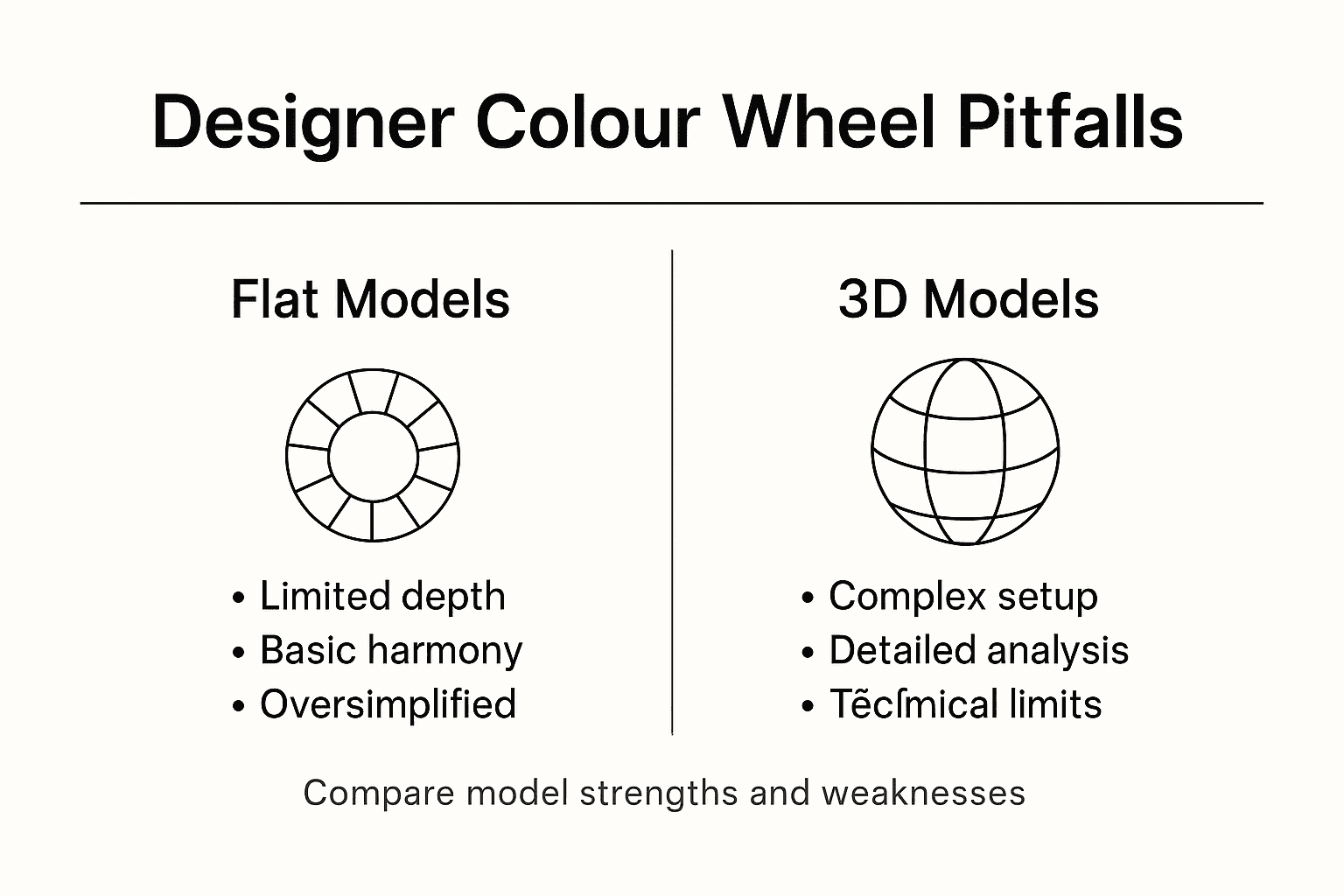
The most critical limitations arise from a narrow perspective on colour application. Designers may inadvertently create ineffective visual compositions by overlooking crucial factors such as cultural context, accessibility requirements, and perceptual variations. Colour perception is not universal; what appears harmonious in one context might be jarring or inappropriate in another, demanding a more sophisticated and adaptable approach to colour selection.
Technical constraints further complicate colour wheel usage. Digital screens, print media, and physical environments each present unique challenges in colour reproduction and perception. The discrepancy between theoretical colour relationships and real-world application requires designers to develop a more flexible, nuanced understanding that extends beyond simplistic colour wheel rules. This demands continuous learning, experimentation, and a willingness to challenge established colour theory conventions.
Pro Design Tip: Develop a comprehensive colour reference library that documents how specific colour combinations perform across different contexts, mediums, and cultural environments.
Unlock the Full Potential of Your Colour Mastery with Kolormondo
Designers face the challenge of transcending traditional flat colour wheels to truly grasp complex colour relationships that bring harmony, contrast and balance to their work. If you seek a deeper, tactile experience of colour theory that matches the nuance of three-dimensional models discussed in this article then the Kolormondo Globe offers a revolutionary solution. This unique 3D colour sphere allows you to explore hue, saturation and lightness in an engaging and intuitive way, empowering you to create visually compelling palettes that resonate emotionally and functionally.
Discover expert tools and resources with our Color Globe and color sphere - Kolormondo collection and enhance your understanding even further through our Educational material and lesson plans - Kolormondo.
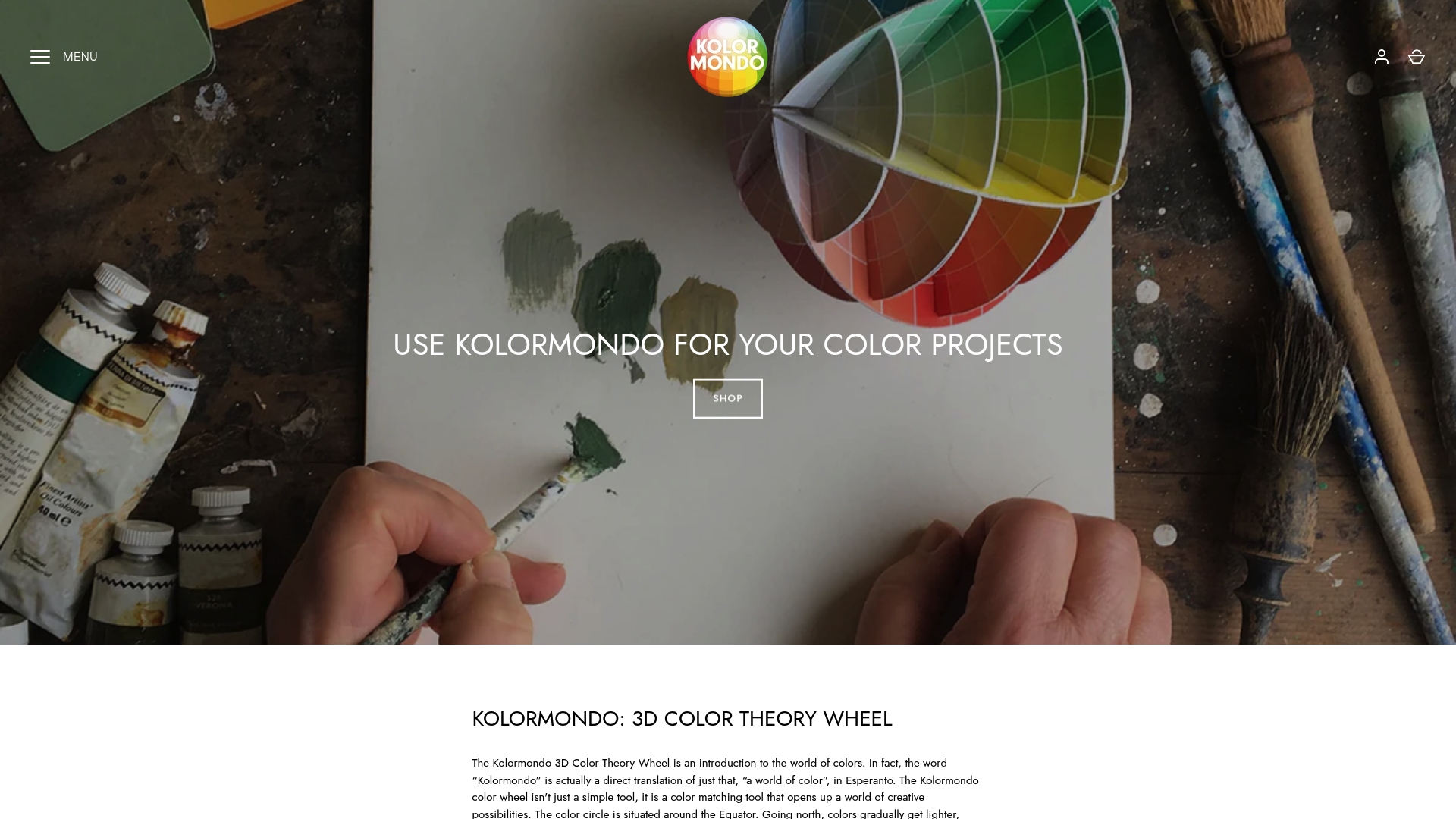
Take your colour exploration beyond static charts and unlock new design possibilities with the Kolormondo Globe today. Visit https://kolormondo.com now to begin your hands-on journey toward visual mastery that meets the highest professional standards.
Frequently Asked Questions
What is a colour wheel and how is it used in design?
A colour wheel is a circular visual tool that maps the relationships between colours. Designers use it to analyse colour temperature, complementary relationships, and to create visually appealing palettes that convey specific emotions and aesthetics.
How do flat colour wheels differ from three-dimensional models?
Flat colour wheels present colours in a simple circular format, illustrating basic relationships. In contrast, three-dimensional models offer a more complex representation by incorporating multiple dimensions such as hue, lightness, and saturation, allowing for a deeper exploration of colour nuances.
What are the core principles of colour theory that designers consider?
Designers consider harmony, contrast, and balance when applying colour theory. Harmony creates cohesive compositions, contrast directs viewer attention, and balance ensures visual stability, all contributing to effective visual communication in design.
How does colour psychology influence design choices?
Colour psychology plays a crucial role in shaping user experience and communication strategies. Designers leverage nuances in colour to evoke emotional responses, guide perceptions, and craft compelling visual narratives across various fields, such as branding and marketing.
Recommended
Find similar articles
why designers use color wheels
