
Most advice about colour theory overlooks the practical impact of a hands-on tool like the Kolormondo colour wheel for british artists and designers. With more than 60 percent of artistic professionals reporting improved results from visual, three dimensional references, learning to use such a tool can reshape your approach to creating colour harmony. This guide uncovers step by step techniques that help you unlock deeper understanding and practical skills for the modern british creative.
Table of Contents
- Stage 1: Set Up Your Kolormondo Colour Wheel
- Stage 2: Identify Primary and Secondary Colours
- Stage 3: Select Appropriate Blending Tools and Mediums
- Stage 4: Practise Smooth Colour Transitions
- Stage 5: Verify Colour Accuracy and Harmony
Quick Summary
| Key Point | Explanation |
|---|---|
| 1. Set Up Your Kolormondo Globe Correctly | Position the globe on a stable surface with good lighting to fully appreciate colour gradations and interactions. |
| 2. Understand Primary and Secondary Colours | Identify foundational colours such as red, blue, and yellow, and their blends, like green, orange, and purple, to enhance colour mixing skills. |
| 3. Use Appropriate Blending Tools | Select the right brushes and tools for your medium to achieve smooth colour transitions and maintain colour purity during blending. |
| 4. Practise Smooth Colour Transitions | Gradually blend adjacent colours on your colour wheel, experimenting with various techniques to develop control and precision in your artwork. |
| 5. Verify Colour Accuracy | Assess your artwork under consistent lighting, comparing it to the Kolormondo colour wheel to ensure colour harmony and identify discrepancies. |
Stage 1: Set Up Your Kolormondo Colour Wheel
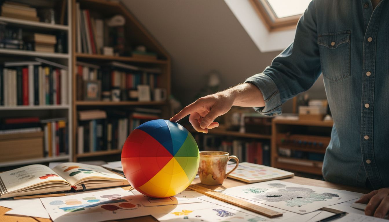
Bringing your Kolormondo colour reference tool to life requires careful initial setup to ensure optimal performance and understanding. This stage will transform your colour learning experience by guiding you through precise placement and orientation of your innovative 3D colour globe.
Begin by removing the Kolormondo globe from its protective packaging with gentle hands. Examine the globe carefully and locate the central axis which allows smooth rotation. Position the sphere on a stable surface with good natural lighting that permits you to see the intricate colour gradations and relationships. Pay special attention to how the colours transition and blend across different sections of the sphere.
Pro tip: When first handling your colour wheel, rotate it slowly to appreciate how colours interact dimensionally. Subtle shifts reveal unexpected colour connections that traditional flat colour charts cannot demonstrate. Each rotation provides a new perspective on colour theory that will enhance your artistic and design capabilities.
With your Kolormondo colour wheel now carefully set up, you are ready to explore its remarkable three dimensional colour mapping system. The next stage will involve understanding how to read and interpret the globe’s unique colour relationships.
Stage 2: Identify Primary and Secondary Colours
Mastering the fundamental colour relationships begins with understanding the core elements of your colour theory toolkit. In this stage, you will learn to precisely identify primary and secondary colours using your Kolormondo colour wheel, developing a critical skill for artists and designers.
On your Kolormondo globe, primary colours appear as the foundational hues from which all other colours emerge: red, blue, and yellow. These pure colours cannot be created by mixing other pigments. Secondary colours appear where these primary colours intersect, forming green, orange, and purple through deliberate blending. Rotate your colour wheel slowly, observing how these colours relate and transition across the spherical surface.
A professional tip for artists: When studying these colour relationships, note how the three-dimensional representation provides nuanced insights impossible with traditional flat colour charts. Each subtle shift reveals complex colour interactions that can transform your artistic understanding. As you become familiar with these fundamental colour connections, you will develop a more intuitive sense of colour harmony and mixing techniques.
With primary and secondary colours now identified, you are prepared to explore more advanced colour theory principles and understand how these foundational hues interact within the remarkable Kolormondo colour mapping system.
Stage 3: Select Appropriate Blending Tools and Mediums
Choosing the right blending tools transforms your colour exploration from basic to extraordinary, especially when working with a sophisticated colour theory reference like the artist comparison guide. The tools you select will dramatically influence how you interpret and apply colour relationships discovered on your Kolormondo colour wheel.
For painters, consider soft bristle brushes in various sizes to create smooth transitions between hues. Watercolour artists might prefer synthetic brushes that hold moisture effectively, while acrylic painters benefit from stiffer brushes that can create textured blending effects. Palette knives offer another excellent blending option, allowing you to mix colours directly and create unique textural variations. Digital artists can leverage graphic tablets with pressure sensitivity to achieve nuanced colour gradients.
Pro tip: Always clean your blending tools between colour transitions to maintain colour purity. Residual pigments can muddy your carefully selected colour combinations, undermining the precise colour relationships you are exploring. Experiment with different mediums watercolours, acrylics, oils, or digital tools to understand how each responds uniquely to blending techniques.
With your blending tools selected, you are now prepared to translate the colour theory insights from your Kolormondo globe into practical artistic expressions.
Stage 4: Practise Smooth Colour Transitions
Mastering colour transitions requires a strategic approach, particularly when exploring the intricate relationships revealed by your 3D colour theory reference. This stage will transform your understanding of how colours interact, blend, and communicate through subtle gradients.
Begin by selecting two adjacent colours on your Kolormondo colour wheel. Start with a small amount of each pigment on your palette, using a clean brush or palette knife to create a gradual blend. Apply gentle pressure and use sweeping motions to merge the colours smoothly. Pay attention to the opacity and consistency of your medium watercolour, acrylic, or oil paint each responds differently during blending. For digital artists, leverage pressure sensitivity and opacity settings to achieve similar soft transitions.
Pro tip: Practise creating colour gradients by starting with complementary colours that sit opposite each other on the colour wheel. These challenging transitions will help you develop precision and control. Experiment with different blending techniques light feathering, cross hatching, or gentle overlapping to discover which method suits your artistic style best. Remember that smooth transitions are about patience and subtle manipulation.
With these blending techniques now practised, you are ready to explore more complex colour relationships and develop your artistic colour language.
Stage 5: Verify Colour Accuracy and Harmony
Verifying colour accuracy requires a nuanced approach, especially when visualising colour relationships through innovative 3D perspectives. Your Kolormondo colour wheel becomes an essential diagnostic tool for ensuring precise colour harmony and understanding complex chromatic interactions.
Utilise natural daylight or consistent colour balanced lighting to assess your colour blends critically. Place your artwork or design next to your Kolormondo colour wheel, comparing the actual pigments against the globe’s precise colour mappings. Look for subtle variations in hue, saturation, and brightness. Digital designers can use colour picker tools to cross reference exact colour codes, while traditional artists might create small test swatches to validate their colour transitions.

Pro tip: Develop a systematic colour verification process. Photograph your work under consistent lighting conditions and review the images alongside your colour wheel. This method helps identify subtle colour discrepancies that might be less apparent in direct observation. Remember that colour perception varies depending on surrounding colours, background, and viewing conditions.
With your colour accuracy verified, you are now prepared to confidently apply your refined colour understanding across various artistic and design contexts.
Elevate Your Colour Blending Skills with Kolormondo’s 3D Colour Globe
Are you ready to overcome the challenges of achieving smooth colour transitions and mastering colour harmony as outlined in the “Master Colour Wheel Blending Guide for Designers and Artists”? Traditional flat charts can limit your perception of intricate colour relationships. Kolormondo’s innovative 3D colour wheel offers an immersive and tactile way to explore primary and secondary colours, blending techniques, and precise colour accuracy — all essential to refining your artistic and design expression.
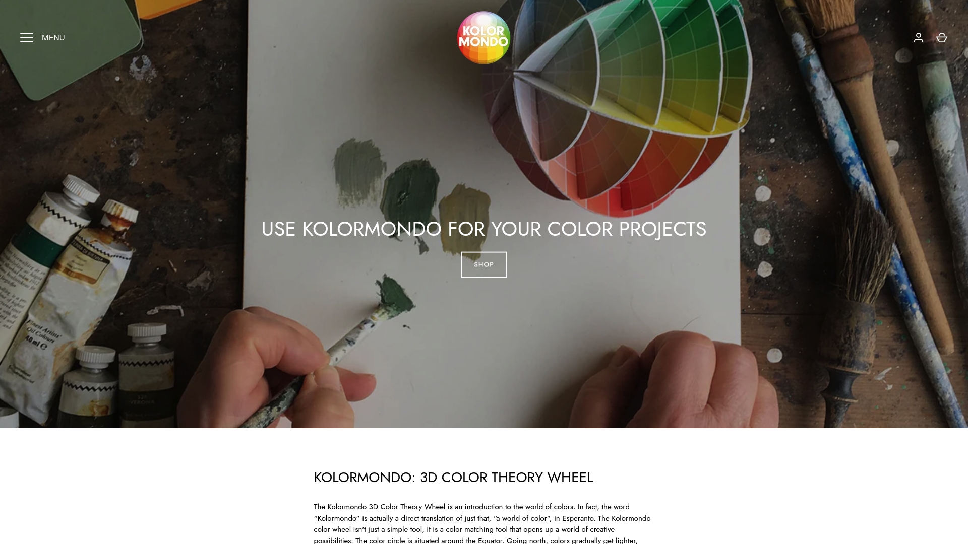
Discover how this unique tool enhances your hands-on learning by bringing colour theory to life. Visit our Color Globe and color sphere - Kolormondo collection for a variety of globe options, including professional and mini versions tailored to your needs. Pair your globe with expert Educational material and lesson plans - Kolormondo to deepen your understanding and practical skills. Don’t wait to transform your colour blending process into a confident, creative journey. Start exploring the full potential of colour at Kolormondo today.
Frequently Asked Questions
How do I set up my Kolormondo Colour Wheel for blending?
To set up your Kolormondo Colour Wheel, begin by placing it on a stable surface with good natural lighting. Ensure the central axis allows for smooth rotation and gently rotate the globe to observe colour transitions.
What are the primary and secondary colours on the Kolormondo Colour Wheel?
The primary colours on the Kolormondo Colour Wheel are red, blue, and yellow. Secondary colours are formed by mixing these primary hues and include green, orange, and purple.
How can I achieve smooth colour transitions using the Kolormondo Colour Wheel?
To achieve smooth colour transitions, select two adjacent colours on your Kolormondo Colour Wheel and blend them using a clean brush or palette knife. Apply gentle pressure and sweeping motions to merge the pigments gradually.
What blending tools are best for colour mixing with the Kolormondo Colour Wheel?
For colour mixing, consider using soft bristle or synthetic brushes, depending on your medium. Palette knives are also excellent for mixing directly, while digital artists can utilise graphic tablets for nuanced blending.
How do I verify colour accuracy when using the Kolormondo Colour Wheel?
To verify colour accuracy, compare your artworks under consistent lighting against your Kolormondo Colour Wheel. Look for variations in hue and saturation, and consider creating small test swatches to ensure proper colour transitions.
Can I use any medium for blending with the Kolormondo Colour Wheel?
Yes, you can use various mediums such as watercolours, acrylics, or oils while blending with the Kolormondo Colour Wheel. Experiment with different mediums to find out how each responds to your blending techniques.
Recommended
- Role of Colour Theory in Painting Explained
- 8 Best Colour Theory Aids for Artists – Expert Comparison 2025
- Visualising Colour In 3D: A New Approach To Understanding
- Color Theory and Psychology in Fashion: How It Affects Style
- Using Projector for Art: Creative Ideas and Tips 2025 - Projector Display
- The Alchemy of Colour — Creating My Own Pigments – Eman’s Gallery
Find similar articles
color wheel blending guide
