
Most British artists develop their own signature style by mastering the basics of colour theory, yet only about 40 percent can confidently identify both primary and secondary colours. Colour knowledge is not just an academic topic but a practical skill that shapes every brushstroke, from creating mood to achieving visual harmony. This guide highlights essential concepts and practical tips, helping British creatives unlock new levels of expression and clarity in their painting journeys.
Table of Contents
- 1. Understanding Primary and Secondary Colours in Painting
- 2. Using Complementary Colours for Visual Impact
- 3. Creating Mood with Warm and Cool Colour Schemes
- 4. Achieving Harmony with Analogous Colours
- 5. Exploring Colour Value and Its Artistic Effects
- 6. Balancing Artworks Using Colour Proportion
- 7. Tactile Learning: Using 3D Tools Like Kolormondo Globes
Quick Summary
| Key Message | Explanation |
|---|---|
| 1. Understand primary and secondary colours | Primary colours are red, yellow, and blue; mixing them creates secondary colours, expanding artistic possibilities. |
| 2. Use complementary colours for impact | Opposite colours on the colour wheel enhance vibrancy and create dynamic visual tension when paired. |
| 3. Create mood with warm and cool colours | Use warm colours for energy and intimacy, while cool colours convey calm and a sense of space. |
| 4. Explore analogous colours for harmony | Colours next to each other on the wheel create soothing compositions, evoking tranquillity and cohesion. |
| 5. Manipulate colour value for depth | Altering the lightness and darkness of colours builds dimension and visual drama in your artwork. |
1. Understanding Primary and Secondary Colours in Painting
Imagine colour as the magical language of visual art, where every hue tells a story. At the heart of this language are primary and secondary colours, the fundamental building blocks that artists use to create stunning visual compositions. Understanding colour mixing fundamentals reveals how just a few base colours can generate an entire spectrum of artistic expression.
In traditional painting, primary colours are the pure, foundational hues that cannot be created by mixing other colours: red, yellow, and blue. These three colours are the cornerstone of colour theory, serving as the essential starting point for all colour creation. When artists blend these primary colours, something extraordinary happens.
Secondary colours emerge through strategic mixing of primary colours. Blue and yellow combine to create green, red and yellow produce orange, while red and blue generate purple. This magical transformation demonstrates how artists can expand their palette by understanding these fundamental colour relationships. Each secondary colour carries its own unique emotional and visual weight, offering painters a rich toolkit for expressing mood and depth.
Practical colour mixing requires precision and understanding. Artists often use a colour wheel to visualise these relationships, helping them predict and control colour interactions. By mastering primary and secondary colour combinations, painters can create nuanced, vibrant artworks that capture complex visual narratives.
Pro tip: Start your colour mixing experiments with small quantities of paint, gradually adjusting proportions to understand how subtle changes dramatically impact the final hue.
2. Using Complementary Colours for Visual Impact
In the vibrant world of art, complementary colours represent a powerful visual strategy that can transform ordinary compositions into extraordinary masterpieces. Colour theory reveals how strategically paired opposite colours create stunning visual dynamics that capture viewers attention and evoke profound emotional responses.
Complementary colours are precise colour pairs positioned directly opposite each other on the colour wheel. These dynamic duos include red and green, blue and orange, and yellow and purple. When artists deliberately place these colours side by side, something magical happens: an explosive visual tension emerges that makes both colours appear more intense and vibrant.
The scientific principle behind complementary colours is rooted in how our visual perception processes contrasting hues. When complementary colours are juxtaposed, they create an optical effect where each colour appears more vivid and energetic. This phenomenon occurs because our eyes naturally try to balance the visual information, causing the colours to seem more saturated and alive.
Practical application involves understanding how to balance these powerful colour relationships. Artists might use a dominant complementary colour with smaller accents of its pair to create visual hierarchy, or employ them in equal proportions for maximum dramatic impact. Painters like Vincent Van Gogh masterfully used complementary colours to create depth, emotion, and visual excitement in his iconic works.
Pro tip: When experimenting with complementary colours, start by using one colour as a dominant shade and the other as an accent to maintain visual harmony while creating dynamic contrast.
3. Creating Mood with Warm and Cool Colour Schemes
Colour is not just a visual element but an emotional language that speaks directly to the viewer’s subconscious. Artists leverage colour psychology to craft powerful visual narratives that evoke specific emotional responses through strategic use of warm and cool colour schemes.
Warm colours such as red, orange, and yellow are dynamic and energetic, reminiscent of sunshine, fire, and passion. These colours naturally draw the viewer’s eye and create a sense of intimacy, excitement, and forward movement. They can make spaces feel smaller and more intense, perfect for creating dramatic or passionate scenes in artwork.
Conversely, cool colours like blue, green, and purple generate a sense of calm, depth, and distance. These hues are associated with water, sky, and tranquillity. Cool colours tend to make areas appear larger and more spacious, offering a sense of contemplation and serenity. Artists often use cool colours to create a sense of depth or to convey emotional distance and reflection.
Mastering mood through colour requires understanding how these colour groups interact. A landscape painting might use warm oranges and yellows in the foreground to create immediacy, while employing cool blues and greens in the background to suggest atmospheric perspective. This technique allows artists to guide the viewer’s emotional journey through visual cues.
Pro tip: Experiment with colour temperature by mixing warm and cool tones within the same painting to create complex emotional landscapes that invite viewers to explore deeper feelings.
4. Achieving Harmony with Analogous Colours
In the nuanced world of colour theory, analogous colours represent a sophisticated approach to creating visual harmony that feels both intentional and naturally pleasing. Artists understand the delicate balance of selecting neighbouring hues that generate a sense of cohesion and tranquillity.
Analogous colours are positioned next to each other on the colour wheel, sharing similar undertones that create a seamless and soothing visual experience. Imagine a spectrum ranging from blue to blue green to green, or from yellow to yellow orange to orange. These colour families possess an inherent relationship that allows artists to craft compositions with subtle depth and understated elegance.
The power of analogous colour schemes lies in their ability to evoke calm and create visual continuity. Where complementary colours create dramatic contrast, analogous colours whisper harmoniously. A landscape painting using various shades of green and blue might capture the serene atmosphere of a misty forest, while a portrait employing warm yellows, oranges, and soft reds could radiate a sense of gentle energy.
Practical application involves understanding subtle variations within your chosen colour family. Artists can introduce slight tonal shifts by incorporating different saturations and lightness levels, preventing the composition from feeling monotonous while maintaining overall harmony. This technique allows for nuanced expression that feels both intentional and organic.
Pro tip: When exploring analogous colours, select a dominant colour and use its immediate neighbours as supporting tones to create sophisticated visual narratives.
5. Exploring Colour Value and Its Artistic Effects
Colour value represents the subtle language of light and shadow that transforms a simple composition into a mesmerising artwork. Artists strategically manipulate colour value to create depth, emotion, and visual drama through the interplay of lightness and darkness.
Colour value describes the relative brightness or darkness of a specific colour, independent of its hue. Imagine a single colour like blue transformed from a pale, barely visible whisper to a deep, intense navy. This gradation from light to dark creates visual intrigue, allowing artists to guide the viewer’s eye and evoke powerful emotional responses.
Mastering colour value involves understanding how light interacts with different pigments. A painting using a wide range of values can create remarkable depth and dimensionality. Consider a landscape where pale, washed out greys in the distant mountains transition to rich, saturated darker tones in the foreground, instantly creating a sense of spatial depth and atmospheric perspective.
Practical application requires developing a keen eye for subtle variations. Artists often create value scales experimental studies, exploring how changing the lightness or darkness of a single colour can dramatically alter the mood and visual impact of their work. This technique allows for nuanced storytelling through subtle shifts in tone and intensity.
Pro tip: When exploring colour value, create a grayscale value study of your artwork first to understand how light and shadow interact before introducing full colour.
6. Balancing Artworks Using Colour Proportion
Artists harness the power of colour proportion as a sophisticated visual language that transforms mere pigments into compelling compositions. Mathematical relationships between colours reveal how strategic placement and quantity can create harmony or dramatic tension in artwork.
Colour proportion is the deliberate management of how much space each colour occupies within a composition. It is not simply about choosing beautiful colours but understanding their visual weight and psychological impact. Imagine a painting where a small, vibrant red area can balance a larger expanse of cool blue creating an extraordinary sense of visual equilibrium.
Classic proportion techniques include the 60 30 10 rule, where 60% of the artwork uses a dominant colour, 30% represents a secondary colour, and 10% provides an accent colour. This mathematical approach ensures visual balance while preventing the composition from feeling overwhelming or chaotic. Renaissance masters like Leonardo da Vinci intuitively understood these proportional relationships, creating paintings that feel simultaneously dynamic and serene.
Practical application requires careful observation and intentional colour selection. Artists can create visual interest by strategically varying colour proportions. A landscape might use vast areas of muted greens with small, brilliant yellow highlights drawing the viewer’s eye precisely where the artist intends.
Pro tip: When experimenting with colour proportion, squint at your artwork to assess the overall visual balance by reducing detailed colour information to simple light and dark shapes.
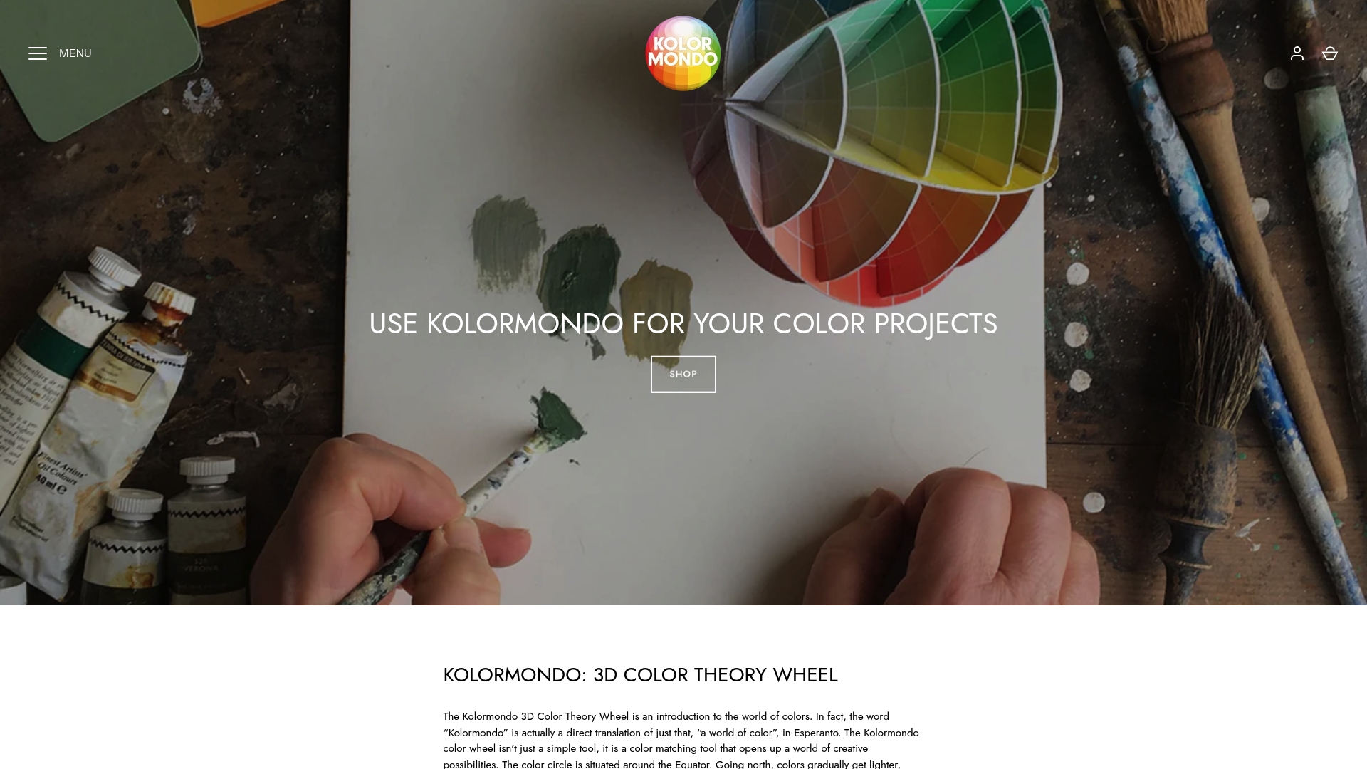
7. Tactile Learning: Using 3D Tools Like Kolormondo Globes
Traditional colour theory has long been confined to flat, two dimensional representations, but tactile learning introduces a revolutionary approach to understanding colour relationships. Visualising colour in three dimensions transforms abstract colour theory into a tangible, interactive experience that engages multiple sensory pathways.
Three dimensional colour tools like the Kolormondo globe offer a transformative learning experience that goes beyond traditional colour wheels. By presenting colours as interconnected spherical relationships, these innovative tools allow artists, designers, and students to physically rotate and explore colour interactions in ways impossible with flat charts. The spatial arrangement reveals nuanced connections between hues, saturations, and values that remain hidden in two dimensional representations.
Tactile learning approaches activate different cognitive pathways compared to visual observation alone. When you can physically manipulate a colour globe, you engage kinesthetic learning mechanisms that enhance understanding and memory retention. This hands on interaction helps students and professionals develop a more intuitive grasp of complex colour theory principles, making abstract concepts feel immediate and comprehensible.
Practical applications span multiple creative disciplines. Interior designers can use 3D colour globes to understand colour harmony, painters can explore subtle colour relationships, and educators can provide students with a more immersive learning experience. The physical interaction creates a memorable, multisensory approach to colour understanding.
Pro tip: When exploring 3D colour tools, experiment with rotating the globe under different lighting conditions to observe how colours interact and transform in varied environmental contexts.
Below is a comprehensive table summarising the key concepts discussed in the article about colour theory in painting.
| Topic | Description | Key Considerations |
|---|---|---|
| Primary and Secondary Colours | Primary colours (red, yellow, blue) are foundational and cannot be mixed. Secondary colours (green, orange, purple) are formed by mixing primary colours. | Use a colour wheel for guidance in mixing colours effectively. |
| Complementary Colours | Colours that are opposite on the colour wheel and create vibrant contrasts when paired, such as red and green. | Use a dominant colour with its pair as an accent for impact. |
| Warm and Cool Colour Schemes | Warm colours (red, orange, yellow) create energy, while cool colours (blue, green, purple) evoke calmness. | Mix both to explore complex emotional landscapes. |
| Analogous Colours | Neighbouring colours on the colour wheel that create harmony, such as blue, blue-green, and green. | Select a dominant colour with neighbours as supporting tones. |
| Colour Value | The lightness or darkness of a colour, creating depth and drama. | Develop a value scale to experiment with tonal variations. |
| Colour Proportion | Management of space each colour occupies, using techniques like the 60-30-10 rule. | Ensure visual balance by varying proportions strategically. |
| Tactile Learning | Use of 3D tools like the Kolormondo globe for interactive colour exploration. | Rotate under different lighting conditions to observe changes. |
Discover Colour Theory in 3D with Kolormondo
Understanding the intricate relationships between primary and secondary colours, complementary contrasts, and the emotional depth of warm and cool schemes can be challenging when relying solely on flat colour wheels. This article highlights key concepts that artists and educators often struggle to visualise in a meaningful and interactive way. Kolormondo offers a unique solution by transforming traditional colour theory into an engaging three dimensional experience with the Kolormondo globe. This tactile tool helps deepen your grasp of colour value, proportion, and harmony by letting you explore hues in a hands-on, intuitive manner.
Explore our Educational Material and Lesson Plans designed to complement your learning journey and get inspired by practical applications.
Elevate your colour understanding today by visiting the Color Globe and Colour Sphere collection and discover how this innovative 3D colour wheel can transform your art, teaching, or design practice. Don’t miss out on turning abstract colour theory into tangible knowledge at Kolormondo.com.
Frequently Asked Questions
What is colour theory in art?
Colour theory in art is the study of how colours interact and influence each other. It involves understanding concepts like primary, secondary, and complementary colours, as well as how colour choices can affect the mood and perception of artwork. Explore different colour combinations to see their visual impacts in your own creations.
How can I use complementary colours in my paintings?
To use complementary colours effectively, identify pairs of colours that are opposite each other on the colour wheel, such as red and green or blue and orange. Incorporate one colour as the dominant hue and use its complement in smaller amounts for accents. This technique can create striking contrast and draw attention to focal points in your artwork.
What are analogous colours and how do they enhance compositions?
Analogous colours are colours that sit next to each other on the colour wheel and share similar undertones. To enhance your compositions with analogous colours, select a dominant colour and use its neighbouring hues to create a harmonious and visually pleasing palette. This approach can bring cohesiveness and tranquility to your artwork.
How do warm and cool colours affect the mood of a piece?
Warm colours like red, orange, and yellow evoke energy and passion, while cool colours such as blue, green, and purple convey calmness and serenity. To affect the mood of your artwork, consider using a warm colour scheme for intensity in the foreground and cool tones in the background to suggest depth. This can guide viewers’ emotional responses.
What is colour value and why is it important in painting?
Colour value refers to the lightness or darkness of a colour, independent of hue, and plays a critical role in creating depth and dimension in art. To emphasise colour value, experiment with varying the lightness of colours in your palette, which can significantly impact the mood and visual drama of your piece. Aim to balance light and dark shades to achieve a dynamic composition.
How can I explore tactile learning tools like 3D colour globes?
To explore tactile learning tools, consider using a 3D colour globe to interact with colours in a tangible way. Rotate the globe while observing how colours relate to one another under different lighting conditions. This hands-on experience will deepen your understanding of colour theory and enhance your artistic practice.
Recommended
Find similar articles
examples of color theory in art
