
Most british fashion design students underestimate the impact of workspace setup on successful colour matching. With over 80 percent of professional designers relying on natural light to judge hues accurately, the way you position your Kolormondo globe can change everything about your design process. This guide shares practical, hands-on advice for harnessing innovative tools and techniques so you build a workspace where colour choices are clear, intuitive, and perfectly tailored to creative projects.
Table of Contents
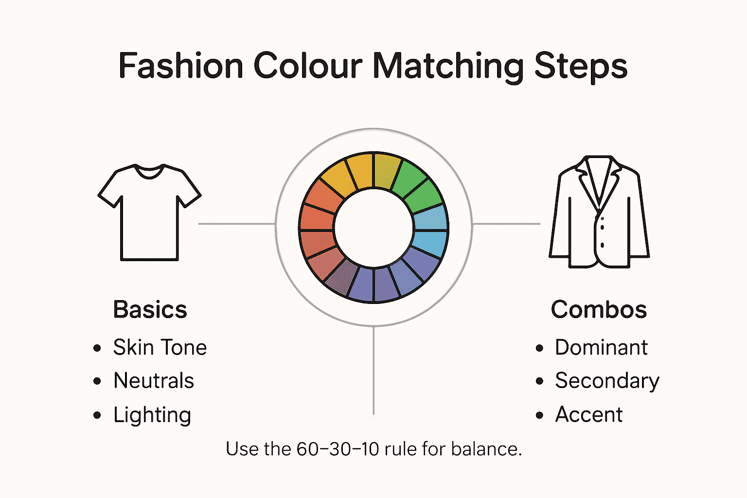
- Step 1: Set Up Your Workspace With The Kolormondo Globe
- Step 2: Identify Key Garment Colours For Your Look
- Step 3: Select Harmonious Colour Combinations
- Step 4: Test Your Combinations With Fabric Swatches
- Step 5: Evaluate Your Outfit Under Different Lighting
Quick Summary
| Key Message | Explanation |
|---|---|
| 1. Position the Kolormondo Globe Correctly | Place the globe in natural light at eye level for optimal colour exploration and interaction. |
| 2. Identify Your Skin Undertone | Determine if you have a cool, warm, or neutral undertone to guide your colour palette choices. |
| 3. Use the Colour Wheel for Combinations | Explore complementary, analogous, and triadic colour schemes to create visually appealing outfits. |
| 4. Test Fabrics Under Natural Light | Use fabric swatches in daylight to assess how colours interact with your skin and each other. |
| 5. Evaluate Outfits in Different Lighting | Check how outfit colours appear under various light sources to ensure versatility and aesthetic appeal. |
Step 1: Set up your workspace with the Kolormondo globe
Creating an effective workspace for colour matching begins with strategically positioning your Kolormondo colour matching globe. This innovative 3D tool transforms how designers understand colour relationships by providing an interactive visual reference that goes beyond traditional flat colour wheels.
Position your globe where natural light illuminates its surface evenly. A workspace near a window with soft, diffused daylight works best. Place the globe at eye level on a stable surface like a dedicated design table or clear workspace area. Ensure you can easily rotate and spin the globe to explore different colour perspectives. The globe allows you to physically manipulate colour relationships by rotating and tilting its spherical design, making colour theory instantly more tangible and intuitive.
Your workspace setup should include supplementary tools such as colour swatches, fabric samples, and sketching materials positioned around the globe. This arrangement creates a comprehensive colour exploration environment where you can cross-reference the globe’s insights with your specific design project requirements.
Top Tip: Always clean your globe with a soft microfibre cloth to maintain its pristine surface and ensure accurate colour representation.
Step 2: Identify key garment colours for your look
Discover your personal colour palette by understanding how colour analysis transforms your wardrobe choices. This process begins with examining your natural colouring to determine which hues will make you look radiant and confident.
Start by identifying your skin undertone through simple tests. Hold white and ivory fabric near your face in natural light. If your skin appears more vibrant against white, you likely have a cool undertone. If ivory makes you glow, you probably have a warm undertone. Neutral undertones can wear both colours equally well. Professional stylists categorise these undertones into seasonal palettes Winter (cool and deep), Summer (cool and soft), Spring (warm and bright), and Autumn (warm and muted). These categories help you select colours that naturally complement your unique features.
Once you understand your undertone, select base neutrals that work harmoniously with your skin. For warm undertones, opt for cream, camel, and olive. Cool undertones look stunning in pure white, navy, and charcoal. Build your foundational wardrobe around these colours, then introduce accent shades that enhance your natural colouring. Experiment with different colour combinations using your Kolormondo globe to visualise how various hues interact.

Here’s a quick reference to skin undertones and their suggested wardrobe colours:
| Skin Undertone | Typical Indicators | Recommended Base Neutrals |
|---|---|---|
| Cool | Vibrant with white | Pure white, navy, charcoal |
| Warm | Vibrant with ivory | Cream, camel, olive |
| Neutral | Suits both colours | Soft grey, taupe, blush |
Expert Tip: Always test potential outfit colours near your face to see how they truly impact your complexion.
Step 3: Select harmonious colour combinations
Master the art of creating visually stunning outfits by understanding colour theory principles in fashion design. Colour harmony transforms your wardrobe from ordinary to extraordinary by strategically combining hues that work together seamlessly.
Begin by exploring classic colour combination strategies using the colour wheel. Complementary colours positioned directly opposite each other create bold, high contrast looks perfect for making a statement. Analogous colour schemes using neighbouring hues produce softer, more unified ensembles. For instance, blue navy paired with cobalt and teal creates a sophisticated monochromatic outfit. Triadic colour combinations selecting three colours equally spaced on the wheel offer dynamic yet balanced options perfect for creative fashion expressions.
When selecting your colour palette, consider proportion and balance. Allow one dominant colour to act as your outfit’s focal point, then introduce supporting shades as accents. Neutrals like white, grey, and beige can help ground more vibrant colour selections. Experiment with different combinations using your Kolormondo globe to visualise how various hues interact and complement each other.
Expert Tip: Use the 60-30-10 colour rule selecting 60% dominant colour, 30% secondary colour, and 10% accent colour for perfectly balanced outfits.
Step 4: Test your combinations with fabric swatches
Elevate your colour matching skills by learning how to create and use fabric swatches effectively. These small fabric samples become your most valuable tool in verifying colour combinations and understanding how different shades interact with your personal colouring.
Begin by collecting fabric swatches in various textures and materials representing the colours from your planned outfit. Natural lighting is crucial for accurate assessment. Hold these swatches against your skin to evaluate how they complement your undertones. Place them next to each other to check harmony and contrast. Pay attention to how colours shift under different lighting conditions warm sunlight, cool fluorescent, or soft indoor illumination. Your Kolormondo globe can help you understand underlying colour relationships while you compare these physical samples.
Organise your swatches systematically by grouping them into potential outfit combinations. Create small boards or use clothing pins to arrange different colour pairings. This visual approach allows you to experiment without committing to full garments. Look for balance between your dominant colour and accent shades. Check how neutrals interact with brighter tones and how different fabric weights and textures influence colour perception.
Expert Tip: Photograph your fabric swatch combinations in natural daylight to review and compare them objectively at a later time.
Step 5: Evaluate your outfit under different lighting
Discover the transformative power of lighting on your carefully curated outfit by understanding how colour perception changes across different environments. Your perfect ensemble can look dramatically different depending on the illumination surrounding you.
Start by testing your outfit in multiple lighting conditions. Natural daylight provides the most accurate colour representation and should be your primary reference point. Move near windows throughout the day to observe how sunlight shifts from morning softness to afternoon intensity. Indoor environments present diverse challenges artificial lights can dramatically alter colour perception. Fluorescent lighting tends to wash out colours, while warm tungsten bulbs can add unexpected yellow or orange tints. Professional photographers recommend checking outfits under studio lights, smartphone screens, and evening ambient lighting to understand their true visual impact.
Use your Kolormondo globe as a reference point while examining colour variations. Take photographs of your outfit under different lighting conditions to compare and analyse how colours interact. Pay special attention to how accent colours and neutrals shift in intensity. Some colours might appear muted in dim light but vibrant in direct sunlight. Understanding these nuanced transformations helps you select versatile outfit combinations that maintain their aesthetic appeal across various settings.
Use this table to understand how common lighting types affect garment colour perception:
| Lighting Type | Colour Shift Effect | Recommended Response |
|---|---|---|
| Natural Daylight | Accurate, vibrant | Primary reference, best for matching |
| Fluorescent | Can wash out colours | Choose bold, saturated shades |
| Tungsten/Incandescent | Adds yellow/orange tint | Opt for cooler-hued garments |
| Evening Ambient | May mute colours | Include dynamic accents for impact |
Expert Tip: Always pack a lightweight neutral jacket or scarf that can adapt to unexpected lighting changes during your day.
Discover the Power of 3D Colour Mastery for Your Fashion Creations
Matching colours in fashion can be challenging when relying on flat colour wheels or guesswork alone. This article highlights key difficulties such as understanding colour harmony, identifying undertones, and testing combinations effectively. The Kolormondo globe offers a unique solution by bringing colour theory into a tangible 3D experience. It helps you visualise complementary, analogous, and triadic relationships clearly while exploring personalised palettes that truly flatter your complexion.
Experience the transformational impact on how you select and combine garment colours through hands-on interaction with our innovative Kolormondo colour globes. Whether you are a designer, student, or fashion enthusiast seeking greater confidence in your outfit choices, this tool bridges knowledge and creativity effortlessly.
Looking to deepen your colour expertise? Explore our Lectures and Workshops about colour - Kolormondo for expert guidance and practical techniques. To see the full range of our acclaimed 3D globes that revolutionise colour matching, visit Color Globe and color sphere - Kolormondo.

Elevate your fashion colour matching skills today with Kolormondo. Visit Kolormondo.com now to explore exclusive offers and bring your wardrobe to life with scientifically inspired creativity.
Frequently Asked Questions
How can I determine my skin undertone for colour matching?
To identify your skin undertone, hold white and ivory fabric near your face in natural light. If your skin looks better against white, you likely have a cool undertone; if ivory suits you more, you probably have a warm undertone.
What is the best way to use a Kolormondo globe for colour matching?
Use the Kolormondo globe to explore and manipulate colour relationships by rotating and tilting it. Set it at eye level in a well-lit area and incorporate it with fabric swatches to see how hues interact with your skin tone.
How can I create harmonious colour combinations for my outfits?
To create harmonious combinations, explore complementary colours from the colour wheel, which are opposite each other, or use analogous colours found next to each other. Experiment by selecting a dominant colour for 60% of the outfit, a secondary colour for 30%, and an accent colour for 10% to achieve balance.
What should I consider when testing outfit colours in different lighting?
Evaluate your outfit in various lighting conditions, as colours can look dramatically different. Start with natural daylight as your primary reference and document how your outfit appears under artificial lights to ensure consistent colour impact.
How can fabric swatches help with my colour matching?
Collect fabric swatches that represent your planned outfit’s colours and assess their compatibility with your skin tone. Hold them against your skin and observe how they interact; this approach will help you recognise which combinations work best visually before committing to garments.
What is the 60-30-10 colour rule in fashion?
The 60-30-10 colour rule is a guideline for creating visually appealing outfits by using 60% of a dominant colour, 30% of a secondary colour, and 10% as an accent. Apply this rule to maintain balance and interest in your outfit while selecting hues wisely.
Recommended
Find similar articles
how to match colors in fashion
