USING KOLORMONDO IN ART, DESIGN & ARCHITECTURE
A 3D color wheel such as Kolormondo is extremely useful when thinking about color intervals and understanding how colors interact visually. It helps you conceptualize the optical mixture between two colors in a structured and intuitive way.
Kolormondo is used by professionals in art, design, and architecture to bridge the gap between theory and practical color decisions.
Fritz Horstmann, Education Director at the Josef & Anni Albers Foundation, has highlighted the importance of tools like this. Anyone working seriously with color will inevitably encounter the work of Josef Albers, which makes this connection especially meaningful.
Another example comes from Scott Henderson, Retail Trainer at PPG Architectural Coatings in New Zealand. He uses the Kolormondo sphere in training to demonstrate color changes and relationships, describing it as: “There are 3 possibilities: Hue, Chroma and Value. I will use it during our Color Theory Course. I believe it will be very useful as a practical tool to enhance understanding.”
Kolormondo is also used to support understanding of advanced color systems such as CIELAB (L*a*b*), Munsell, and Delta E. Abhay Sharma, Professor at Toronto Metropolitan University and author of Understanding Color Management, has referenced its relevance in communicating complex color structures.
A 3D COLOR THEORY TOOL FOR ART, PAINT & PRINT
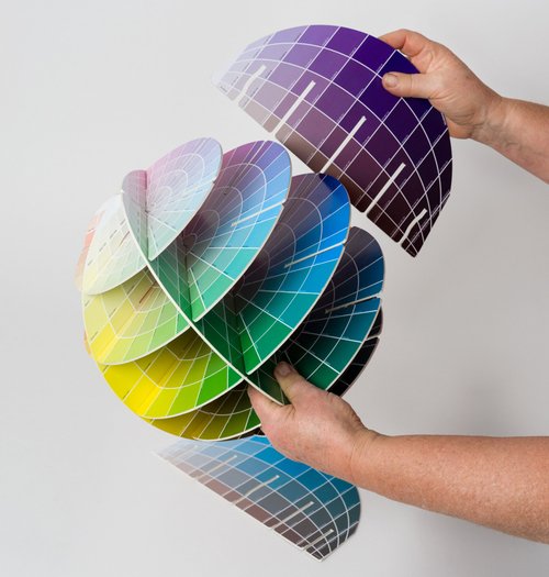
Art, paint, and print are key industries where Kolormondo is used as a practical tool for identifying, matching, mixing, discussing, and teaching color. It is also widely used across architecture, fashion, graphic design, printing, interior design, and product design. Despite this, color is still often represented in flat 2D systems such as wheels, charts, and fan decks — even though color is inherently three-dimensional.
Understanding color requires a shift in perspective: color exists in three dimensions.
Discover the Kolormondo globes →
HOW KOLORMONDO VISUALIZES COLOR
Kolormondo makes the structure of color easy to see and understand:
- Hue moves around the globe
- Value changes vertically from dark to light
- Saturation increases from the neutral gray center outward
This three-dimensional model makes abstract color theory visible, intuitive, and easy to communicate.
The globe is a simplification, but a powerful one — making the fundamentals of color relationships easier to grasp for both beginners and professionals.
HOW YOU CAN USE KOLORMONDO
- Understand and communicate color between experts and beginners
- Identify colors and understand relationships
- Find matches, complements, and contrasts
- Develop artistic and creative capability
- Use as inspiration in creative work
- Teach color fundamentals in education
- Add as a design object in studios and classrooms
- Give as a gift for creatives and professionals
READY TO EXPERIENCE COLOR IN 3D?
Discover the Kolormondo globes for Art, Design & Architecture →DESIGN, ITALY
“One of the smartest products I’ve seen at Milan Design Week.”
Riccardo Capuzzo, juror Red Dot Award

ART, ARCHITECTURE, USA
“We use Kolormondo in the School of Art. It will also be used in the School of Architecture.”
Jae Rossman, Yale University
“The Kolormondo sphere is just beautiful, what an attractive and organized “kit.” It’s a learning experience just to open the envelope.”
Olivia Gude, Professor, School of Art and Art History, University of Illinois at Chicago