
Over eighty percent of british students say that understanding colour mixing feels confusing at first. Colour theory is a core skill for both young artists and educators, yet many find its basics surprisingly tricky to master. By breaking down the essentials of primary, secondary, and tertiary colours and sharing practical tips, this guide gives you the confidence to teach or learn colour relationships with ease and creativity.
Table of Contents
- Understand Primary, Secondary, and Tertiary Colours
- Use 3D Colour Wheels for Visual Learning
- Teach Colour Relationships Through Hands-On Activities
- Explain Colour Harmony and Contrast Simply
- Demonstrate the Impact of Light and Shadow
- Incorporate Real-World Examples into Lessons
- Encourage Experimentation with Colour Mixing
Quick Summary
| Takeaway | Explanation |
|---|---|
| 1. Learn Primary, Secondary, and Tertiary Colours | Understanding these colour categories enhances colour mixing and artistic composition. Knowing how they relate is fundamental for artists and educators. |
| 2. Use 3D Colour Wheels for Better Understanding | Three-dimensional models offer insights into colour relationships that flat wheels cannot, making learning more intuitive and engaging. |
| 3. Engage in Hands-On Colour Activities | Practical experiments like mixing play-dough or creating colour wheels help students actively grasp colour interactions, making lessons memorable. |
| 4. Explore Colour Harmony and Contrast | Recognising how colours work together or against each other aids in creating visually appealing designs and effective colour schemes. |
| 5. Experiment with Light and Shadow | Observing how light affects colour perception develops a deeper understanding of the dynamic nature of colour in real-world contexts. |
1. Understand Primary, Secondary, and Tertiary Colours
Colour theory begins with understanding the fundamental building blocks of colour: primary, secondary, and tertiary colours. These categories form the foundation for how artists and educators comprehend colour relationships and create visual harmony.
At the core of colour theory are primary colours: red, yellow, and blue. These are the pure, fundamental colours that cannot be created by mixing other hues. They are the original pigments from which all other colours emerge. Primary colours form the backbone of artistic colour understanding and serve as the starting point for colour mixing and manipulation.
When you blend two primary colours, you create secondary colours. Mix yellow and blue, and you get green. Combine red and yellow, and orange appears. Red and blue together form purple. These secondary colours expand the artist’s palette and demonstrate the magical interactions between foundational pigments.
One step further are tertiary colours, which emerge when you mix a primary colour with an adjacent secondary colour. Examples include blue-green, red-orange, and yellow-green. These nuanced hues provide depth, complexity, and subtle variations that make artwork rich and vibrant.
For educators and artists, understanding these colour relationships opens up endless creative possibilities. By mastering how colours interact and blend, you can create more sophisticated, harmonious compositions across various artistic mediums.
Pro tip: Practice colour mixing systematically. Use transparent materials like coloured cellophane or watercolours to experiment with how different pigments combine and transform, helping you develop an intuitive understanding of colour relationships.
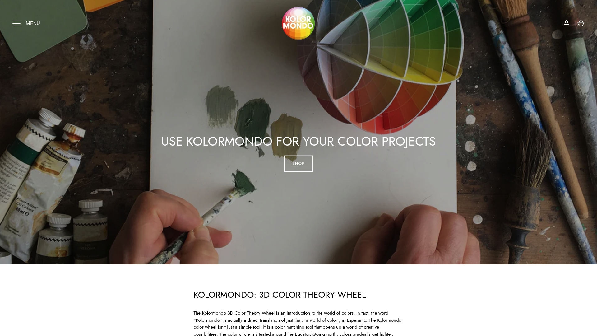
2. Use 3D Colour Wheels for Visual Learning
Traditional flat colour wheels can be limiting, but three-dimensional colour models revolutionise how we understand colour relationships. Visual learning transforms dramatically with three-dimensional colour representations, offering a more comprehensive and intuitive approach to understanding colour interactions.
A 3D colour wheel goes beyond traditional two-dimensional models by providing depth and spatial relationships between different hues. While standard colour wheels show basic colour connections, 3D models reveal nuanced variations in lightness, chroma, and saturation that flat charts simply cannot capture.
Why 3D colour wheels matter:
- They demonstrate how colours relate in a more natural, holistic way
- Provide a comprehensive view of colour interactions
- Help learners understand complex colour relationships instantly
- Allow for more precise colour selection and mixing
Educators and artists can use 3D colour wheels as powerful teaching tools. Hands-on activities like constructing colour wheels engage students and help them internalize colour theory principles. By manipulating a three-dimensional model, learners can physically explore how colours blend, contrast, and harmonise.
The spatial nature of 3D colour models makes abstract colour theory tangible. When students can rotate, examine, and interact with a colour representation, learning becomes more memorable and intuitive. This approach transforms colour theory from a theoretical concept into a vivid, interactive experience.
Pro tip: Create your own simple 3D colour wheel using painted paper plates or clay to help students or yourself develop a more intuitive understanding of colour relationships. Experiment with positioning and rotating the model to reveal different colour interactions.
3. Teach Colour Relationships Through Hands-On Activities
Teaching colour theory is most effective when students can physically engage with colours and experience their interactions directly. Hands-on learning transforms abstract colour concepts into tangible experiences that students can see, touch, and understand intuitively.
Practical activities provide a powerful pathway to understanding colour relationships. When learners actively mix, blend, and experiment with pigments, they develop a deeper comprehension of how colours interact than they would through passive observation or theoretical instruction.
Engaging Hands-On Colour Activities:
- Coloured Play-Dough Mixing: Encourage students to blend different coloured play-dough to create new hues
- Crayon Rubbings: Explore colour interactions by overlapping different coloured wax crayons
- Colour Paddles: Create transparent colour filters using coloured cellophane to observe colour blending
- Paper Plate Colour Wheel: Construct a three-dimensional colour representation using painted paper plates
These activities work because they engage multiple senses. By physically manipulating colours, students learn to predict and understand colour transformations. They discover how primary colours combine to create secondary and tertiary colours through direct experimentation.
For younger learners, turning colour theory into a playful exploration makes learning memorable. An activity like mixing play-dough becomes an exciting discovery process where students become colour scientists, observing how different pigments interact and change.
Pro tip: Always prepare materials in advance and demonstrate the activity first. This helps students understand the process and ensures they can focus on exploring colour relationships rather than getting frustrated with complex instructions.
4. Explain Colour Harmony and Contrast Simply
Colour theory can seem complex, but understanding harmony and contrast is simpler than most people realise. Colour harmony represents a visually pleasing arrangement of colours that creates a sense of balance and aesthetic appeal.
Harmony occurs when colours work together seamlessly. Think of colours that sit next to each other on the colour wheel as natural companions. These analogous colours create a soft, relaxed feeling that feels inherently comfortable to the human eye.
Key Colour Harmony Principles:
- Choose colours adjacent to each other on the colour wheel
- Use variations of similar hues for a cohesive look
- Consider the emotional impact of your colour selection
- Balance warm and cool tones
Contrast, by comparison, is about creating visual excitement. When you place colours from opposite sides of the colour wheel next to each other, you generate dynamic tension. These complementary colours make elements pop and draw attention.
Imagine a purple object against a yellow background. The colours are direct opposites, creating a vibrant interaction that immediately catches the eye. Artists and designers use this principle to create visual interest, guide viewer attention, and communicate emotion through colour relationships.
Pro tip: Before finalising a colour scheme, create a small test palette. Experiment with different colour combinations to understand how they interact and communicate with each other visually.
5. Demonstrate the Impact of Light and Shadow
Light and shadow transform colours in ways that can dramatically alter visual perception. Understanding how lighting conditions influence colour appearance is crucial for artists, designers, and educators seeking to create compelling visual experiences.
When light interacts with surfaces, it reveals colours in their most nuanced and dynamic state. A single colour can appear completely different depending on the intensity, direction, and quality of light surrounding it. This phenomenon demonstrates the complex relationship between colour, light, and perception.
Key Observations About Light and Colour:
- Bright light can make colours appear more saturated and vibrant
- Soft light tends to create more muted, subtle colour variations
- Shadows add depth and dimensionality to colour perception
- Different light sources (natural, artificial) produce unique colour interpretations
Exploring colour through three dimensional models helps students understand light interactions more effectively than traditional flat representations. By physically rotating and examining objects under various lighting conditions, learners can witness how shadows and illumination transform colour experiences.
For artists and designers, mastering light and shadow means developing an intuitive understanding of how colours shift and change. A red object might appear deep crimson in warm evening light, yet look bright scarlet under harsh midday sunlight.
Pro tip: Create a simple shadow box with different coloured objects and experiment with multiple light sources. Observe how the same colour changes appearance when illuminated from different angles and intensities.
6. Incorporate Real-World Examples into Lessons
Abstract colour theory becomes meaningful when connected to tangible, everyday experiences. Exploring colour applications in online art helps students bridge theoretical knowledge with practical understanding.
Real-world context transforms colour theory from a dry academic concept into a vibrant, engaging subject. When students can recognise colour principles in their immediate environment, learning becomes intuitive and memorable.
Strategies for Real-World Colour Exploration:
- Analyse album artwork and graphic design
- Study fashion and textile colour combinations
- Examine architectural colour palettes
- Investigate natural colour relationships in landscapes
- Review branding and product design colour choices
Encouraging students to observe colour usage in their surroundings creates a dynamic, interactive learning environment. A simple walk through a city street or a careful examination of product packaging can reveal complex colour theory principles.
By connecting classroom learning to everyday visual experiences, educators can help students develop a more nuanced and sophisticated understanding of colour. The goal is not just to teach colour theory, but to help learners see the world through a more informed and creative lens.
Pro tip: Create a colour observation journal where students document interesting colour combinations they encounter in daily life. This practice helps develop colour awareness and makes theoretical concepts feel more relevant and exciting.
7. Encourage Experimentation with Colour Mixing
Colour mixing is an art of discovery where intuition meets scientific precision. Experimental approaches transform colour theory from abstract concept to tangible exploration.
Every colour experiment is a journey of unexpected revelations. When students or artists actively mix pigments, they unlock a world of creative potential beyond theoretical understanding.
Experimental Colour Mixing Strategies:
- Use transparent materials like watercolours for subtle blending
- Add white or black to observe tint and shade transformations
- Explore mixing complementary and analogous colours
- Create gradient effects by gradually introducing new pigments
- Document colour mixing results in a dedicated experiment journal
Three dimensional colour wheel activities provide an excellent framework for systematic colour mixing experiments. By physically manipulating colours, learners develop an intuitive understanding of how different pigments interact and transform.
The magic of colour mixing lies in its unpredictability. Each combination reveals unique characteristics impossible to anticipate through theoretical study alone. This hands-on approach cultivates curiosity, creativity, and a deeper appreciation for colour complexity.
Pro tip: Always start with small quantities when experimenting with colour mixing. Use clean brushes, maintain a systematic approach, and record your findings to track your learning progression.
Below is a comprehensive table summarising the key concepts and strategies related to colour theory discussed throughout the article.
| Topic | Description | Key Considerations |
|---|---|---|
| Primary Colours | Fundamental hues: red, yellow, blue. Cannot be mixed. | Foundation for all other colours. |
| Secondary Colours | Created by blending two primary colours. E.g., red + yellow = orange. | Expands the colour palette. |
| Tertiary Colours | Formed by mixing a primary and adjacent secondary colour. E.g., red-orange. | Provides depth and complexity. |
| 3D Colour Wheels | Offers a spatial representation of colours, enhancing understanding. | Reveals lightness, chroma, and saturation details. |
| Hands-On Activities | Engage students through interactive experiments with colours. | Develops intuitive understanding. |
| Colour Harmony & Contrast | Uses analogous and complementary colours to create balance and excitement. | Key for visual appeal and emotional impact. |
| Light & Shadow | Transforms colour perception; crucial for understanding colour nuance. | Dependent on light intensity and direction. |
| Real-World Examples | Utilises practical applications to connect theory with experience. | Bridges the gap between academia and everyday life. |
Discover Colour Theory Like Never Before with Kolormondo
Are you seeking effective, hands-on methods to teach or explore colour theory concepts such as primary, secondary, and tertiary colours or 3D colour relationships? Many educators and artists struggle to connect abstract colour principles with real-world understanding and practical applications. Kolormondo offers an innovative 3D colour globe designed to visualise and interact with colours in ways traditional flat colour wheels cannot. This tactile tool unlocks deeper insights into colour harmony, contrast, light effects, and intuitive mixing—empowering both students and creatives to master colour theory through experience.
Explore our comprehensive collection of Educational material and lesson plans - Kolormondo to support your teaching journey or personal learning. Join our Lectures and Workshops about color - Kolormondo to engage with expert-led sessions that bring colour to life. Visit https://kolormondo.com now to experience how the Kolormondo globe can transform your approach to colour theory from abstract ideas into vibrant, interactive learning. Take the step that will make colour understanding truly unforgettable today.
Frequently Asked Questions
How can I teach primary, secondary, and tertiary colours effectively?
Understanding these basic colour categories is vital. Start by introducing the primary colours: red, yellow, and blue. Use engaging activities, such as colour mixing with paints or play-dough, to show how secondary and tertiary colours are formed.
What are some hands-on activities to teach colour relationships?
Using hands-on activities engages students and enhances their understanding of colour interactions. Consider using coloured play-dough mixing or creating a paper plate colour wheel to give students practical experience in blending colours.
How can I incorporate 3D colour wheels into my lessons?
Utilising 3D colour wheels allows for a more interactive exploration of colour relationships. Create a simple 3D colour wheel using painted paper plates, and encourage students to rotate it to observe different colour interactions physically.
What are some ways to demonstrate colour harmony and contrast?
Simplify the concepts of colour harmony and contrast by relating them to familiar examples. Show students how analogous colours create a sense of calming harmony, while complementary colours add contrast and visual interest. Provide activities where they can experiment with both principles in their own artwork.
How does lighting affect colour perception, and how can I demonstrate this?
Lighting conditions significantly impact how colours are perceived. Set up experiments in a shadow box with various coloured objects under different light sources, allowing students to observe how the same colour changes in appearance based on light intensity and direction.
How can I help students connect colour theory to real-world examples?
Encourage students to observe colour in their everyday environment to make colour theory more relatable. Assign a project where students document interesting colour combinations they encounter in urban settings, nature, or product design to reinforce practical understanding of colour principles.
Recommended
Find similar articles
color theory tips for educators
