
Most people still rely on basic colour wheels, yet more than 60 percent of british design professionals now favour three-dimensional colour globes for advanced work. Understanding colour in three dimensions goes far beyond what traditional charts offer, revealing the intricate relationships that shape art, design, and education. Exploring how these globes work not only deepens your appreciation for colour, it gives you practical tools to create and analyse visual harmony with greater confidence.
Table of Contents
- Colour Globe Definition and Core Principles
- Kolormondo’s Unique 3D Colour Structure
- Comparing Colour Globes and Flat Charts
- Applications in Art, Design, and Education
- Choosing and Using a Colour Globe Effectively
Key Takeaways
| Point | Details |
|---|---|
| Innovative Three-Dimensional Approach | Colour globes provide a spatial representation of colour relationships, surpassing limitations of traditional two-dimensional colour charts. |
| Enhanced Understanding of Colour Relationships | They allow users to explore nuanced connections between hue, value, and chroma by rotating the globe for different perspectives. |
| Applications Across Disciplines | Colour globes serve as vital tools in art, design, and education, facilitating a deeper comprehension of colour theory. |
| Considerations for Selection and Use | When choosing a colour globe, evaluate size, material quality, and primary colour systems to meet specific professional needs. |
Colour Globe Definition and Core Principles
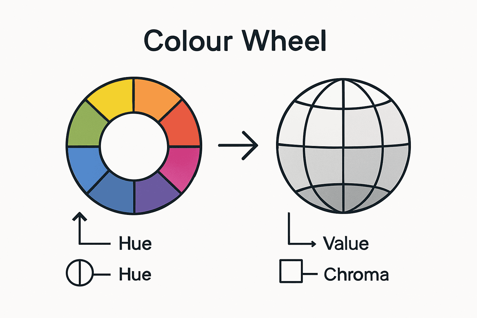
A colour globe represents a revolutionary three-dimensional model of colour relationships that transcends traditional two-dimensional colour wheels. Unlike flat charts, these spherical representations provide an immersive, tactile approach to understanding how colours interact, relate, and transform across spatial dimensions. Colour models like these help visualise complex colour attributes with unprecedented clarity.
The core principles of a colour globe centre on spatial representation and systematic organisation. Typically, these globes map colours according to fundamental attributes: hue (colour family), value (lightness or darkness), and chroma (colour intensity). Each colour occupies a specific position within the spherical space, allowing designers and artists to understand nuanced colour relationships through physical, three-dimensional exploration.
Crucial to the colour globe’s design are several key structural elements. The central axis represents the grayscale spectrum, transitioning from pure white at the top to absolute black at the bottom. Radiating outwards from this central axis, colours demonstrate their chromatic intensity and variation. This approach enables users to comprehend colour harmony, complementary relationships, and subtle gradations with remarkable precision.
Pro tip for Colour Exploration: Rotate the colour globe systematically and observe how colours interact from different perspectives, revealing unexpected connections and harmonies that traditional colour charts cannot demonstrate.
Kolormondo’s Unique 3D Colour Structure
The Kolormondo colour globe represents an innovative approach to understanding colour relationships through a sophisticated three-dimensional model. Modern interpretations of colour globes have evolved from historical colour theory, utilising sophisticated primary colour systems that challenge traditional two-dimensional representations. By employing Cyan, Magenta, and Yellow as foundational colours, this design enables users to explore colour interactions with unprecedented depth and complexity.
Kolormondo’s structure distinguishes itself through precise spatial mapping of colour attributes. The globe’s architecture allows colours to be positioned strategically, revealing intricate relationships between hue, saturation, and brightness. Unlike conventional colour wheels, this three-dimensional model enables designers, artists, and educators to comprehend colour dynamics by rotating and examining colours from multiple perspectives, uncovering nuanced chromatic interactions that flat representations cannot capture.

The structural innovation lies in its systematic organisation. The central vertical axis represents the grayscale spectrum, creating a neutral reference point from which colours radiate outward. Each colour’s position is mathematically determined, reflecting its precise chromatic characteristics. This approach provides a scientifically grounded yet visually intuitive method of understanding colour theory, making complex colour relationships accessible to professionals and enthusiasts alike.
Pro tip for Colour Exploration: Experiment with viewing the Kolormondo globe from different angles, systematically rotating it to reveal unexpected colour harmonies and relationships that traditional colour charts cannot demonstrate.
Comparing Colour Globes and Flat Charts
Traditional flat colour charts have long been the standard tool for understanding colour relationships, but they inherently limit our comprehension of colour complexity. Three-dimensional colour models offer a revolutionary approach that transcends these limitations, providing a more nuanced and comprehensive understanding of colour interactions. Where flat charts present colours as static, two-dimensional representations, colour globes allow users to explore the dynamic spatial relationships between different hues, saturations, and brightness levels.
The primary distinction lies in dimensionality and representation. Flat charts typically arrange colours in linear or circular configurations, which fundamentally restrict how we perceive colour relationships. Colour globes, by contrast, map colours across a three-dimensional sphere, enabling viewers to rotate and examine colours from multiple perspectives. This spatial approach reveals subtle chromatic variations that are impossible to detect on traditional two-dimensional surfaces, making colour globes invaluable for designers, artists, and educators seeking a more intricate understanding of colour theory.
Practical differences emerge in how these tools communicate colour information. Flat charts often rely on predetermined colour wheels or linear gradients, which can oversimplify complex colour interactions. Colour globes incorporate more sophisticated mapping techniques, typically using primary colours like Cyan, Magenta, and Yellow as foundational reference points. This approach allows for a more mathematically precise and visually intuitive representation of colour relationships, showing how colours blend, contrast, and harmonise in a way that mimics natural perceptual experiences.
Here is a comparison of flat colour charts and colour globes for visual analysis:
| Aspect | Flat Colour Charts | Colour Globes |
|---|---|---|
| Dimensionality | Two-dimensional, limited depth | Three-dimensional, spatial depth |
| Perception of Harmony | Restricted to fixed views | Multiple perspectives, dynamic |
| Detail Level | Simplifies relationships | Reveals subtle gradations |
| Practical Application | Suitable for quick reference | Best for exploratory analysis |
Pro tip for Colour Understanding: When comparing colour systems, always rotate and examine colour globes from multiple angles to uncover nuanced relationships that flat charts cannot reveal.
Applications in Art, Design, and Education
Colour globes serve as transformative tools across multiple disciplines, offering unprecedented insights into colour theory and visual communication. Role of colour wheels in teaching creativity demonstrates how three-dimensional colour models can revolutionise educational approaches. In art and design, these sophisticated instruments enable practitioners to explore chromatic relationships with remarkable precision, moving beyond traditional two-dimensional constraints and providing a more intuitive understanding of colour interaction.
For visual artists, colour globes represent a critical analytical instrument. Painters, graphic designers, and illustrators can leverage these tools to understand subtle colour gradations, complementary relationships, and harmonic combinations that might otherwise remain invisible. Interior designers utilise colour globes to predict how different hues will interact within spatial environments, allowing for more sophisticated colour palette selections that consider depth, luminosity, and emotional resonance. The three-dimensional perspective provides a comprehensive view of colour dynamics that static colour charts cannot replicate.
In educational settings, colour globes become powerful pedagogical resources. Art schools, design academies, and colour theory programmes increasingly incorporate these tools to help students comprehend complex chromatic principles. By allowing learners to physically rotate and examine colour relationships, these globes transform abstract colour theory into a tangible, interactive experience. They bridge theoretical knowledge with practical understanding, enabling students to develop a more nuanced perception of colour that extends beyond traditional academic instruction.
Pro tip for Colour Exploration: Experiment with viewing colour relationships from multiple perspectives, using the globe as a dynamic learning tool that reveals unexpected chromatic connections and harmonies.
Choosing and Using a Colour Globe Effectively
Selecting the right colour globe requires understanding your specific professional or educational needs. Visualising colour in 3D for art and design projects provides critical insights into choosing an appropriate three-dimensional colour representation. Different colour globes vary in complexity, precision, and intended application, making it essential to evaluate your specific requirements before making a selection.
When examining potential colour globes, consider several key factors. Size matters significantly - smaller globes are portable and suitable for personal study, while larger models offer more detailed colour mapping for professional design work. Material quality is equally crucial, with professional-grade globes featuring precision-engineered surfaces that maintain colour accuracy. Look for globes that provide clear colour coding, distinct primary and secondary colour zones, and a robust mechanism for rotation that allows smooth, consistent movement.
The following table summarises key considerations when selecting a colour globe:
| Criteria | Why It Matters | Professional Use Example |
|---|---|---|
| Size | Influences portability and detail | Large models for studio designers |
| Material Quality | Affects colour accuracy and durability | Precision surfaces for accurate sampling |
| Primary Colour System | Fundamental to colour blending | CMY for advanced colour theory |
| Rotation Mechanism | Enables interactive exploration | Smooth turning for teaching demos |
Effective usage involves more than passive observation. Professionals and students should interact with the colour globe dynamically, rotating it to understand complex colour relationships. Experiment by identifying complementary colours, exploring chromatic gradations, and observing how colours shift and interact from different perspectives. Some practitioners find it helpful to use the globe alongside digital colour tools, creating a comprehensive approach to colour theory that combines physical and digital learning methods.
Pro tip for Colour Globe Mastery: Always rotate your colour globe systematically, examining colours from multiple angles to uncover nuanced chromatic relationships that are invisible in static representations.
Discover Colour Theory Like Never Before with Kolormondo
Are you searching for a more intuitive way to understand the complexities of colour relationships beyond flat charts and traditional wheels? The concept of the colour globe as explained in the article reveals the challenge of grasping hue, value, and chroma through two-dimensional means. Kolormondo’s innovative 3D colour globes transform this learning experience by providing a tactile, immersive model that brings colour theory to life. Whether you are an artist, designer, or educator, exploring colour in three dimensions allows you to uncover subtle harmonies and contrasts that flat charts cannot reveal.
Experience the unique benefits of our Kolormondo globes for yourself. Visit our Color Globe and color sphere - Kolormondo collection to explore different models designed for both professional and personal use. Enhance your teaching or creative projects further by browsing our Educational material and lesson plans - Kolormondo which complement the globes with practical insights. Don’t wait to transform your understanding of colour theory. Dive into the world of three-dimensional colour exploration today at Kolormondo.com and unlock new creative possibilities.
Frequently Asked Questions
What is a colour globe?
A colour globe is a three-dimensional representation of colour relationships, providing an immersive way to understand how colours interact, relate, and transform across spatial dimensions, unlike traditional two-dimensional colour wheels.
How does a colour globe differ from a flat colour chart?
Colour globes allow users to explore dynamic colour relationships in three dimensions, revealing subtle chromatic variations that flat colour charts cannot. Unlike traditional charts, globes provide multiple perspectives on colour interactions.
What are the core principles of colour globes?
The core principles centre on spatial representation and systematic organisation, mapping colours according to hue, value, and chroma. Each colour’s position within the globe reflects its unique chromatic characteristics.
How can I effectively use a colour globe for learning?
To effectively use a colour globe, systematically rotate it to examine colours from different angles. This interaction helps uncover nuanced relationships and complex colour interactions that are often missed with static representations.
Recommended
Find similar articles
what is a color globe
