
Mixing red and yellow for orange or blue and yellow for green seems straightforward until one lesson crosses into digital design, lighting, or printing. This is where the familiar classroom rules start to fall apart, leaving both teachers and students puzzled by inconsistent results. Colour mixing operates on distinct principles depending on medium and context, so using the same primary colour model everywhere often leads to lasting misconceptions. Understanding these differences is crucial if you want your students to master colour theory and gain real confidence when working across all forms of media.
Table of Contents
- Colour Mixing Fundamentals And Common Misconceptions
- Primary Colour Systems And Their Distinctions
- Comparing 2D Wheels And 3D Colour Globes
- Hands-On Methods For Teaching Colour Mixing
- Practical Classroom Challenges And Solutions
Key Takeaways
| Point | Details |
|---|---|
| Understand Contextual Colour Mixing | Different colour systems (additive and subtractive) require specific approaches; students must recognise the medium they’re working in. |
| Challenge Misconceptions Actively | Encourage predictions before mixing to surface misunderstandings and reinforce learning through direct observation. |
| Utilise 3D Models for Enhanced Understanding | 3D colour models offer a comprehensive view of hue, saturation, and brightness, aiding in grasping complex mixing outcomes. |
| Facilitate Experiential Learning | Engage students with hands-on activities that allow them to explore and discover colour mixing principles rather than relying solely on theoretical instruction. |
Colour Mixing Fundamentals and Common Misconceptions
When you first learn about colour mixing, you likely encounter a straightforward rule: mix red and yellow to get orange, combine blue and yellow for green, blend red and blue to create purple. Simple enough. Except here’s what most classrooms and online tutorials get wrong: this rule only applies to one context. The moment you shift from painting to light or from one paint medium to another, the entire system changes. The primary and secondary colours that work perfectly with watercolours behave completely differently when you’re working with light or pastels. This disconnect creates a fundamental problem in colour education that teachers and students rarely address directly.
The core issue stems from mixing up three distinct domains where colour operates differently. In physics, colour mixing follows the logic of light combining additively—red light and cyan light merge to create white. In the physiology of human vision, our eyes perceive colours through three types of cone cells, each sensitive to different wavelengths. In painting and art, we work with pigments that mix subtractively, where adding more colour actually removes light from the mixture. These aren’t variations on the same theme; they’re fundamentally different systems. A student who memorises “primary colours are red, yellow, and blue” has learned something useful for traditional painting but walks into confusion the moment they encounter colour in light or graphic design software. Research into these misconceptions shows they persist across educational levels precisely because we treat colour mixing as one universal concept rather than context-specific knowledge.
One particularly persistent misconception involves assuming that certain colours are “primary” in an absolute sense. In reality, colour perception exists along a physical continuum rather than in discrete categories, and which colours function as primaries depends entirely on your mixing method. With light, red, green, and blue (RGB) serve as primaries because these wavelengths trigger maximum response in our three types of colour receptors. With pigments, the situation shifts again depending on whether you’re using traditional oils, watercolours, or modern printing inks. A magenta, cyan, and yellow system (used in colour printing) works better than traditional red, yellow, blue for reproducing the full spectrum. Yet another misconception involves the idea that mixing two colours always produces a result halfway between them. When you blend red and blue pigments, you don’t get a perfect purple; you get a muted purple that appears darker because the pigments absorb light across a broader range of wavelengths than either pure colour alone. Understanding these distinctions transforms how you approach colour work, whether you’re teaching students or creating designs yourself.
When teaching colour mixing, separate the domains explicitly rather than treating them as one universal system. Show your students how red light and cyan light combine to make white, then demonstrate how red and cyan pigments create a muddy brown. Ask them to predict what will happen before they mix, then let them observe the actual result. This experiential approach reveals the misconceptions far more effectively than lectures. If you use a three-dimensional representation of colour space, you can show how colours relate spatially and how mixing operates differently depending on your medium. When students see these relationships displayed across all three axes rather than on a flat plane, the logic becomes clearer and the exceptions make sense.
Pro tip: When introducing colour mixing, always name the medium explicitly—specify that you’re discussing watercolour pigments, light, or digital colour—and have students predict results before mixing, which surfaces misconceptions and creates memorable learning moments.
Primary Colour Systems and Their Distinctions
Imagine you’re teaching a class where half your students work with watercolours and the other half use graphic design software. You explain that red, yellow, and blue are the primary colours. The painters nod along, mix their primaries, and create secondary colours as expected. Your digital designers, however, follow the same instructions and end up with muddy greys instead of vibrant hues. Both groups followed your teaching perfectly. Neither one got the wrong answer. They simply worked within completely different colour systems that operate by fundamentally opposite rules.
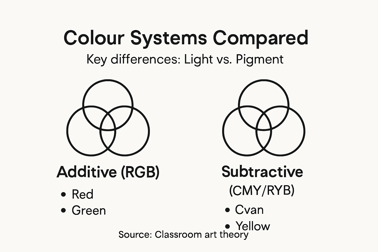
This is where primary colour systems diverge so sharply that calling them by the same name becomes misleading. The additive colour system (RGB—red, green, blue) works with light and combines wavelengths additively. When you layer red light over green light, you get yellow. Add all three primaries together at full intensity and you produce white light. This system governs everything from LED screens to theatrical lighting to how your eyes actually perceive colour wavelengths. The subtractive colour system (CMY—cyan, magenta, yellow) works with pigments and inks, where each colour absorbs (subtracts) certain wavelengths and reflects others. Combine cyan and magenta pigments and you get blue. Layer all three primaries together and the result approaches black because you’ve subtracted nearly all visible light. These aren’t slight variations on a theme; they’re inverse operations. Additive and subtractive colour mixing produce fundamentally different results because they operate on opposite principles about how colour is created and perceived.
Traditional colour education often presents the red, yellow, blue system as the absolute foundation, then sometimes acknowledges RGB as an alternative. This approach leaves students confused about why their digital work doesn’t follow the rules they memorised in art class. The reality is more nuanced and far more practical. Different primary colour sets are used depending on context and medium, which means your teaching strategy should explicitly name the system being used rather than treating all colour mixing as interchangeable. In traditional painting with oils or watercolours, red, yellow, and blue (or increasingly, magenta, cyan, and yellow for better colour mixing results) work well. In graphic design and digital work, RGB reigns because it reflects how screens emit light. In commercial printing, the CMYK system (cyan, magenta, yellow, and black for depth) dominates because printers use these inks and operate subtractively. When photographers work with colour filters and lighting gels, they’re thinking additively. When a textile dyer mixes indigo with weld to create green, they’re working subtractively. The system depends entirely on the medium and how colour is actually being created.
For educators, the most practical approach involves teaching colour systems as context-specific knowledge rather than universal rules. Show your students the RGB system using light sources—actual LEDs or coloured lights work brilliantly for this. Let them see red and cyan light merge to create white. Then transition to pigments with paints or pastels and show how red and cyan pigments create muddy brown. Ask them to predict results before mixing based on the system you’re using. This makes the distinction visceral and memorable. When you introduce students to colour systems in educational contexts, show how a three-dimensional model reveals relationships across all three axes simultaneously, making it clear why the system matters and how colours relate spatially within each model. This spatial understanding transforms colour theory from a set of arbitrary rules into a coherent, logical system that students can apply across different media.
Here’s a concise comparison of additive and subtractive colour mixing systems:
| Attribute | Additive System (RGB) | Subtractive System (CMY/RYB) |
|---|---|---|
| Primary colours | Red, Green, Blue | Cyan, Magenta, Yellow (or Red, Yellow, Blue) |
| Used in | Screens, stage lighting | Painting, printing, dyeing |
| Mixing result of all | White | Black or dull brown |
| Typical application | Digital displays, lighting | Fine art, commercial print |
Pro tip: Always name the primary colour system explicitly when teaching (additive RGB, subtractive CMY, or traditional RYB), and have students predict what happens when they mix primaries in that specific system before they begin, which anchors their understanding to the actual mechanism at work.
Comparing 2D Wheels and 3D Colour Globes
You’ve probably seen a traditional colour wheel countless times. It’s flat, circular, and shows hues arranged in a ring with complementary colours opposite each other. Simple. Clean. Utterly incomplete. The moment your students or design clients ask why a particular colour mixing combination produced something muddy rather than vibrant, or why a colour they mixed looks duller than they expected, the 2D wheel runs out of answers. It shows you hue relationships brilliantly but completely ignores two critical dimensions of colour: saturation and brightness. A colour wheel tells you which colours sit next to each other on the spectrum, but it never shows you that red in full saturation looks completely different from pale pink, or that dark navy behaves differently from bright cyan in mixing scenarios. This limitation isn’t a minor flaw; it’s a fundamental gap that leaves educators and designers working with incomplete information.

The traditional 2D colour wheel originated centuries ago as a practical tool for painters who needed a quick reference for colour relationships. It served that purpose reasonably well for basic colour harmony decisions. However, the 3D colour model adds depth, showing hue, saturation, and brightness simultaneously, which offers a far more complete representation of how colours actually behave. Picture a sphere rather than a circle. The equator represents fully saturated, mid-brightness hues arranged like a traditional wheel. As you move toward the top of the sphere, colours become lighter and less saturated, eventually reaching white at the very top. As you move toward the bottom, colours become darker and less saturated, eventually reaching black at the very bottom. Now you can see not just which colours complement each other, but also how brightness and saturation affect mixing outcomes. When you blend a fully saturated red with a desaturated red (which appears greyish), you don’t get a colour halfway between them on a wheel; you get something influenced by the saturation levels involved. A 3D model shows you exactly where that result falls spatially.
This dimensional difference transforms how you teach colour mixing fundamentally. With a 2D wheel, you explain harmony rules and primary colour mixing, and students accept it as given. With a 3D globe representing colour relationships across all three dimensions, students can physically rotate the model, see how colours relate spatially, and understand why certain combinations work while others produce disappointing results. They can grasp why mixing two fully saturated primaries creates a bright secondary colour, but mixing that same secondary with a desaturated version of one primary produces something completely different. The globe becomes a tactile, three-dimensional reference that mirrors how colour actually works in light, pigment, and perception. Instead of memorising rules, students develop spatial intuition about colour relationships. They begin to predict outcomes before mixing because the 3D structure makes the logic visible.
For teaching purposes, the practical distinction matters enormously. A 2D wheel works fine as a quick reference for basic colour harmony—complementary pairs, triadic harmonies, analogous schemes. But the moment you move into colour mixing, mixing pigments of varying saturation, or working with tints and shades, you need three dimensions to show what’s actually happening. Educational research shows that 3D models better represent natural colour phenomena and support more accurate colour theory education because they align with scientific understanding rather than oversimplified traditions. When you introduce students to a physical 3D colour globe alongside traditional tools, they gain the advantages of both: quick reference harmony rules from the wheel and sophisticated mixing understanding from the globe. Your teaching becomes layered rather than limited.
This summary shows how 2D colour wheels and 3D colour globes differ in teaching effectiveness:
| Model Type | What It Shows | Main Limitation | Best Use Case |
|---|---|---|---|
| 2D Colour Wheel | Hues and simple relationships | Ignores saturation and brightness | Quick harmony checks |
| 3D Colour Globe | Hue, saturation, brightness | Less familiar, harder to draw on paper | Mixing and theory |
Pro tip: Introduce the 2D wheel for harmony reference but teach all colour mixing concepts with a 3D model, having students physically rotate it to see how saturation and brightness change outcomes, which grounds abstract colour theory in spatial, tactile understanding.
Hands-On Methods for Teaching Colour Mixing
There’s a moment in nearly every colour mixing classroom where a student mixes two colours and looks disappointed. They followed your instructions perfectly, combined what should have been complementary or harmonious colours, and instead got something muddy or disappointing. At that point, traditional lectures about colour theory feel useless. What works instead is letting them experience colour mixing across different contexts and media, observing actual results rather than memorising rules. The most effective teaching shifts the burden from abstract knowledge to direct observation. When students describe what they see before mixing, predict outcomes, then compare predictions to results, they’re building genuine understanding rather than just following steps. This experiential approach catches misconceptions in real time and corrects them through evidence rather than correction.
Start by having students observe colours in various media before touching paint or light mixers. Show them coloured paper under different lighting conditions. Ask them to describe how the same colour looks different under fluorescent light versus natural daylight. Have them arrange coloured papers next to each other and notice how colours appear to shift based on their neighbours. This groundwork builds colour literacy without mixing anything yet. Once students develop a language for describing colours and understand how context changes perception, introduce mixing in one medium at a time. With light, using hands-on interactive setups with coloured light mixers helps students experience additive colour mixing firsthand. Students physically combine red, green, and blue lights and observe the results directly. They see that red plus green creates yellow, which contradicts their pigment-based expectations. The shock of seeing something counterintuitive lodges in memory far more effectively than a lecture explaining additive colour theory.
With pigments, the approach shifts slightly. Rather than starting with paint mixing, explore colour in various media and processes to broaden understanding of how colours mix differently depending on medium and lighting conditions. Have students mix coloured water instead of paint initially. Water colours are forgiving, transparent, and allow easy observation of what happens when you layer different colours. Students can see how a yellow layer beneath a blue layer creates a different effect than reversing the order. They observe how brightness changes when they add white or black. They discover that mixing equal amounts of two colours doesn’t always produce equal saturation in the result. Once they’ve built this foundation with water, introduce paint mixing with the same exploratory mindset. Ask predictions. Allow experimentation. Celebrate discoveries about why certain combinations work while others produce disappointment.
A three-dimensional approach transforms this teaching further. When you introduce a spatial colour model alongside hands-on mixing, students gain an abstract framework for understanding what they’re observing. They can rotate the model, see where their mixed result falls spatially within the three-dimensional structure, and begin predicting outcomes for colours they haven’t mixed yet. The model becomes a testing ground for hypotheses. Does mixing these two colours produce something along this axis? What happens if I choose colours at different saturation levels? The tactile experience of handling a physical model combined with actual mixing creates multiple sensory pathways to understanding. Some students learn best through observation. Others benefit from manipulating the model. Many need both. By offering experiential colour mixing alongside three-dimensional representation, you reach learners with different strengths and create lasting understanding that serves them across all media and contexts.
Pro tip: Begin colour mixing lessons with observation activities and prediction exercises before any actual mixing occurs, allowing misconceptions to surface and be corrected through direct evidence rather than explanation alone.
Practical Classroom Challenges and Solutions
You’ve prepared a brilliant colour mixing lesson. You’ve structured it carefully, explained the concepts clearly, gathered materials, and feel ready to teach. Then reality hits. A student mixes colours and immediately asks why the result doesn’t match what the colour wheel predicted. Another student notices that mixing red and cyan pigments produces something completely different from mixing red and cyan light, and they’re confused about which rule applies. A third student mixed colours correctly but the result still looks dull, and they’re frustrated. These aren’t failures of your teaching; they’re the predictable challenges that emerge when colour mixing theory meets classroom practice. The gap between what textbooks describe and what students experience is where real learning happens, but only if you’re prepared for it.
The most common classroom challenge involves students expecting universal rules when colour mixing operates differently across media. When you teach traditional red, yellow, blue mixing, students accept it as gospel. Then they encounter RGB colour on screens or CMYK in printing, and suddenly the rules don’t apply. Rather than teaching colour mixing as one system with exceptions, frame it from the start as context-dependent knowledge. Using comparative teaching approaches that clearly distinguish between media and mixing types reduces confusion and helps students develop mental models that actually transfer across situations. Create explicit comparisons. Show side by side how red and cyan behave in light versus in pigment. Have students predict outcomes in each medium before demonstrating. Ask them to articulate why the results differ. This comparative approach transforms potential confusion into insight. Students develop the ability to ask “which medium am I working in?” before applying mixing rules, which is the foundation of genuine colour literacy.
Another persistent challenge involves students clinging to oversimplified primary colour models even when they’ve learned more sophisticated systems. They’ve memorised red, yellow, blue so thoroughly that introducing magenta, cyan, yellow as superior mixing primaries creates cognitive dissonance. Experimental and inquiry based approaches using hands-on setups help students understand colour as a spectrum rather than discrete categories. When students physically mix paints and discover that traditional primaries don’t produce clean secondary colours, when they add more primary colours and achieve better results, when they see these limitations visually rather than hearing about them verbally, they accept new systems because they’ve experienced the necessity. The evidence comes from their own hands and eyes, not from your authority. This experiential verification carries far more weight than explanation ever could.
A third challenge appears when students mix colours but get disappointing results even when technically following correct procedures. They mixed the right primaries in the right proportions but the result looks muddy or dull. This happens because mixing is about more than just hue; saturation and brightness matter enormously. A student who doesn’t understand this gets frustrated and questions whether they’re doing something wrong. The solution involves making saturation and brightness explicit teaching objectives alongside hue. Show how mixing pigments of different saturations produces different results than mixing fully saturated colours. Demonstrate how brightness changes when you add white or black. Use a three-dimensional colour model to show where each colour sits in saturation and brightness space. When students understand that colour mixing happens across three dimensions simultaneously, disappointing results make sense. They begin to see mixing not as a failure but as a predictable outcome of the saturation and brightness values involved. This reframes frustration into understanding.
Implementation across different classroom contexts requires flexibility. Some schools lack resources for elaborate light-mixing setups or extensive colour materials. The solution is starting with what you have. Coloured paper, natural light, and pigment are enough to teach genuine colour mixing principles. You don’t need expensive equipment to create experiential learning. You do need intentional design of activities that surface misconceptions and allow students to discover principles through observation. You need clear naming of the system you’re using in each lesson. You need comparative approaches that show how mixing works differently across contexts. When you integrate colour theory teaching strategies that address specific learning challenges, you move from hoping students understand to actively engineering the conditions for deep comprehension.
Pro tip: When a mixing result surprises students, pause and investigate together rather than correcting them, asking what variables might have produced this outcome and rebuilding understanding through evidence rather than explanation.
Experience Colour Mixing Like Never Before with the Kolormondo Globe
The challenge of grasping complex colour mixing principles and overcoming misconceptions is real. This article highlights crucial concepts such as distinguishing between additive and subtractive systems and the limits of traditional 2D colour wheels. If you have struggled to teach or understand these ideas practically, the Kolormondo colour globe offers an immersive solution. This unique 3D model transforms abstract colour theory into a tactile, spatial experience making it easier to visualise hue, saturation, and brightness simultaneously and reveal why colours mix the way they do in different media.
Dive deeper into mastering colour with our Color Globe and color sphere - Kolormondo for hands-on exploration or enhance your teaching with Educational material and lesson plans - Kolormondo designed around these innovative tools. Visit https://kolormondo.com now to bring three-dimensional colour theory to life and empower your understanding or classroom with a resource that truly connects theory with practice.
Frequently Asked Questions
What are the primary colour systems for mixing light and pigment?
The primary colour system for mixing light is additive (RGB - Red, Green, Blue), while for pigments, the subtractive system is commonly used (CMY - Cyan, Magenta, Yellow, or RYB - Red, Yellow, Blue). Each system operates on different principles, leading to different results when mixing colours.
How does saturation and brightness affect colour mixing outcomes?
Saturation and brightness play crucial roles in colour mixing. Mixing pigments of varying saturation levels can produce different results compared to mixing fully saturated colours. Additionally, adding white or black alters the brightness of the colours, affecting the final mixed outcome.
Why do colour wheels fall short in teaching colour theory?
Traditional 2D colour wheels only represent hue relationships and ignore critical dimensions like saturation and brightness. This limitation fails to explain why certain mixtures yield unexpected or muddy results. A 3D colour globe provides a more accurate understanding as it shows hue, saturation, and brightness simultaneously.
What hands-on activities can enhance understanding of colour mixing?
Hands-on activities such as mixing coloured waters, observing colour changes in various light conditions, and using interactive coloured light setups can enhance understanding of colour mixing. These activities allow students to predict outcomes, observe results directly, and experience the principles of colour mixing in real-time.
Recommended
- 7 Essential Colour Theory Tips for Educators and Artists
- Role of Colour Theory in Painting Explained
- Colour Learning for Beginners: Unlocking 3D Colour Theory
- 7 Essential Colour Mixing Tips for Artists and Designers
- Hair colour numbering system | MyHair
- Dimensional Color: Transforming Hair With Depth & Movement - Joel C Ma Hair Studio
Find similar articles
color mixing explained
