
Teaching colour theory can feel overwhelming when your students are faced with a swirl of pigments, palettes, and design principles. You want to help them move beyond random colour choices and see how deliberate decisions can transform their artwork. The right approach gives them the tools to communicate visually, solve creative challenges, and understand how colour shapes both art and everyday experiences.
By building a strong foundation in colour theory, your students can unlock practical skills like improved communication, creative confidence, and critical thinking. From hands-on tactile learning to mastering colour psychology, every insight on this list is designed to make your lessons more engaging and effective. Get ready to discover practical teaching strategies that will help your students see colour in a whole new way.
Table of Contents
- 1. Improves Understanding of Colour Relationships
- 2. Enhances Visual Communication Skills
- 3. Boosts Student Engagement with Tactile Learning
- 4. Supports Creative Problem-Solving in Art Projects
- 5. Facilitates Interdisciplinary Teaching Approaches
- 6. Promotes Confident Use of Colour in Design
- 7. Encourages Experimentation and Critical Thinking
Quick Summary
| Takeaway | Explanation |
|---|---|
| 1. Understanding Colour Relationships Enhances Artistic Skills | Grasping how colours interact allows students to make intentional and informed artistic choices rather than random selections. |
| 2. Colour as a Communication Tool | Students learn to use colour strategically to convey complex ideas and emotions, improving their visual communication in various contexts. |
| 3. Tactile Learning Increases Engagement | Hands-on experiences with colour materials engage students actively, fostering better comprehension of colour concepts through direct interaction. |
| 4. Confidence in Colour Choices Elevates Design Work | Students who understand colour theory gain the confidence to make informed decisions, presenting their designs with conviction and clarity. |
| 5. Interdisciplinary Teaching Connections | Teaching colour theory across different subjects enriches understanding, showing students how interconnected knowledge enhances their learning and application. |
1. Improves Understanding of Colour Relationships
Colour relationships form the backbone of effective visual communication in art and design. When your students grasp how colours interact with one another, they move beyond simply choosing colours based on preference and begin making intentional creative decisions. This understanding transforms their work from amateur experimentation into informed artistic expression.
At its core, colour theory teaches students how different hues respond to their neighbours on the colour wheel. Complementary colours create vibrant contrast and visual tension, whilst analogous colours produce harmony and calm. Triadic schemes offer balanced excitement. When students understand these relationships, they can predict how their colour choices will affect the emotional impact and composition of their work. Rather than hoping a combination works, they know why it will work.
Historically, scholars like Chevreul, Munsell, and Itten laid the groundwork for modern colour education, establishing frameworks that help artists understand how colours communicate with each other. Today, contemporary art movements continue to demonstrate these principles in action. Impressionist painters manipulated colour relationships to capture light and atmosphere, whilst Fauvists pushed bold colour combinations to convey emotion over realism. Your students can study these real world applications and see exactly how artists leverage colour relationships to achieve specific effects.
The practical benefit becomes apparent when you introduce students to working with actual colour interactions. Ask them to place a warm red next to a cool red, then observe how they appear different despite being the same colour family. Have them mix a colour and watch how adding its complement desaturates it. These hands on experiences cement the concept far more effectively than any textbook explanation. Colour schemes like complementary and analogous colours directly improve composition and emotional impact in student artwork.
When students comprehend colour relationships, they develop a visual literacy that extends beyond the classroom. They notice how graphic designers use colour contrast to guide viewer attention. They recognise why certain fashion combinations appeal to them. They understand the psychology behind brand colour choices. This awareness makes them more discerning visual consumers and more confident creative makers.
Tip profesional Start with simple two colour relationships before advancing to complex schemes, allowing students to build confidence and observe clear cause and effect between colour choices and visual outcomes.
2. Enhances Visual Communication Skills
Your students live in a world saturated with visual information. Every day, they encounter logos, photographs, infographics, and videos designed to communicate messages without words. Teaching them to harness colour as a communication tool transforms them from passive viewers into active creators who can shape how others perceive and understand their work.
Colour communicates faster than language. A red stop sign needs no text. A green traffic light requires no explanation. When students understand colour psychology and its cultural significance, they develop the ability to convey complex emotions and ideas through deliberate colour choices. This skill extends far beyond art class into graphic design, marketing, social media content, and professional communication in virtually every field.
Visual arts education strengthens both verbal and non-verbal communication by encouraging students to express complex ideas through visual cues. When a student chooses a deep indigo for a painting about solitude, they are communicating a feeling that might take paragraphs to describe in writing. When they pair warm oranges with cool blues in a composition, they create visual tension that speaks to audience emotions before conscious thought enters the picture. This develops their ability to think critically about how form, colour, and composition work together to send specific messages.
The connection runs deeper than aesthetics. Colour psychology and cultural connotations enable educators and designers to deliberately choose colours that enhance message clarity and audience engagement. Students who grasp this principle recognise that colour choices are never accidental. A brand using red conveys energy and urgency. A healthcare provider choosing soft greens communicates calm and trust. Your students can learn to make these intentional decisions, transforming them into more persuasive and effective communicators.
In practical terms, this means students can begin applying colour strategically across projects. When creating a poster about environmental conservation, they might incorporate greens and earth tones to align colour with message. When designing a cover for a story about conflict, they could use complementary colours to create visual discord that mirrors the narrative tension. These choices demonstrate sophisticated communication thinking that moves beyond surface level decoration.
The benefits extend into personal development as well. Students who learn to communicate visually gain confidence in expressing themselves and understanding others. They develop empathy by considering how different audiences might interpret colour meanings. They strengthen critical thinking by evaluating whether their colour choices actually support their intended message. These are transferable skills that support academic success, workplace readiness, and lifelong creative confidence.
Tip profesional Have students deliberately mismatch colours with messages, then discuss how the disconnect affects communication, reinforcing why colour choices matter as much as the content itself.
3. Boosts Student Engagement with Tactile Learning
Students today sit for hours staring at screens, and their attention spans reflect it. When you introduce tactile learning into your colour theory lessons, you immediately shift their engagement from passive observation to active participation. Touching, rotating, and physically manipulating colour materials transforms abstract concepts into lived experiences that stick in their memory.
Tactile learning engages multiple senses simultaneously, which is precisely why it works so effectively in art education. When students hold physical colour wheels, spin three dimensional models, or mix actual pigments with their hands, they are not simply seeing colour relationships. They are feeling the weight of materials, observing how light plays across surfaces, and experiencing the physical reality of colour mixing. This multisensory engagement strengthens their understanding because it creates stronger neural pathways than visual information alone.
Younger students and those with different learning styles benefit particularly from this approach. A student who struggles to visualise colour harmony on a flat chart suddenly grasps it when they can pick up a three dimensional colour model and examine it from every angle. They can see how tertiary colours sit between primary and secondary hues. They can physically rotate the model to compare colour relationships. This concrete experience builds confidence and removes the frustration of trying to learn from abstract representations.
Beyond the cognitive benefits, tactile learning creates classroom energy that simply does not exist in traditional lecture based teaching. When students have something to manipulate and explore, they become investigators rather than passive recipients. They ask more questions, make unexpected discoveries, and feel ownership over their learning. Collaboration increases as students want to share their observations and compare findings. The classroom transforms into an active, engaged environment where real learning happens.
Tactile learning involving direct physical interaction improves fine motor skills, spatial recognition, and knowledge retention whilst strengthening collaborative learning opportunities. When you combine this with visualising colour in three dimensions, you create a learning environment that speaks to how students actually learn best.
Consider the practical application. Instead of showing students a flat colour wheel and explaining analogous harmony, hand them a tactile model and let them discover it. Watch as they recognise patterns independently. Listen as they explain to peers what they have found. This ownership transforms understanding into genuine knowledge that persists long after the lesson ends. Students remember experiences far more vividly than information presented to them.
You might also notice improved motivation in students who typically struggle with traditional art instruction. The tactile element removes some of the intimidation factor. There is no wrong way to touch and explore a colour model. This accessibility broadens engagement across your entire class, ensuring that students with varying abilities and learning preferences find success.
Tip profesional Rotate your tactile materials regularly and encourage students to discover colour relationships independently before discussing them, maximising both engagement and genuine comprehension.
4. Supports Creative Problem-Solving in Art Projects
Every art project presents a puzzle waiting to be solved. How do you convey movement? Which colours establish the right mood? How do you guide the viewer’s eye through the composition? When your students understand colour theory deeply, they gain a powerful toolkit for addressing these creative challenges with confidence and sophistication.
Creative problem-solving in art requires both divergent thinking, which generates multiple possibilities, and convergent thinking, which evaluates and refines those possibilities. Colour theory provides the framework that makes this process deliberate rather than accidental. A student facing a composition that feels flat now has concrete strategies to explore. They understand that adding a small accent of complementary colour can create focal points. They recognise that warm and cool colour relationships can suggest depth and space. They know that colour intensity and saturation can communicate hierarchy and emphasis.
This knowledge transforms how students approach artistic challenges. Instead of trying random combinations and hoping something works, they can analyse what their project needs and select colour solutions strategically. A student creating an illustration about loneliness might deliberately choose desaturated colours and limited palettes to communicate isolation. Another working on a piece about celebration might employ saturated, vibrant colours and complex colour relationships to convey energy. These are not accidental choices. These are solutions born from understanding.
Design thinking within modern art education enhances problem-solving capabilities by promoting experimentation and iterative refinement. When students understand colour as a variable they can adjust, they move through creative iterations more effectively. They can test whether shifting from cool to warm tones improves their composition. They can experiment with colour intensity to see if increasing contrast strengthens their concept. This experimental mindset, grounded in colour theory knowledge, accelerates creative development.
Consider practical scenarios your students encounter. A student designing a book cover needs colours that communicate genre and attract their target audience. A student illustrating a children’s story must select palettes that support the narrative tone. A student creating environmental design must choose colours that guide user experience. All of these real world problems become manageable through colour theory application. Your students learn to see colour not as decoration but as a communication and design tool.
The cognitive skills this develops extend far beyond art class. Students practise critical thinking as they analyse why certain colour combinations work. They develop flexibility by experimenting with different colour approaches to the same problem. They build resilience by recognising that not every attempt succeeds and that iteration leads to better solutions. Arts education develops the cognitive skills including critical thinking necessary for innovative solutions across diverse challenges.
When you frame colour theory as a problem-solving system rather than a set of rules to memorise, students engage differently. They ask better questions. They experiment more boldly. They defend their colour choices with reasoning rather than saying “I just liked it.” They approach their work as designers solving briefs rather than students completing assignments. This shift in perspective elevates the entire quality of their creative output.
Tip profesional Present colour challenges as design problems with specific constraints, such as “communicate urgency using only three colours” or “create visual hierarchy for a complex composition,” encouraging students to apply theory strategically rather than decoratively.
5. Facilitates Interdisciplinary Teaching Approaches
Colour theory sits at a fascinating intersection where art, science, psychology, and design converge. When you teach colour through this interdisciplinary lens, you unlock teaching possibilities that go far beyond traditional art instruction. Your lessons become opportunities for students to see how knowledge connects across seemingly separate subjects.
Consider what happens when you explore colour from multiple angles simultaneously. Your students learn the physics of light wavelengths in science class, then apply that understanding to how humans perceive colour in art class. They study colour psychology to understand emotional responses, connecting to personal, social and health education. They examine colour in cultural and historical contexts, linking to humanities. They investigate colour applications in design, technology, and fashion. Suddenly, colour theory is not an isolated art concept but a living framework that touches nearly every discipline they study.
This interdisciplinary approach offers genuine cognitive benefits. When students make connections across subjects, their learning becomes deeper and more memorable. A student who understands the physics of light absorption and reflection grasps why certain pigments behave as they do. A student who studies colour psychology whilst creating artwork makes more intentional emotional choices. A student who examines colour in cultural contexts develops both artistic skill and cultural awareness simultaneously. These connections create neural networks that strengthen overall learning.
Light and colour education benefit from integrating science and art perspectives to foster comprehensive understanding. When you position colour theory as a subject that requires collaboration between departments, you model real world thinking. Professional designers, architects, and scientists all use colour knowledge in their work. Your interdisciplinary teaching prepares students for these authentic applications.
Practically speaking, this might mean partnering with science colleagues to explore the physics of colour, then applying those principles in your studio lessons. You might collaborate with history teachers to examine how colour meanings shift across cultures and time periods. You could work with psychology specialists to understand colour’s influence on mood and behaviour, then create artwork that deliberately manipulates these responses. You might team with technology teachers to explore digital colour models and how screens display colour differently than pigments.
The benefits extend to student engagement and employability. Interdisciplinary methods broaden learning contexts and enrich student experiences whilst preparing students for diverse careers. Students who see colour through multiple lenses develop more flexible thinking. They become comfortable moving between analytical and creative modes. They understand that complex problems rarely belong to a single discipline. These are exactly the skills employers seek across creative industries, design fields, scientific research, and beyond.
Do not underestimate the motivational impact either. A student who finds traditional art instruction uninspiring might become genuinely engaged when colour theory connects to physics or psychology. Another student might discover unexpected passion for art through its scientific foundations. Yet another might explore interdisciplinary pathways they had not previously considered. By presenting colour as a subject of genuine complexity that requires multiple perspectives, you open doors for students with diverse interests and learning styles.
Implementing this requires some coordination and communication. You might start by identifying one colleague in another department and exploring shared learning objectives around colour. Perhaps the chemistry teacher covers pigment composition whilst your students explore how pigment choice affects their work. Perhaps the geography teacher discusses regional colour preferences and cultural significance whilst you facilitate creative responses. Small collaborations build the foundation for larger interdisciplinary units.
Tip profesional Develop one collaborative unit with a colleague from another department, such as a joint science-art project exploring colour properties, then document the results to justify expanding interdisciplinary approaches across your curriculum.
6. Promotes Confident Use of Colour in Design
Confidence in colour selection separates student designers from professional ones. When your students hesitate over colour choices, second guessing themselves and making arbitrary decisions, their work suffers. When they understand colour theory deeply, they approach design challenges with certainty. They know why they are choosing specific hues, and that knowledge shows in their finished work.
Colour confidence develops through understanding cause and effect. When students learn that certain colour combinations evoke specific emotional responses, they stop treating colour selection as guesswork. They understand that a corporate brand identity requires different colour thinking than an entertainment brand. They recognise that cultural context influences colour appropriateness. They comprehend that colour psychology influences purchasing decisions, mood, and user behaviour. With this knowledge, they make intentional decisions rather than hoping their choices work.
This confidence manifests in multiple ways. Students present their colour choices with reasoning instead of shrugging and saying they liked it. They defend their design decisions by referencing colour theory principles. They experiment more boldly because they understand the principles behind their experiments. They adapt and refine colour selections confidently when designs require revision. They take on design briefs with genuine belief that they can solve the colour challenges presented.
Colour psychology plays a vital role in design by influencing human emotions and behaviour, which enables designers to make informed decisions. When your students understand these principles, they become designers rather than decorators. They move beyond applying colours because they look nice and instead select colours because they achieve specific objectives. A student designing a health clinic website chooses soft greens and blues confidently because they understand the calming psychological effects. Another student creating packaging for a luxury product selects sophisticated colour combinations that communicate premium positioning. A third student developing a social media campaign for youth engagement employs bold, saturated colours with intention.
Practically, this confidence building happens through structured learning and guided experimentation. When you teach students to analyse existing designs and articulate why particular colour choices work, you develop their critical eye. When you require them to justify colour selections in project briefs, you reinforce intentional thinking. When you show them colour applications across diverse design contexts, you expand their understanding of possibilities. When you celebrate strong colour choices and discuss what makes them effective, you reinforce the connection between theory and excellent outcomes.
The professional world demands this confidence. Design clients rarely accept vague explanations about colour choices. They want to understand how colour supports brand identity, attracts target audiences, and achieves business objectives. Your students who understand why designers use colour wheels and systematic approaches rather than relying on intuition alone bring professional credibility to their work. This distinction matters whether they pursue graphic design, web design, fashion, interior design, product design, or any other colour intensive field.
Confidence also transfers to students’ personal creative practices beyond schoolwork. Students who develop strong colour theory knowledge become more discerning visual consumers. They notice strong colour choices in the world around them. They understand why certain designs succeed whilst others fall flat. This heightened awareness feeds their own design thinking and creative development. They apply colour principles to personal projects, social media content, and future career work.
Tip profesional Create regular design challenges with specific colour briefs, requiring students to articulate their colour reasoning in writing, building both strategic thinking and confidence in defending colour choices.
7. Encourages Experimentation and Critical Thinking
Colour theory provides a framework that simultaneously encourages bold experimentation and rigorous critical thinking. This combination transforms your classroom into a space where students feel safe taking creative risks whilst maintaining intellectual accountability for their choices. They ask questions, test hypotheses, and analyse results with the mindset of both artists and researchers.
Experimentation thrives when students understand colour principles deeply enough to know what they are testing and why. A student who grasps complementary colour relationships might experiment with varying the intensity of one colour whilst keeping the other constant, observing how the visual effect changes. Another might test whether warm and cool colour combinations create different spatial illusions in their composition. These are not random attempts but structured investigations grounded in colour theory. The student has a hypothesis, tests it, observes outcomes, and draws conclusions. This is scientific thinking applied to artistic practice.
Critical thinking develops through reflection on these experiments. When you ask students to analyse why their colour choices succeeded or failed, you push them beyond surface level observation. They must consider multiple factors. Did the colour choice fail because of the theory itself, or because they applied it incorrectly? Was the problem colour selection, or did other design elements undermine their colour strategy? Could a different colour intensity have worked better? This metacognitive reflection strengthens analytical abilities that transfer far beyond art class.
Arts based learning encourages students to experiment and think creatively, developing analytical abilities that support broader cognitive gains. When you position colour theory as a system to explore rather than rules to memorise, students approach learning differently. They become curious investigators rather than passive recipients. They take ownership of their discoveries. They feel motivated to share findings with peers because they genuinely want to test whether others observe the same results.
Colour theory also supports critical thinking through comparative analysis. When students examine artworks across different styles and periods, they analyse how artists used colour relationships to achieve specific effects. Why did the Impressionists favour certain colour combinations? How did Fauvists deliberately distort natural colour relationships to convey emotion? Why do contemporary designers make specific colour choices for particular audiences? These analytical questions develop deeper understanding than simple colour application exercises ever could.
Practically, this means structuring lessons that balance guided exploration with open ended investigation. You might teach colour mixing theory, then invite students to experiment with different pigment combinations to discover relationships through direct experience. You might present a design challenge with specific constraints, allowing students to explore multiple colour solutions and then critically compare their effectiveness. You might facilitate group discussions where students interpret how colour choices function in existing artworks, developing collaborative analytical skills.
The safety to experiment without fear of failure becomes crucial here. When students know that colour experiments contribute to learning rather than being graded as right or wrong, they attempt bolder approaches. They test unconventional colour combinations. They push beyond predictable harmony schemes to explore tension and dissonance. They discover unexpected relationships that feel genuinely original because they uncovered them through experimentation rather than following instructions.
Critical and creative thinking in art involves analytical reasoning and collaborative interpretation, where educators facilitate exploration and reflection. When you create opportunities for students to discuss their colour experiments with peers, you deepen their critical thinking. They articulate their reasoning, hear alternative perspectives, and refine their understanding through dialogue. This collaborative approach develops both confidence and intellectual rigour.
These skills extend far beyond art class into academic success more broadly. Students who develop experimental thinking become more resilient problem solvers. They approach challenges with curiosity rather than anxiety. They generate multiple hypotheses rather than fixating on a single approach. They analyse evidence carefully rather than jumping to conclusions. Students who develop critical thinking through colour study bring those analytical habits to every subject they encounter.
Tip profesional Create structured experiments where students test specific colour theories, document observations, and present findings to peers, transforming colour theory into active investigation rather than passive learning.
Below is a comprehensive table summarising the core points discussed throughout the article on the impact of teaching colour theory in educational contexts.
| Aspect | Description | Benefits |
|---|---|---|
| Understanding Colour Relationships | Learning colour wheel interactions and schemes like complementary and analogous colours. | Enhances creative decision-making and visual literacy. |
| Improving Visual Communication | Utilising colour as a tool for non-verbal messaging and emotional expression. | Strengthens both verbal and non-verbal communication skills. |
| Engagement Through Tactile Learning | Active interaction with colour models and materials. | Boosts retention, critical thinking, and collaborative learning. |
| Problem-Solving in Art | Applying colour theory for effective compositional strategies. | Fosters innovative solutions and critical application. |
| Interdisciplinary Approaches | Integrating art with science, psychology, and history. | Deepens learning by connecting across disciplines, enhancing critical thinking. |
| Developing Design Confidence | Teaching intentional colour choices and their impact. | Prepares for professional industry standards and personal growth. |
| Encouraging Experimentation | Using colour experiments to test theories and refine art. | Promotes creativity, analysis, and collaborative learning. |
Elevate Your Colour Teaching with Innovative Tools from Kolormondo
Understanding complex colour relationships and fostering tactile, interdisciplinary learning can be challenging for art educators striving to make colour theory engaging and memorable. The article highlights key goals such as enhancing visual communication, promoting confident colour use, and supporting creative problem-solving. If you seek to move beyond traditional flat charts and empower your students with hands-on, 3D exploration of colour, Kolormondo offers a unique solution.
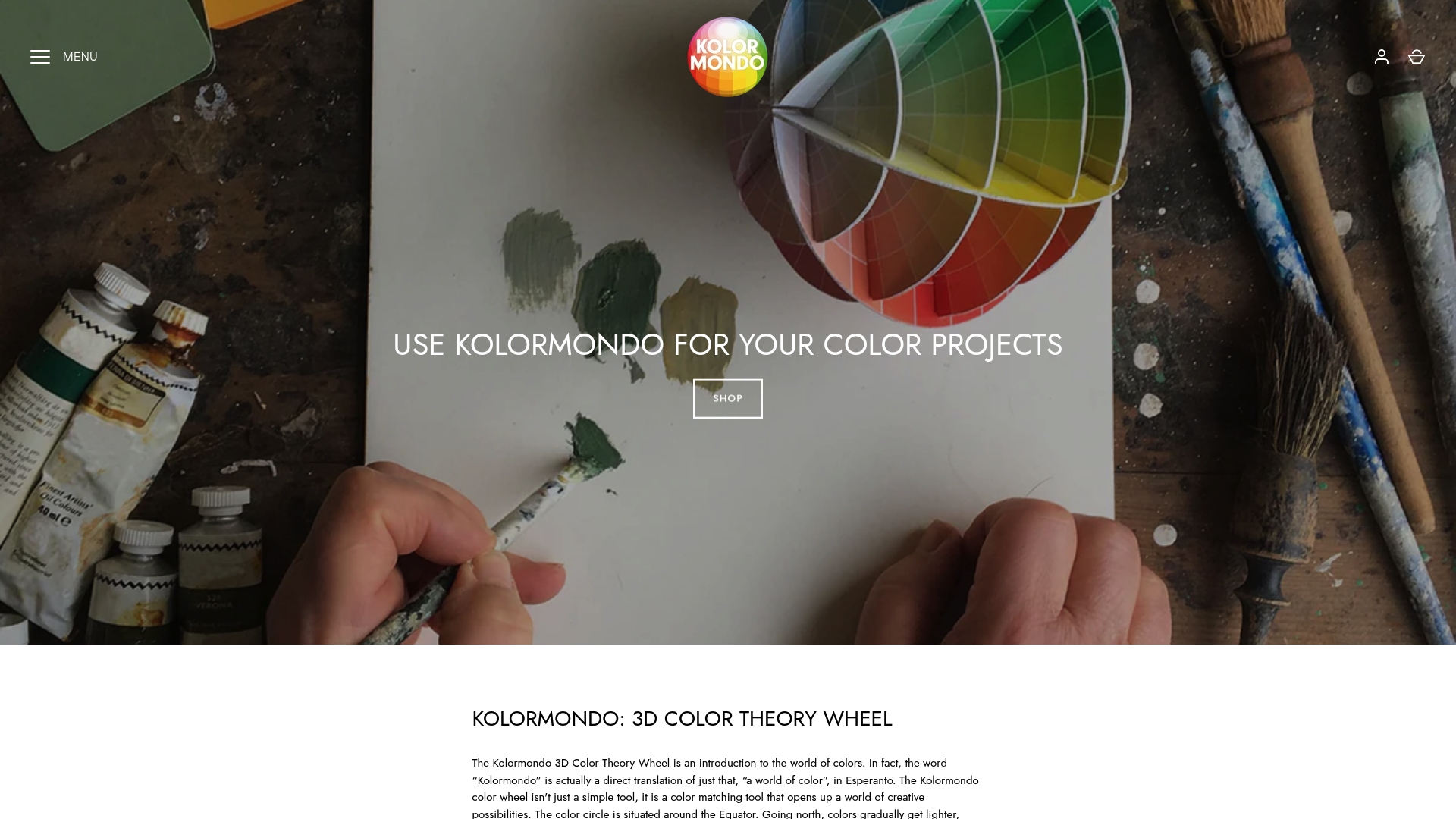
Explore our Educational material and lesson plans - Kolormondo that seamlessly integrate the revolutionary 3D Kolormondo globe into your curriculum. This tactile globe allows students to manipulate colour interactions physically, boosting understanding and retention. Join countless educators who transform their classrooms into active environments where theory meets application. Visit Kolormondo.com today and discover how to bring a new dimension to your teaching with our Lectures and Workshops about color - Kolormondo. Act now to inspire confident and creative learners through the power of colour.
Frequently Asked Questions
How does colour theory improve my students’ understanding of colour relationships?
Colour theory teaches students how different hues interact, allowing them to make informed decisions rather than relying solely on personal preference. Start by introducing simple two-colour relationships to build confidence in understanding cause and effect between colour choices and visual outcomes.
What are the benefits of enhancing my students’ visual communication skills through colour theory?
Teaching colour theory enhances students’ abilities to convey emotions and ideas quickly and effectively through deliberate colour choices. Implement colour psychology discussions in your lessons so that students can make intentional decisions in their art projects.
How can tactile learning methods support student engagement in colour theory?
Tactile learning allows students to actively engage with colour materials, transforming abstract concepts into hands-on experiences. Encourage students to manipulate physical colour wheels or mix pigments to deepen their understanding and retention of colour relationships.
In what ways does colour theory facilitate creative problem-solving in art projects?
A strong understanding of colour theory provides students with a structured approach to tackle artistic challenges, enabling them to choose colours that enhance their work’s mood and composition. Design specific colour challenges to help students apply these principles in their projects actively.
How can I incorporate interdisciplinary teaching approaches using colour theory?
Utilising colour theory from various disciplinary angles enriches your lessons and makes connections across subjects like science, psychology, and design. Plan collaborative units with colleagues from other departments to explore concepts like the physics of light or cultural colour significance alongside practical art applications.
What can I do to promote confident use of colour in my students’ designs?
To build confidence in colour selection, encourage students to articulate their reasoning behind colour choices based on colour theory principles. Assign regular design challenges that require them to justify their choices, reinforcing their decision-making skills and knowledge application.
Recommended
- Why Learn About Colour – Transforming Visual Education
- Colour Psychology in Art: Transforming Creative Teaching
- 7 Inspiring Examples of Colour Theory in Art Explained
- Challenges in Colour Theory Learning – Solutions for Educators
- Väriterapia sisustuksessa – Visuaalinen voimavara ravintolatiloihin – Dekoja.net
Find similar articles
benefits of color theory
