
Over 60 percent of british art students leave school with misconceptions about colour mixing and perception. These misunderstandings can hold back creative progress and lead to frustration in both art and design fields. By confronting common myths and exploring the real science behind colour, you will discover practical strategies and deeper knowledge that help move beyond outdated ideas. Expect to gain the clarity needed to build stronger, more expressive colour skills grounded in modern research.
Table of Contents
- Colour Learning Basics And Fundamental Myths
- Traditional Versus 3D Colour Models Explained
- Understanding Colour Relationships And Harmony
- Practical Benefits Of Hands-On Colour Tools
- Avoiding Common Colour Learning Mistakes
Key Takeaways
| Point | Details |
|---|---|
| Understanding Colour Complexity | Colour perception is nuanced and involves psychological, physical, and sensory dimensions, requiring a holistic approach beyond traditional primary colour models. |
| Three-Dimensional Colour Models | These models represent colour relationships more accurately than two-dimensional approaches, allowing for a deeper understanding of interactions and emotional resonance. |
| Colour Harmony Techniques | Employ diverse colour scheme strategies to create visually pleasing compositions and communicate distinct emotional states effectively. |
| Hands-On Colour Learning | Engaging with tactile colour tools enhances comprehension and allows learners to experience dynamic colour interactions in a way digital methods cannot replicate. |
Colour Learning Basics and Fundamental Myths
Colour theory is a fascinating discipline that extends far beyond simple artistic techniques. Colour perception and understanding represent complex psychological and perceptual experiences that challenge many common assumptions. Artists, designers, and researchers have long sought to unravel the intricate relationships between colour, light, and human perception.
One fundamental myth that persists in art education is the traditional belief that red, yellow, and blue are the definitive primary colours. Modern colour science reveals a more nuanced perspective. Colour Literacy Project research demonstrates that colour perception is significantly more complex than these simplistic models suggest. Traditional colour wheels often mislead students by presenting an overly reductive view of colour interaction and mixing.
Understanding colour requires moving beyond binary thinking. Colour is not just a visual phenomenon but a multidimensional experience involving psychology, physics, and sensory perception. Contemporary colour theorists argue for a more holistic approach that considers emotional responses, cultural contexts, and perceptual variations. The spectrum of colour is far more intricate than the seven colours typically associated with rainbows.
Pro Tip - Colour Learning Strategy: Start by observing colours in natural environments, noting subtle variations and interactions. Practise mixing colours systematically, recording your observations to develop a more nuanced understanding beyond theoretical models.
Traditional Versus 3D Colour Models Explained
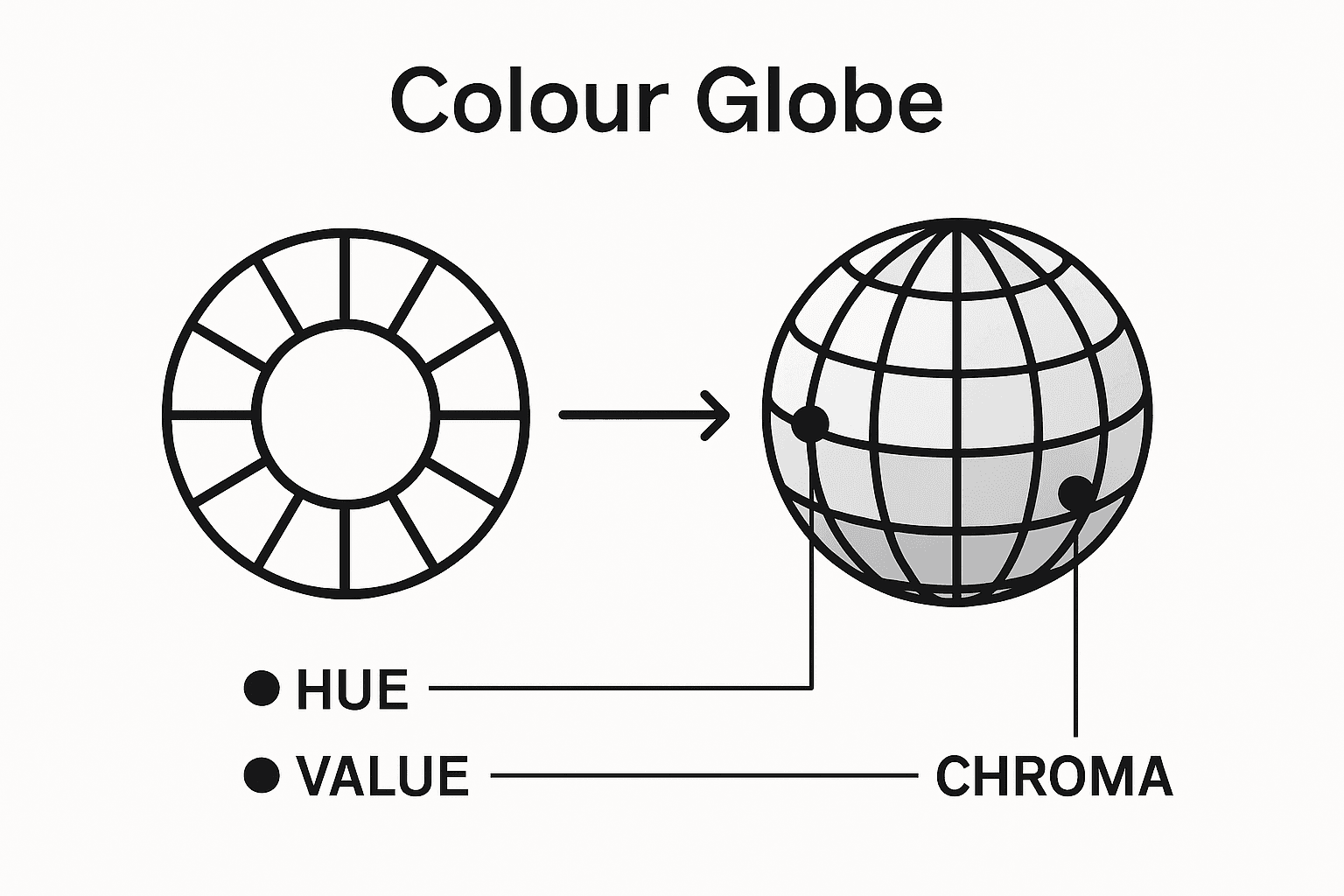
Traditional colour models have long relied on two-dimensional representations that severely limit our understanding of colour complexity. Arranging colours in three-dimensional models provides a more comprehensive and realistic approach to understanding colour interactions and relationships. Conventional flat colour wheels reduce the richness of colour perception to a simplistic circular arrangement, missing crucial nuances of depth, saturation, and emotional resonance.
The evolution of colour representation has been marked by innovative approaches that challenge traditional thinking. Colour models developed by researchers like Nicoline Kinch and Andreas Schwarz demonstrate how three-dimensional representations can capture the multifaceted nature of colour perception. These advanced models consider multiple dimensions beyond mere hue, including brightness, saturation, and contextual variations that traditional approaches often overlook.
Three-dimensional colour models offer several significant advantages over their two-dimensional counterparts. They provide a more holistic view of colour relationships, allowing designers, artists, and researchers to understand how colours interact in more complex ways. Unlike flat colour wheels, 3D models can represent the subtle gradations and transitions between colours, reflecting the nuanced way humans actually experience visual information. Three-dimensional colour representation transforms our understanding from a linear perspective to a more dynamic, interconnected spatial approach.
To clarify the evolution of colour understanding, here is a comparison of traditional versus three-dimensional colour models:
| Aspect | Traditional 2D Colour Model | 3D Colour Model |
|---|---|---|
| Representation | Flat, circular wheel | Spatial, volumetric |
| Dimensions shown | Mainly hue | Hue, brightness, saturation |
| Depth of relationships | Simplified interactions | Complex transitions |
| User experience | Abstract and theoretical | Intuitive and practical |
| Emotional resonance | Limited depth | Captures subtleties |
Pro Tip - Colour Model Exploration: Experiment with different 3D colour models to develop a more intuitive understanding of colour relationships. Try rotating and examining colours from multiple perspectives to appreciate the full complexity of colour interactions.
Understanding Colour Relationships and Harmony
Colour harmony represents a sophisticated visual language where colours interact and communicate through intricate relationships. Exploring colour wheel strategies reveals complex systems for creating visually pleasing compositions across various design disciplines. Understanding these relationships goes beyond mere aesthetic appreciation, delving into psychological and perceptual mechanisms that govern how humans experience visual stimuli.

Designers and artists employ multiple sophisticated colour scheme approaches to achieve harmonious results. Value-based colour constructs play a crucial role in creating legible and emotionally resonant visual experiences. Key colour relationship strategies include complementary, analogous, triadic, and split complementary arrangements, each offering unique ways of generating visual interest and emotional depth through calculated colour interactions.
The complexity of colour relationships extends far beyond simple matching techniques. Different colour schemes communicate distinct emotional and psychological states, with complementary colours creating dynamic tension, while analogous colours generate a sense of calm and cohesion. Understanding these nuanced interactions requires both technical knowledge and intuitive sensitivity to how colours communicate and influence perception. Inspiring examples of colour theory in art demonstrate the profound impact of thoughtful colour selection.
To support colour harmony exploration, here is a summary of key colour scheme types and their effects:
| Scheme Type | Core Principle | Typical Effect |
|---|---|---|
| Complementary | Opposite on colour wheel | High contrast, dynamic tension |
| Analogous | Adjacent colours | Harmonious, calming feel |
| Triadic | Three evenly spaced hues | Vibrant yet balanced |
| Split Complementary | Base + adjacent to complement | Contrast with extra harmony |
Pro Tip - Colour Harmony Practice: Develop your colour intuition by creating small studies exploring different colour relationships, experimenting with various combinations and observing how they interact and evoke emotional responses.
Practical Benefits of Hands-On Colour Tools
Tactile colour learning transforms abstract theoretical knowledge into profound sensory understanding. Colour mixing exercises demonstrate how physical interaction with colour tools enables deeper comprehension of complex colour relationships. Unlike digital representations, hands-on tools engage multiple sensory pathways, allowing learners to experience colour interactions through direct manipulation and observation.
Professional designers and artists recognise that three-dimensional colour tools provide unique advantages over traditional two-dimensional colour charts. Comprehensive colour theory aids enable practitioners to explore nuanced colour interactions, understanding how hue, saturation, and value interact in real-world contexts. These tactile experiences help develop an intuitive understanding that transcends theoretical knowledge, bridging the gap between conceptual learning and practical application.
Handling physical colour tools allows learners to understand subtle variations that digital screens or printed materials cannot capture. Exploring colour wheel blending techniques reveals the intricate relationships between different colour families, helping students comprehend complex colour generation processes. By rotating, comparing, and physically mixing colours, learners develop a more sophisticated understanding of colour theory that goes beyond passive observation.
Pro Tip - Colour Tool Practice: Create a personal colour exploration journal, documenting your hands-on experiments with different colour tools and noting the unique insights gained from each tactile interaction.
Avoiding Common Colour Learning Mistakes
Colour education requires challenging deeply entrenched misconceptions that limit understanding. Updating colour literacy fundamentals reveals how traditional learning approaches often perpetuate oversimplified and inaccurate models of colour theory. Many beginners unknowingly adopt flawed perspectives that restrict their ability to comprehend the true complexity of colour interactions.
One pervasive myth that consistently misleads learners is the outdated notion that red, yellow, and blue represent the sole primary colours. Modern colour science demonstrates a far more nuanced understanding of colour generation and relationship. Emerging colour education models emphasise the need to move beyond rigid, reductive colour frameworks, encouraging students to embrace the multidimensional nature of colour perception and interaction.
Critical learning obstacles emerge from oversimplified educational approaches that fail to acknowledge colour’s intricate psychological and perceptual dimensions. Exploring colour wheel techniques helps students recognise that colour is not a static concept but a dynamic, context-dependent experience. Common mistakes include treating colour as a purely visual phenomenon, neglecting its emotional and cultural significance, and relying on outdated colour mixing theories that do not reflect contemporary scientific understanding.
Pro Tip - Colour Learning Strategy: Challenge your existing colour assumptions by experimenting with diverse colour models and seeking perspectives from multiple disciplines, including art, psychology, and design.
Unlock the Power of 3D Colour Learning with Kolormondo
Begin your journey beyond traditional flat colour charts and discover the true multidimensional nature of colour theory with Kolormondo. If you struggle with outdated models or seek a tactile learning experience that deepens your understanding of complex colour relationships like hue, saturation, and brightness, our innovative 3D colour globe is the ideal tool. It transforms abstract concepts into interactive exploration, perfect for beginners aiming to master colour harmony and interactions in an intuitive way.
Explore our Educational material and lesson plans - Kolormondo designed to complement the Kolormondo globe and elevate your colour education. Engage in hands-on activities, join our Lectures and Workshops about color - Kolormondo to deepen your knowledge, and take advantage of Special offers for colour to get started today. Visit Kolormondo.com now to transform your colour learning experience and embrace the full depth of 3D colour theory.
Frequently Asked Questions
What are the primary colours in modern colour theory?
Modern colour theory recognises that red, yellow, and blue are not the only primary colours. Instead, colour science reveals a more complex palette that includes secondary and tertiary colours resulting from mixing various hues. Understanding this complexity challenges traditional perceptions and promotes a deeper appreciation of colour relationships.
How do three-dimensional colour models improve my understanding of colour?
Three-dimensional colour models provide a more comprehensive view of colour interactions by incorporating dimensions such as brightness, saturation, and hue. Unlike flat colour wheels, these models allow for a more intuitive understanding of complex colour relationships, reflecting how humans actually perceive colour in a multidimensional space.
What are some techniques for practising colour harmony?
To practise colour harmony, try experimenting with various colour schemes such as complementary, analogous, triadic, and split complementary. Create small studies where you mix and observe different combinations of colours, noting their emotional responses and interactions. This hands-on approach can help develop your colour intuition and understanding of harmonious compositions.
Why is hands-on colour learning important?
Hands-on colour learning is crucial because it transforms theoretical knowledge into sensory understanding. Engaging with physical colour tools allows learners to experience colour interactions firsthand, which can deepen comprehension and facilitate a more intuitive grasp of colour theory. Tactile experiences provide insights that digital representations often cannot convey.
Recommended
Find similar articles
color learning for beginners
