
Colour matching feels effortless when your workspace is set up with intention, yet many art and design students in Europe overlook how vital this step is for authentic project results. A well-calibrated monitor with the right colour profile ensures your creative decisions look as vivid in print as they do on screen. By combining authentic references and structured tools like the Kolormondo globe, you lay the groundwork for truly accurate and harmonious colour work in any coursework or personal project. Highlighting the importance of monitor calibration and real reference materials sets you apart from guesswork-driven design.
Table of Contents
- Step 1: Set Up Your Workspace And Gather Reference Materials
- Step 2: Identify Dominant Hues Using The Kolormondo Globe
- Step 3: Select Harmonious Colours Based On Relationships
- Step 4: Test Your Matches With Lighting And Context Checks
- Step 5: Refine Your Selections For Project Coherence
Quick Summary
| Key Point | Explanation |
|---|---|
| 1. Ensure Accurate Monitor Calibration | Calibrate your monitor to match your working colour space, utilising proper profiles for consistent colour representation in your designs. |
| 2. Collect High-Quality Reference Materials | Gather authentic images that align with your project’s colour palette to ground your choices in reality and enhance colour decisions. |
| 3. Test Colours in Real Lighting Conditions | Evaluate your colour selections under various lighting to ensure they maintain harmony and behave as intended in real-world settings. |
| 4. Create a Unified Colour Palette | Refine your colour choices to develop a cohesive palette, making intentional adjustments to enhance overall project coherence and accessibility. |
| 5. Document Colour Values and Applications | Keep a record of colour codes and how they work together, ensuring consistency and providing a reference for future projects. |
Step 1: Set up your workspace and gather reference materials
Your workspace forms the foundation of accurate colour matching. Before you dive into any colour project, take time to arrange your environment so that your eyes and creative tools work together seamlessly. This step sounds straightforward, but getting it right makes an enormous difference in how reliably you can match colours throughout your design process.
Start by ensuring your monitor displays colours accurately. Proper colour profiles and monitor calibration are critical for consistent colour work. Whether you’re using sRGB for web design or Adobe RGB for print projects, your monitor should reflect the actual colour space you’re working in. Take twenty minutes to calibrate your screen using your device’s built-in tools or a calibration utility. This guarantees that the colours you match on your screen translate reliably to your final artwork. Poor calibration leads to frustrating surprises when you print or publish your work only to discover that your colours look completely different.
Gather high-quality reference materials that support your colour decisions. Build a collection of real, unedited reference images that relate to your project’s colour palette and mood. If you’re designing a series of botanical illustrations, collect photographs of actual plants. If you’re working on a fashion collection, photograph fabric textures and garment details in natural light. Having authentic visual references prevents you from relying on guesswork and grounds your colour choices in observable reality. Organise these materials where you can see them whilst working, whether that’s printed samples pinned to your wall or digital folders on your secondary screen.
Arrange your physical space thoughtfully. Position your monitor away from direct sunlight, which creates glare and distorts colour perception. Keep your colour mixing area or drawing surface near your reference materials so you can compare your work against them constantly. Good lighting matters enormously. Natural daylight reveals colours more truthfully than artificial lighting, so work near a window when possible. If that’s not feasible, invest in a colour corrected LED lamp that mimics daylight temperature.
Pro tip Dedicate a small notebook to recording colour codes and mixing ratios as you work, creating a personal reference library you can return to for future projects.
Step 2: Identify dominant hues using the Kolormondo globe
Now that your workspace is arranged, you’re ready to explore colour with intention. Identifying dominant hues is where your colour matching work truly begins. The Kolormondo globe transforms this process from abstract theory into something you can physically hold, rotate, and understand. Rather than staring at flat colour charts, you interact with a three-dimensional object that mirrors how colours actually relate to one another.
Start by holding the globe and observing its structure. The Kolormondo model uses hue planes that visually separate colours by their position in three-dimensional space, making it easier to recognise dominant hues and understand their relationships. Rotate the globe slowly and notice how colours transition from one hue to another. You’ll see that colours aren’t scattered randomly across the surface. Instead, they’re organised in a way that shows which hues sit close together and which stand apart. When you’re working on a design project, look for the dominant hue first. Is your project leaning towards warm yellows and oranges, cool blues and purples, or neutral greens? Once you identify this primary hue family on the globe, you’ve established the foundation for your entire colour scheme. Place your finger on that hue and explore the variations around it. These are the secondary and tertiary colours that will support and enhance your dominant hue.
Use the globe’s spatial format to explore colours by brightness and saturation alongside hue. Rotate the globe to view the same hue from different angles. You’ll notice that moving around the sphere reveals how a single hue transforms from vibrant and saturated to muted and soft. This visual exploration helps you make conscious decisions about whether you need bright, bold versions of your dominant hue or quieter, more subtle variations. If you’re designing packaging for a luxury product, you might choose a deeply saturated, muted version of your dominant hue. If you’re creating an energetic poster, the same hue in bright, vivid form would serve you better. The globe lets you see all these possibilities at once, grounded in spatial relationships rather than abstract numbers on a screen.
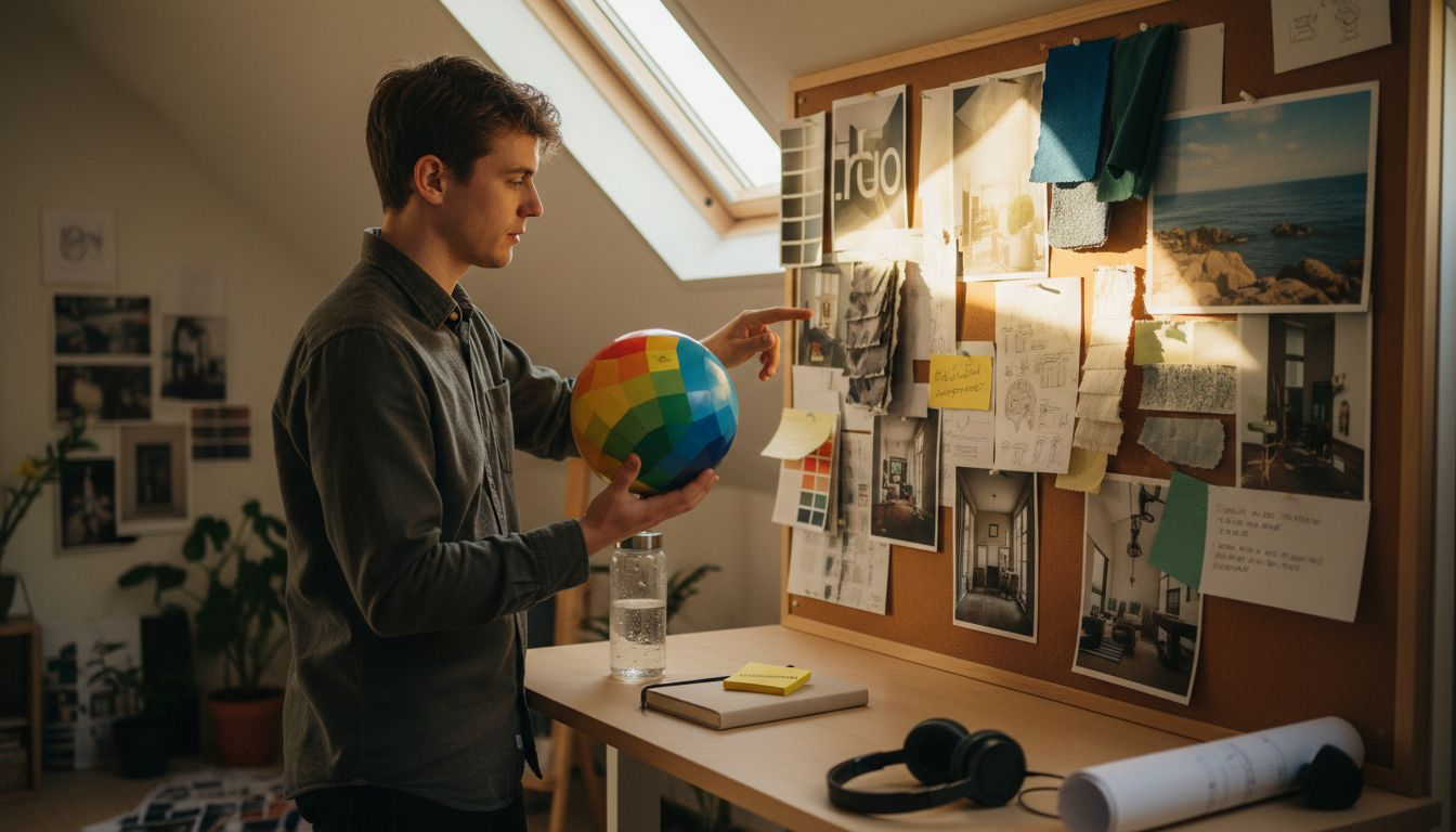
As you work with the globe, reference it constantly against your project materials. Rotate it next to your mood board or reference photographs. Observe how the globe’s colours compare to the real-world colours you’ve gathered. This comparison strengthens your eye and builds your intuitive understanding of colour relationships over time. You’re training yourself to see dominant hues not as isolated values but as interconnected parts of a larger colour system.
Professional tip Keep a simple sketch or colour note beside your Kolormondo globe showing which hue families you’ve selected for your current project, creating a quick reference guide you can glance at whilst working.
Step 3: Select harmonious colours based on relationships
You’ve identified your dominant hue. Now comes the part where colour theory transforms your choices into something visually coherent. Selecting harmonious colours means understanding how different hues speak to one another. The colours you choose aren’t random, and they’re not just pretty. They work together according to principles that have been tested and refined across centuries of art and design practice.
Colour harmony relies on specific relationships that create balance and visual appeal. Complementary, analogous, and triadic relationships form the foundation of coherent colour schemes. Think of complementary colours first. These sit directly opposite each other on the colour wheel. A deep blue paired with a warm orange creates immediate visual tension and vibrancy. Use this relationship when you want energy and contrast in your design. Analogous colours sit next to each other on the wheel and create harmony naturally. If your dominant hue is blue, pairing it with blue-green and blue-violet produces a calm, cohesive palette. Triadic schemes use three colours equally spaced around the wheel, offering balance with more variety than analogous combinations. Once you understand these relationships conceptually, your Kolormondo globe becomes an invaluable tool. Hold it in your hands and physically trace these relationships across its surface. Watch how complementary colours sit in opposition. Observe how analogous colours flow smoothly together. This tactile, spatial understanding embeds colour theory into your muscle memory rather than leaving it as abstract knowledge.
Consider your project’s mood when selecting which relationship to apply. Are you designing a children’s book cover that needs to pop off the shelf? Complementary colours will grab attention instantly. Creating a sophisticated branding system for a wellness product? Analogous relationships produce the calm, trustworthy feeling you need. Designing an editorial layout where you want visual interest without chaos? A split-complementary scheme, where you pair one colour with the two hues adjacent to its complement, gives you flexibility and sophistication. Map your chosen colours against your Kolormondo globe before committing to them. Rotate the globe and see how your selections sit in three-dimensional space. This spatial verification catches colour combinations that might work theoretically but feel off intuitively.
As you build your palette, remember that harmony isn’t about using colours of equal brightness or saturation. The most interesting palettes combine vivid hues with muted ones, bright tones with deep ones. Your dominant hue might be a bright, saturated colour, whilst your secondary hues could be softer, less intense. This variation creates sophistication and prevents your design from feeling flat or immature.
Professional tip Test your harmonious colour combinations by photographing them next to real objects in natural light before finalising your design, ensuring they feel harmonious in actual viewing conditions rather than only on your screen.
Here is a comparison of common colour harmony methods and when to use them:
| Harmony Type | Visual Effect | Best Use Case |
|---|---|---|
| Complementary | High contrast, vibrant | Posters, attention-grabbing designs |
| Analogous | Relaxed, unified | Branding, calm artwork, wellness products |
| Triadic | Balanced, dynamic | Editorial layouts, playful themes |
| Split-Complementary | Flexible, nuanced | Sophisticated palettes, subtle contrast |
Step 4: Test your matches with lighting and context checks
Your colour palette looks brilliant on your screen and feels harmonious in theory. But here’s where many designers stumble. The moment your work exists in the real world, everything changes. Light transforms colour perception dramatically. A colour that feels sophisticated under warm tungsten bulbs might look entirely different under cool fluorescent lighting or natural daylight. Testing your matches under actual lighting conditions and within their intended context separates professional work from amateur efforts.
Start by understanding how light affects colour perception. Colour perception changes significantly with ambient light and environmental context, influencing how viewers experience your design. If you’re creating a poster for a gallery space with bright white walls and overhead spotlights, your colour choices need to perform in that specific environment. If you’re designing packaging that will sit on retail shelves under mixed lighting, test it there. If you’re creating digital designs for screens, view your work on multiple devices and in different rooms. Print a colour swatch or mock-up of your design and observe it throughout the day as natural light changes. Morning light looks cooler and bluer than afternoon light. Evening light carries warm orange tones. Your colours should feel intentional and balanced across all these conditions, not just under the perfect studio lighting you happened to use whilst working.
Context matters enormously. Your colour combinations exist alongside other colours and shapes. A shade of green that looks fresh and clean when viewed alone might clash with the surrounding environment or design elements. Place your colour swatches next to the actual materials, surfaces, and objects they’ll accompany. If you’re designing a book cover, see your colours alongside the book’s existing typography and imagery. If you’re creating interior design, view your colour selections against the actual wall, floor, and furniture they’ll interact with. Test readability and contrast as well. Sufficient colour contrast ensures clarity and accessibility across diverse viewing conditions and for users with varying visual abilities. If your design includes text, make certain the foreground and background colours provide enough contrast to remain readable in different lighting. Don’t just check this on your monitor. Print it out. View it on a phone. Squint at it from across the room. These real-world tests reveal problems that wouldn’t be obvious during screen-based design work.
Document your findings. Keep notes about which colours performed well under different lighting conditions and which ones surprised you. This information becomes invaluable for future projects. You’re building personal colour knowledge that extends far beyond any colour theory textbook.
Professional tip Create a simple testing ritual by photographing your colour samples in three different lighting situations (natural daylight, warm interior light, and cool interior light), then compare these images side by side to identify which combinations remain harmonious across all conditions.
Step 5: Refine your selections for project coherence
You’ve tested your colours in context and lighting. Now it’s time to polish them into a unified palette that serves your entire project. Refinement isn’t about starting over. It’s about making small, strategic adjustments that transform good colour choices into an intentional, cohesive system. This is where your colour palette becomes professional.
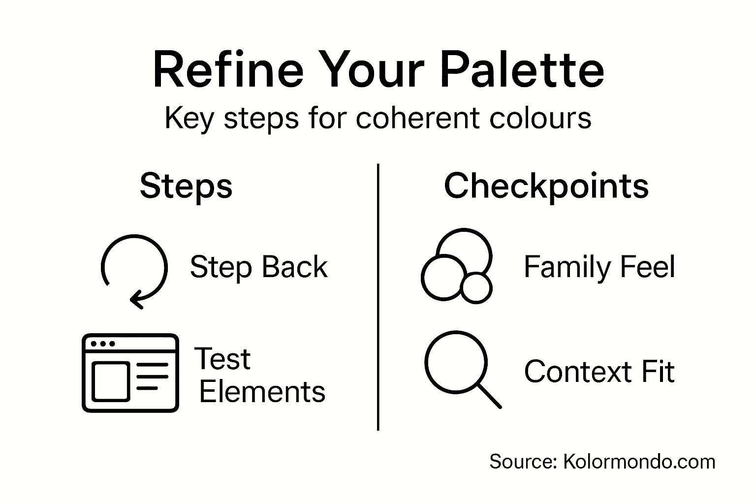
Begin by stepping back and viewing all your selected colours together. Do they feel like they belong to the same family, or do some seem to contradict the others? A cohesive colour palette doesn’t require every colour to be similar. Instead, it requires intention. Each colour should earn its place by supporting the overall mood, brand identity, or communication goal of your project. Creating a cohesive colour palette involves limiting colour families and adjusting hues, tones, and grades systematically to maintain visual harmony across all project elements. Consider whether you need seven colours or if four would be stronger. Limiting your palette often increases its impact. A designer working on a fashion collection might use only three hues but vary their saturation and brightness to create richness within constraint. A website redesign might use two primary colours and three accent colours, creating visual hierarchy without overwhelming users. Use your Kolormondo globe to verify that your refined selections sit comfortably within the three-dimensional colour space. Colours that appear scattered or disconnected on the globe might benefit from slight adjustments to their saturation or value to strengthen the overall coherence.
Test your refined palette against real project elements. If you’re designing a brand identity, see your colours alongside your logo, typography, and imagery. If you’re creating artwork, place your refined colours next to the actual subjects you’ll be depicting. Real-world application reveals whether your palette truly works or whether specific colours create unexpected tensions. Accessibility should guide your refinement process as well. Checking colour contrast in final contexts ensures your design remains clear and usable for all viewers, including those with colour vision deficiencies. If your design includes text or requires distinguishing between different elements, verify that adjacent colours provide sufficient contrast. Use online contrast checking tools to measure this objectively, then make small adjustments to saturation or value as needed. These refinements strengthen your design’s accessibility without sacrificing aesthetics.
Document your final palette clearly. Write down the specific values, codes, or Kolormondo globe references for each colour. Create a visual reference guide that shows how your colours work together and how they should be applied across your project. This documentation ensures consistency as you execute your design and provides a foundation for future related projects.
Use this table to help refine and document your final colour palette for project consistency:
| Palette Aspect | What to Check | Why It Matters |
|---|---|---|
| Colour Family Limit | Limit hues for cohesion | Prevents discordant combinations |
| Saturation Balance | Mix vivid and muted colours | Adds depth and sophistication |
| Contrast Levels | Ensure readable text and clear hierarchy | Improves accessibility and clarity |
| Documentation | Record codes, applications and usages | Guarantees repeatable results |
Professional tip Create two versions of your colour palette, one for screen viewing and one for print, testing both against actual outputs before finalising, since colours shift between digital and physical media in ways that only real-world testing reveals.
Discover Practical Colour Matching with the Kolormondo Globe
Matching colours effectively in art and design can feel overwhelming without the right tools and guidance. This article highlights common challenges such as identifying dominant hues, selecting harmonious colour relationships, and testing colours in real-world lighting and contexts. By addressing terminology like complementary, analogous, and triadic schemes alongside the essential step of refining palettes for coherence, you gain a deeper understanding of how to achieve consistent and professional colour results.
Transform your colour matching experience with the Kolormondo globe, a unique three-dimensional tool designed to visualise colour relationships intuitively. Holding the globe lets you experience hue, saturation, and brightness in spatial context, making complex colour theory tangible and accessible. Whether you are an artist, designer, student or educator, the Kolormondo globe supports hands-on exploration of colour harmony and practical application across various creative fields.
Explore the full range of our Color Globe and color sphere - Kolormondo to find the version that suits your needs. Enhance your skillset further with our Educational material and lesson plans - Kolormondo providing guided learning content that complements the globe perfectly.
Make precise colour decisions with confidence and elevate your art and design projects today. Visit Kolormondo.com now to discover special offers and start your journey towards mastering colour matching with our innovative tools and resources.
Frequently Asked Questions
How can I set up my workspace for accurate colour matching?
To set up your workspace effectively, ensure that your monitor is calibrated to display accurate colours. Spend about twenty minutes calibrating using built-in tools or a calibration utility, and collect high-quality reference materials related to your project to ground your colour choices in reality.
What role does the Kolormondo globe play in colour identification?
The Kolormondo globe helps you identify dominant hues by providing a three-dimensional representation of colour relationships. Hold the globe, observe how colours transition, and use it to find your primary hue family before selecting supporting colours.
How do I select harmonious colours for my project?
To select harmonious colours, consider relationships such as complementary, analogous, and triadic schemes. Choose based on the mood you want to convey; for instance, use complementary colours for energetic designs or analogous colours for a calm palette.
Why is testing my colours under different lighting conditions important?
Testing colours under various lighting conditions is vital because light can significantly alter colour perception. Observe your colours in natural daylight and artificial lighting to ensure they maintain their desired aesthetic across different environments.
How can I refine my colour selections for better project coherence?
Refine your colour selections by stepping back to assess them as a cohesive palette. Limit the number of colours and make small adjustments to create a unified system that enhances the overall mood and purpose of your design.
What should I document about my final colour palette?
Document the specific values and codes of your final colour palette, along with how each colour should be applied throughout your project. This practice ensures consistency and provides a clear reference for future projects.
Recommended
Find similar articles
how to match colors
