
Choosing the right colours is often where beginners and even seasoned british artists get stuck. Colour theory shapes every creative decision, from fine art to graphic design, and a deep grasp of primary, secondary, warm, cool, and neutral tones makes all the difference. Mastering these basics is the gateway to unlocking a palette as wide as your imagination. Over 85% of visual artists say understanding colour relationships improves their work dramatically. This guide shows how simple practical mixing skills can instantly elevate your creative results.
Table of Contents
- 1. Understanding Primary and Secondary Colours
- 2. Exploring Warm and Cool Colour Relationships
- 3. Mastering the Art of Neutral Tones
- 4. Using the Kolormondo Globe for 3D Colour Mixing
- 5. Mixing Complementary Colours for Vibrant Effects
- 6. Controlling Saturation and Tint with White and Black
- 7. Creating Colour Harmony with Hands-On Practice
Quick Summary
| Takeaway | Explanation |
|---|---|
| 1. Master primary and secondary colours | Understanding primary colours (blue, red, yellow) and their combinations is key to creating vibrant secondary colours. Experimenting with ratios expands your palette. |
| 2. Leverage warm and cool colour relationships | Warm colours bring energy and immediacy, while cool colours provide calmness and depth. Use these strategically to enhance emotional impact in your work. |
| 3. Incorporate neutral tones for balance | Neutral colours like grays and browns add sophistication and visual harmony to compositions. Mixing complementary colours creates rich neutrals that elevate your artwork. |
| 4. Use the Kolormondo globe for colour mixing | The 3D Kolormondo globe offers a fresh perspective on colour relationships, allowing you to explore intricate interactions and enhance your mixing techniques. |
| 5. Control saturation with white and black | Adjusting colour intensity through tints (white) and shades (black) enables greater control and creates emotional depth in your palettes. Always mix gradually. |
1. Understanding Primary and Secondary Colours
Every artist and designer needs a solid foundation in colour theory, and understanding primary and secondary colours is where the magic begins. These fundamental colour categories form the backbone of visual creativity and composition.
Primary colours are the building blocks of the colour wheel. Blue, red, and yellow cannot be created by mixing other colours and serve as the essential starting point for colour creation. When these primary colours are strategically combined, they produce secondary colours: green (blue + yellow), orange (red + yellow), and violet (red + blue). This simple colour mixing principle unlocks endless creative possibilities for artists and designers.
In practical terms, understanding these colour relationships allows you to expand your palette dramatically. Artists can create nuanced hues by experimenting with different proportions of primary colours. For instance, adding more blue to green will produce a cooler, more oceanic tone, while increasing yellow creates a warmer, more vibrant green reminiscent of spring foliage.
Visual artists, graphic designers, and illustrators rely on this fundamental knowledge to create harmonious colour schemes and evoke specific emotional responses. Whether you’re painting a landscape, designing a logo, or creating digital art, mastering primary and secondary colours provides a crucial strategic advantage.
Pro tip: Always keep a colour wheel nearby as a reference tool. Experiment with mixing primary colours in different ratios to discover the incredible range of secondary colours you can create.
2. Exploring Warm and Cool Colour Relationships
Colour temperature is a powerful visual language that can dramatically transform artistic compositions and design work. Understanding the psychological and perceptual impact of warm and cool colours opens up nuanced possibilities for creative expression.
Warm colours like red, orange, and yellow are energetic and dynamic. These hues are typically associated with heat, fire, and sunlight, creating a sense of immediacy and excitement. In contrast, cool colours such as blue, green, and violet evoke feelings of calmness and distance, reminiscent of water, sky, and forest landscapes.
Artists and designers can leverage these colour relationships strategically. Warm colours tend to visually advance towards the viewer, making objects appear closer or more prominent. Cool colours, meanwhile, create a sense of depth and receding space. This principle is particularly powerful in landscape painting, interior design, and graphic compositions where spatial perception matters.
Practically, you can use warm and cool colour interactions to create visual hierarchy, emotional resonance, and depth in your work. A painting with predominantly cool blues and greens can suddenly feel more dynamic when a small warm orange or red element is introduced. Similarly, graphic designers can use these principles to guide viewer attention and create engaging visual narratives.
Pro tip: When creating colour palettes, experiment with mixing warm and cool tones in varying proportions to discover subtle, sophisticated colour relationships that add depth and intrigue to your artistic work.
3. Mastering the Art of Neutral Tones
Neutral tones are the unsung heroes of colour composition, providing visual balance and sophistication to artistic and design work. Understanding how to create and utilise these subtle hues can transform an ordinary piece into a nuanced masterpiece.
Neutral colours like grays and browns are not boring background elements but strategic tools for visual harmony. These tones are created by mixing complementary colours or combining all three primary colours, resulting in sophisticated palette options that allow more vibrant colours to truly shine.
In practical terms, neutral tones serve multiple critical functions. They create depth, provide visual breathing space, and help guide the viewer’s eye through a composition. A painting with only bright colours can feel overwhelming, but introducing subtle grays or warm browns can instantly create a sense of balance and sophistication.
Artists and designers can experiment with neutral tones by gradually introducing them into their work. Try mixing complementary colours like blue and orange, or red and green, in equal proportions to create rich, complex neutrals. The key is to avoid muddy results by being intentional about your colour mixing technique and understanding the underlying colour relationships.
Pro tip: When mixing neutral tones, start with small amounts and gradually adjust the proportions. A tiny drop of complementary colour can dramatically shift the warmth or coolness of your neutral palette.
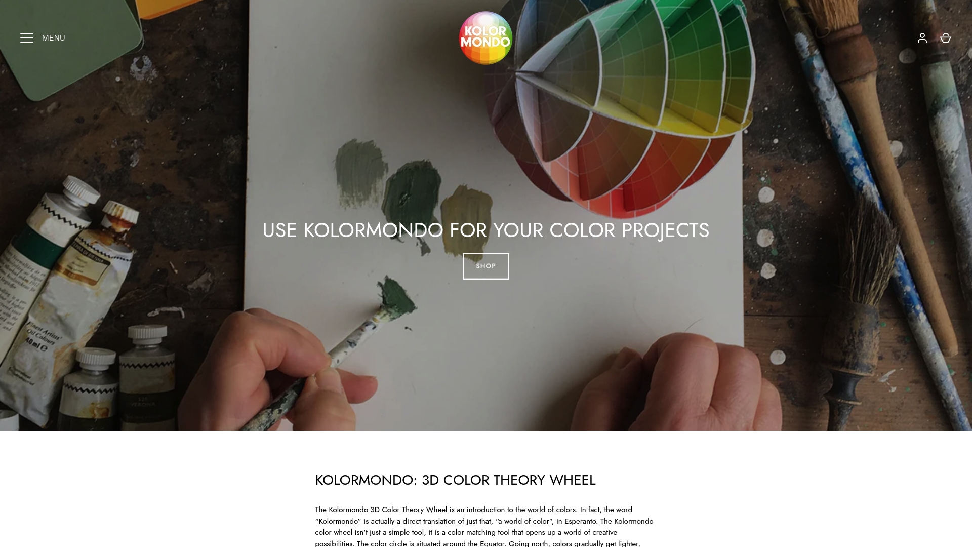
4. Using the Kolormondo Globe for 3D Colour Mixing
Traditional colour wheels are flat and limited, but a 3D colour globe transforms how artists and designers understand colour relationships. The Kolormondo globe offers a revolutionary approach to visualising colour interactions that goes beyond conventional two dimensional representations.
Unlike standard colour charts, a 3D globe allows you to see colours in their full spatial complexity. Each colour exists as a point in three dimensional space, revealing intricate relationships between hues that are impossible to perceive on a flat surface. This means you can track subtle colour transitions, understand complementary relationships, and explore colour blending with unprecedented precision.
Practical application involves rotating the globe to explore how different colours interact from multiple perspectives. Artists can use this tool to predict how colours will blend, understand temperature shifts, and create more nuanced palettes. Interior designers might discover unexpected colour harmonies, while graphic designers can develop more sophisticated colour strategies.
The three dimensional nature of the Kolormondo globe enables users to see colours as interconnected volumes rather than isolated points. By understanding colours as spatial entities, you can make more informed mixing decisions and develop a more intuitive sense of colour theory.
Pro tip: When using the colour globe, experiment by tracking a single colour’s relationship to surrounding hues. Rotate slowly and observe how its perceived qualities change with different adjacent colours.
5. Mixing Complementary Colours for Vibrant Effects
Complementary colours are the secret weapon of artists and designers seeking to create visual drama and dynamic compositions. These colour pairs sit directly opposite each other on the colour wheel, offering powerful opportunities for artistic expression.
Complementary colour pairs like blue and orange or red and green create extraordinary visual contrasts that can dramatically enhance the vibrancy of your artwork. When these colours are placed side by side, they create an electrifying visual tension that immediately draws the viewer’s attention.
Artists can leverage complementary colours in multiple ways. When placed adjacently, these colours appear more intense and luminous. Alternatively, when mixed together, they neutralise each other, producing sophisticated muted tones perfect for creating depth and subtle transitions in paintings, designs, and illustrations.
In practical application, experiment with complementary colour relationships by creating gradients, using them in graphic design layouts, or developing nuanced colour palettes that play with visual perception. A small accent of a complementary colour can transform an entire composition, making elements pop and creating visual interest.
Pro tip: Start by selecting one dominant colour and introducing its complementary pair in smaller, strategic amounts to create balanced yet dynamic visual compositions.
6. Controlling Saturation and Tint with White and Black
Colour manipulation is an art form that transforms ordinary palettes into extraordinary visual experiences. Understanding how white and black interact with pure hues can unlock sophisticated colour control for artists and designers.
Saturation describes the intensity and purity of a colour, which can be dramatically altered by introducing white or black. Adding white creates tints that lighten colours while reducing their intensity, whereas adding black produces shades that darken and deepen colour values.
Practical colour mixing involves careful proportional adjustments. A tiny amount of white can soften a vibrant red into a delicate pastel, while minimal black can transform bright yellow into a rich, deep ochre. These subtle modifications enable artists to create nuanced colour palettes with remarkable emotional depth and visual complexity.
Designers and artists can leverage tints and shades to create visual hierarchy, develop mood, and guide viewer attention. A predominantly light tinted composition can feel ethereal and soft, while a design using deeper shades communicates sophistication and gravity. The key is understanding how incremental colour adjustments produce profound perceptual shifts.
Pro tip: When mixing tints and shades, always add white or black gradually and in small quantities. This approach provides greater control and prevents accidentally overwhelming your original colour.
7. Creating Colour Harmony with Hands-On Practice
True mastery of colour theory transcends theoretical knowledge and emerges through deliberate, tactile exploration. Engaging in practical colour mixing exercises transforms abstract concepts into tangible artistic skills.
Hands-on practice allows artists and designers to develop an intuitive understanding of colour relationships that cannot be learned solely through books or lectures. By physically mixing pigments, observing subtle shifts, and experimenting with unexpected combinations, you build a sensory memory of colour interactions that becomes an intrinsic part of your creative process.
Design a structured practice routine that challenges your colour perception. Create small studies exploring complementary colour pairings, experiment with tonal variations, and document your discoveries. Start with simple exercises like creating a monochromatic palette using only one base colour and white or black, then progressively introduce more complex mixing techniques.
The goal is not perfection but continuous exploration. Each mixture reveals unique insights about colour behaviour. Pay attention to how different proportions of pigments create nuanced effects, how lighting changes colour perception, and how emotional responses shift with subtle tonal adjustments.
Pro tip: Maintain a colour mixing journal to track your experiments. Sketch, record precise mixture ratios, and note the emotional and visual impact of each colour combination.
This table summarises the fundamental principles, strategies, and practical applications of colour theory as discussed in the article.
| Topic | Description | Key Considerations |
|---|---|---|
| Primary and Secondary Colours | Understanding primary colours (blue, red, yellow) as building blocks and their combination to create secondary colours. | Creating nuanced hues and using a colour wheel for reference. |
| Warm and Cool Colour Relationships | Warm colours (red, orange, yellow) evoke energy; cool colours (blue, green, violet) create calmness. | Use to create visual hierarchy and depth in compositions. |
| Neutral Tones | Utilising neutral tones like greys and browns for balance and sophistication. | Mix complementary colours; avoid muddiness for effective integration. |
| Kolormondo 3D Colour Globe | 3D visualisation tool for exploring complex colour relationships. | Enables sophisticated blending and understanding colour as spatial entities. |
| Complementary Colours | These pairs (e.g., blue and orange) create vibrant contrasts when placed adjacently. | Use to enhance vibrancy and create visual interest; mix for muted tones. |
| Saturation and Tinting | Adjust intensity with white (tints) and black (shades) for nuanced palettes. | Gradually add for control; affects mood and perception. |
| Practical Colour Mixing | Engaging in hands-on mixing exercises to internalise colour relationships. | Maintain a journal for experiments; focus on continuous exploration. |
Master Colour Mixing with the Kolormondo Globe for Stunning Artistic Results
Struggling to master the complex colour relationships like primary, secondary, and complementary colours or to control tints and shades precisely The article highlights key challenges such as understanding colour harmony, temperature, and saturation that are essential but often difficult concepts to grasp through flat charts. With Kolormondo’s innovative 3D colour globe, you can explore these colour interactions in a tactile and intuitive way and deepen your understanding of visual colour mixing beyond traditional methods. This hands-on tool turns abstract theory into practical discovery and enhances your creative confidence.
Unlock the full potential of your artistic and design skills by experiencing the Kolormondo globe today. Combine your study of colour with our Educational material and lesson plans - Kolormondo and engage with expert insights through our Lectures and Workshops about color - Kolormondo. Don’t wait to elevate your colour mastery. Visit Kolormondo.com now and transform your creative journey with the power of 3D colour exploration.
Frequently Asked Questions
How can I create secondary colours from primary colours?
To create secondary colours, mix equal parts of two primary colours. For example, blending blue and yellow will yield green, while mixing red and yellow will produce orange.
What are the benefits of using warm and cool colours together in my work?
Using warm and cool colours can enhance emotional impact and create depth in your compositions. Experiment by introducing a warm hue, like orange, against a predominantly cool background to see how it draws attention.
How do I effectively incorporate neutral tones into my artwork?
To incorporate neutral tones, try mixing complementary colours or combining primary colours to create sophisticated greys and browns. Start by adding small amounts of complementary colours to your mixes until you achieve the desired neutrality.
What is the Kolormondo globe, and how can it help me with colour mixing?
The Kolormondo globe is a 3D tool that visualises colours in their spatial relationships, providing a clearer understanding of colour interactions. To utilise it, rotate the globe and observe different colours’ relationships from multiple angles to aid your mixing decisions.
How do I determine the right tint or shade for my colours?
To create a tint, add white to your base colour, and to create a shade, add black. Begin with small increments, such as adding a single drop, and observe the effects on the colour until you reach a satisfactory tint or shade.
What practical exercises can I do to improve my colour mixing skills?
Engage in hands-on practice by creating colour studies that focus on specific colour relationships, such as complementary or tonal variations. Keep a colour mixing journal to document your experiments and insights as you develop your skills.
Recommended
Find similar articles
color mixing tips
