
Struggling to keep your American students engaged with colour theory during studio lessons? Moving colour concepts from abstract charts to hands-on exploration can spark curiosity and transform outcomes. The bold use of the Kolormondo globe gives educators a fully three-dimensional approach, making hue, value and saturation tangible for young learners. This guide gives you practical steps to set up immersive colour workflows, blending visual tools and testing methods that encourage confident, interactive discovery in your classroom.
Table of Contents
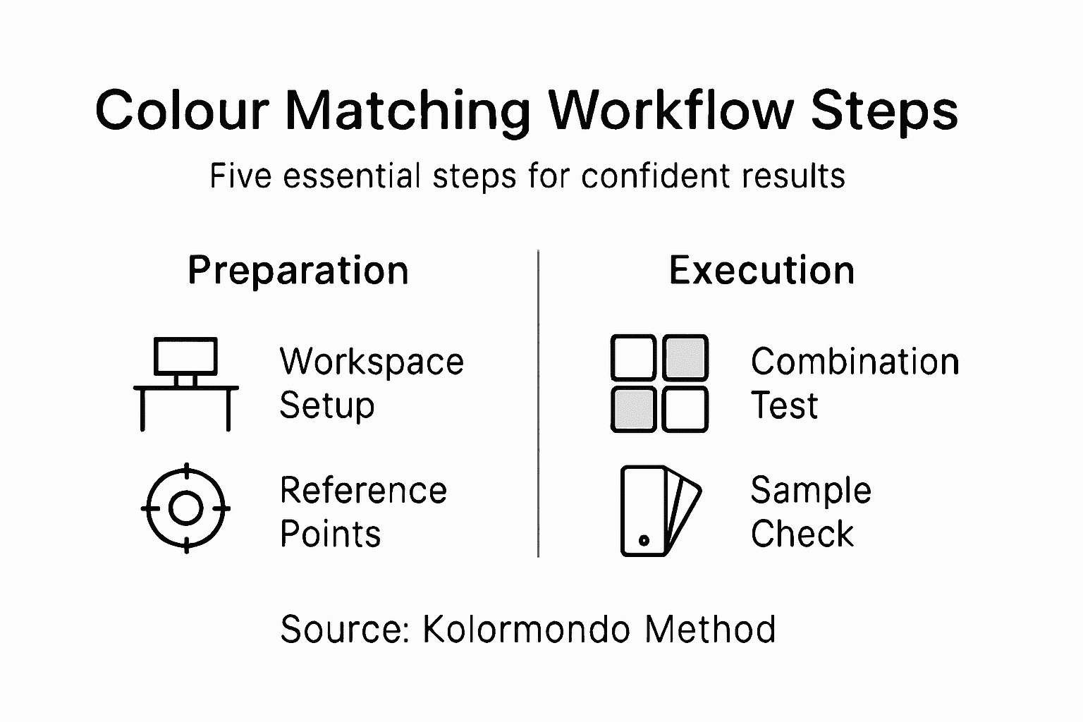
- Step 1: Set up your workspace with a Kolormondo globe
- Step 2: Identify colours using 3D reference points
- Step 3: Test combinations through hands-on trials
- Step 4: Verify accuracy with real-world samples
- Step 5: Record successful matches for future use
Quick Summary
| Key Point | Explanation |
|---|---|
| 1. Create an effective workspace | Set up a stable, well-lit area for colour exploration, using a Kolormondo globe to enhance understanding of colour relationships. |
| 2. Use three-dimensional colour mapping | Rotate the Kolormondo globe to see colour interrelations, facilitating intuitive colour identification and a deeper understanding of hues. |
| 3. Implement hands-on colour testing | Engage in practical experiments with colour mixtures, layering, and documentation to uncover unique combinations and enhance your design process. |
| 4. Verify colour accuracy thoroughly | Collect real-world samples and use standardised conditions for comparison to ensure precise colour matching and eliminate subjective perception issues. |
| 5. Systematically document colour findings | Record colour matches and contextual details to create a reliable archive, allowing for easy retrieval and utilisation in future projects. |
Step 1: Set up your workspace with a Kolormondo globe
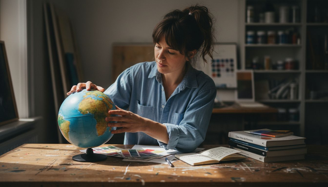
Designing an optimal colour workspace requires strategic planning and the right visual tools. When preparing to explore colour relationships, the Kolormondo globe transforms your approach by offering a three-dimensional perspective that traditional colour charts simply cannot match.
To set up your workspace effectively, gather these essential items:
- A stable, well-lit workspace surface
- Your Kolormondo colour globe
- Natural daylight or colour-balanced lighting
- White background paper or neutral surface
- Colour reference materials (optional)
Position your Kolormondo globe where you can easily rotate and examine its intricate colour relationships. Natural, diffused lighting helps reveal the subtle nuances and interactions between different colour zones. Angle the globe at eye level to gain the most comprehensive understanding of its three-dimensional colour mapping.
By creating a dedicated colour exploration area, you enable more intuitive and precise colour matching techniques. Your workspace becomes a learning environment that encourages visual discovery and precise colour comprehension.
Pro tip: Consider placing your Kolormondo globe near a window with soft, indirect sunlight to enhance your colour perception and create an inspiring workspace environment.
Here is a comparison of traditional colour charts and the Kolormondo globe for colour study:
| Aspect | Traditional Colour Charts | Kolormondo Globe |
|---|---|---|
| Visual dimension | Flat, two-dimensional | Fully three-dimensional |
| Interaction | Limited, static | Rotatable, interactive |
| Colour relationships | Hard to visualise | Easily observable |
| Precision | Prone to misinterpretation | Highly accurate matching |
| Learning experience | Abstract, theoretical | Tangible, immersive |
Step 2: Identify colours using 3D reference points
Mastering colour identification requires more than traditional flat colour charts. The three-dimensional colour exploration empowers artists, designers, and colour enthusiasts to understand complex colour relationships with unprecedented precision.
To effectively identify colours using the Kolormondo globe, follow these strategic steps:
- Rotate the globe to examine colour positions
- Observe how primary colours intersect
- Track colour transitions between hue zones
- Note the spatial relationships between different colour intensities
- Understand vertical and horizontal colour movements
The three-dimensional approach reveals nuanced colour interactions impossible with traditional methods. Spatial colour mapping allows you to comprehend how colours blend, shift, and relate across different dimensions. By understanding the globe’s structure, you can precisely pinpoint exact colour locations and understand their relationships with surrounding hues.
Colour identification becomes an intuitive, visual experience when you explore colours in three-dimensional space.
Professional colour experts recognise that depth, not just surface appearance, reveals a colour’s true character. The Kolormondo globe transforms abstract colour theory into a tangible, interactive learning experience.
Pro tip: Always examine colours under consistent lighting conditions to ensure accurate colour perception and reliable reference point identification.
Step 3: Test combinations through hands-on trials
Designing confident colour combinations requires strategic experimentation and methodical assessment. Practical colour testing techniques transform abstract theories into tangible visual experiences that reveal unexpected harmonies and interactions.
Your hands-on trial process should incorporate these essential steps:
- Create physical colour swatches on separate sheets
- Layer colours to observe transparency and interaction
- Record precise mixing ratios and pigment details
- Compare combinations under different lighting conditions
- Document your experimental results
Systematic colour exploration allows you to understand subtle nuances that digital representations cannot capture. By physically mixing and testing colours, you develop an intuitive sense of how different hues communicate and blend.
Colour combinations are conversations between pigments, and hands-on trials reveal their most intimate dialogues.
Professional designers recognise that empirical testing provides insights impossible through theoretical study alone. Each experimental trial brings you closer to understanding the complex language of colour relationships.
Pro tip: Photograph your colour studies to create a personal reference library for future design projects and colour matching challenges.
Step 4: Verify accuracy with real-world samples
Transforming colour theory into precise visual representation requires rigorous validation. Advanced colour measurement techniques bridge the gap between theoretical understanding and practical application, ensuring your colour matching process achieves scientific precision.
To verify colour accuracy comprehensively, implement these strategic verification steps:
- Collect physical colour samples representing your target palette
- Use standardised lighting conditions for consistent evaluation
- Employ calibrated colour reference charts
- Measure spectral reflectance across different surfaces
- Compare digital representations with physical samples
Systematic sample verification transforms subjective colour perception into measurable, reproducible data. By cross-referencing multiple sources and measurement techniques, you eliminate potential discrepancies that could compromise your colour matching workflow.
Precision in colour verification is the difference between guesswork and professional expertise.
Professional designers understand that empirical validation requires multiple assessment methods. Each verification technique provides another layer of confidence in your colour selection, ensuring consistency across different materials and lighting conditions.
Pro tip: Invest in a portable spectrophotometer to conduct on-site colour verifications and maintain professional-grade accuracy in your colour matching process.
Step 5: Record successful matches for future use
Documenting your colour discoveries transforms fleeting insights into a robust, reusable design resource. Systematic colour documentation strategies ensure that your carefully curated colour matches become a valuable reference for future projects.
Implement these comprehensive recording techniques:
- Capture digital photographs of colour combinations
- Note precise colour codes (HEX, RGB, CMYK)
- Describe lighting conditions during matching
- Log material and surface types used
- Create a structured digital or physical colour archive
Methodical colour documentation converts individual experiments into a strategic knowledge base. By recording contextual details alongside your colour matches, you build a personalised reference that captures the nuanced relationships discovered through your exploration.
Every recorded colour match is a potential breakthrough for future creative endeavours.
Professional designers recognise that systematic archiving transforms sporadic discoveries into a powerful design tool. Your carefully maintained colour records become a unique resource that reflects your artistic journey and technical precision.
Pro tip: Develop a consistent naming convention for your colour documentation to ensure quick retrieval and seamless organisation of your colour match archives.
This table summarises the progression from colour identification to documentation in the design process:
| Process Stage | Core Activity | Main Benefit |
|---|---|---|
| Identify colours | Locate on globe | Enhanced spatial understanding |
| Test combinations | Mix and compare | Reveals hidden harmonies |
| Verify accuracy | Validate with samples | Ensures real-world consistency |
| Record matches | Archive findings | Builds a reliable design reference library |
Elevate Your Colour Matching with Kolormondo’s Innovative Tools
Struggling with accurate colour identification and confident combination testing can hold back creative projects and precise design work. This article emphasises the challenge of moving beyond flat colour charts to a more intuitive, three-dimensional understanding of colour relationships through hands-on exploration and rigorous verification. If you want to overcome guesswork and build a reliable colour reference library, discovering how to work seamlessly from colour identification to documentation is essential.
Experience the transformative power of the Kolormondo globe and enrich your colour workflow today. Explore expert-led Lectures and Workshops about colour - Kolormondo to deepen your practical knowledge. Gain access to tailored Educational material and lesson plans - Kolormondo to support systematic colour studies. Act now to refine your colour mastery by visiting Kolormondo.com and discover special offers designed to make advanced colour learning accessible. Take the next step in your colour journey and transform the way you see and work with colour.
Frequently Asked Questions
How can I set up my workspace for effective colour matching?
To set up your workspace effectively, gather a stable surface, your Kolormondo globe, and good lighting. Position the globe at eye level and ensure it is well-lit to enhance your colour perception.
What steps should I follow to identify colours using the Kolormondo globe?
To identify colours, rotate the globe to examine how primary colours intersect and track transitions between hue zones. Focus on spatial relationships between different colour intensities to improve your understanding of their interactions.
How can I test colour combinations effectively?
Create physical colour swatches and layer colours to observe their interactions. Record precise mixing ratios and experiment under various lighting conditions to discover unexpected harmonies in your combinations.
What techniques can I use to verify colour accuracy with samples?
Collect physical colour samples and evaluate them under standardised lighting conditions. Use calibrated colour reference charts to measure colour fidelity and ensure your matches are consistent and reliable.
How should I document successful colour matches for future reference?
Capture digital photographs and note precise colour codes alongside contextual details like lighting conditions and material types. Create a structured archive to ensure your colour matches are easily retrievable for future projects.
Recommended
Find similar articles
practical color matching workflow
