
Choosing and combining colours can feel confusing when you want your designs to look professional instead of random. Just picking shades that seem attractive often leads to unbalanced or uninspired results. Understanding how colours really work together helps you create visuals that grab attention and send the right message.
This guide reveals practical methods for mastering colour theory in your designs. You will discover how to balance colours, guide attention, and create harmony using principles that work across any project. Expect clear explanations and actionable tips that will help you make confident choices and achieve standout results.
Table of Contents
- 1. Understand Colour Basics With A 3D Perspective
- 2. Use Colour Harmony To Balance Your Designs
- 3. Leverage Contrast For Greater Visual Impact
- 4. Consider Lighting Effects On Colour Perception
- 5. Apply Colour Psychology To Influence Mood
- 6. Test Combinations With Physical Colour Tools
- 7. Adapt Colour Choices To Project Purpose
Quick Summary
| Takeaway | Explanation |
|---|---|
| 1. Embrace 3D Colour Models | Understanding colour in three dimensions enhances your ability to perceive and manipulate colours effectively. |
| 2. Implement Colour Harmony Techniques | Use colour harmony to select colours that create balanced and engaging designs. |
| 3. Leverage Contrast for Impact | Use contrast to establish visual hierarchies and draw attention to key design elements. |
| 4. Test Colours Under Varying Lighting | Always assess colour selections across different lighting conditions to understand true appearances. |
| 5. Align Colour Choices to Project Goals | Each design should reflect its specific context and target audience for maximum effectiveness. |
1. Understand Colour Basics with a 3D Perspective
Designers seeking mastery must move beyond traditional flat colour wheels and embrace a more sophisticated understanding of colour relationships. Visualising colour in 3D transforms how we perceive and manipulate chromatic spaces, offering unprecedented depth and nuance in colour theory.
Traditional colour wheels represent only a limited two dimensional perspective, constraining our understanding of how colours genuinely interact. A three dimensional approach allows designers to comprehend colour not just as hues, but as complex spatial relationships involving depth, saturation, and luminosity.
Scientific colour theory reveals that human perception operates far more dynamically than simple circular models suggest. By understanding colour as a volumetric construct, you can unlock more precise control over chromatic interactions, enabling more sophisticated design strategies.
Professional designers recognise that colour exists in a spherical spectrum where hue, value, and chroma interrelate continuously. This means colours are not static points, but dynamic volumes with infinite gradational possibilities. Imagine colours as points within a spherical space that can move, blend, and transform organically.
Key insights for 3D colour understanding:
- Colour is a volumetric experience, not a flat diagram
- Hue represents position, saturation indicates intensity
- Brightness determines a colour’s vertical placement in 3D space
- Complementary colours exist in opposing spatial relationships
Professional recommendation: Invest time in studying three dimensional colour models to develop a more nuanced and professional approach to colour selection and manipulation.
2. Use Colour Harmony to Balance Your Designs
Designers seeking visual mastery must understand the critical role of colour harmony in creating compelling visual compositions. Colour harmony principles offer a strategic approach to balancing visual elements that engage and delight viewers.
At its core, colour harmony represents a sophisticated interplay between different chromatic elements, where colours are carefully selected to create a cohesive and aesthetically pleasing result. This is not about randomly selecting attractive colours, but understanding their complex relationships and interactions.
Professional designers recognise that harmonious colour schemes are scientifically grounded. Specific strategies like complementary, analogous, and triadic colour relationships provide structured frameworks for creating balanced designs. Each approach offers unique opportunities to generate visual interest while maintaining overall compositional unity.
Colour Harmony Strategies:
- Complementary Colours: Select colours directly opposite on the colour wheel
- Analogous Colours: Choose colours adjacent to each other on the colour wheel
- Triadic Colours: Use three colours equally spaced around the colour wheel
- Monochromatic Approach: Utilise variations in saturation and brightness within a single hue
Context plays a crucial role in colour harmony. A combination that works brilliantly in one design might feel jarring in another. Professional designers continually adapt their colour choices based on specific project requirements, cultural considerations, and intended emotional response.
Professional recommendation: Experiment with different colour harmony techniques by creating small test compositions, comparing how various colour relationships interact and communicate your intended visual message.
3. Leverage Contrast for Greater Visual Impact
The strategic use of contrast transforms ordinary designs into powerful visual communications. Contrast principles empower designers to create compelling visual hierarchies that guide viewer attention and enhance overall design effectiveness.
Contrast is more than simply placing different colours or elements together. It represents a sophisticated method of visual communication where deliberate differences in colour, size, texture, and spatial relationships create meaningful visual experiences. Professional designers understand that contrast is a nuanced tool for directing viewer perception and emotional response.
Effective contrast achieves multiple design objectives. By creating strategic differences between design elements, you can establish visual hierarchy, improve readability, and communicate complex information more intuitively. The key is finding the delicate balance between distinctiveness and cohesion.
Contrast Application Strategies:
- Colour Contrast: Use complementary or opposing colour values
- Size Contrast: Vary element dimensions to create focal points
- Texture Contrast: Combine smooth and rough visual surfaces
- Spatial Contrast: Manipulate negative and positive space
Balancing contrast requires careful consideration. Too little contrast renders designs bland and uninspiring, while excessive contrast can create visual chaos. Professional designers develop an intuitive sense for this delicate equilibrium through consistent practice and keen visual observation.
Professional recommendation: Create contrast studies by experimenting with different element combinations, always evaluating how variations impact overall visual communication and emotional resonance.
4. Consider Lighting Effects on Colour Perception
Mastering colour design requires understanding how lighting dramatically transforms colour appearance and perception. Lighting spectral qualities play a crucial role in how humans experience and interpret visual environments.
Lighting is not merely an ambient element but a powerful tool that fundamentally alters colour interpretation. Different light temperatures and intensities can make identical colours appear dramatically different, challenging designers to develop nuanced lighting strategies that reveal true chromatic qualities.
Professional designers recognise that lighting conditions create complex perceptual experiences. Warm lighting with moderate illuminance can enhance comfort and relaxation, while cooler light temperatures might promote alertness and productivity. Understanding these subtle interactions enables more sophisticated colour selections across various design contexts.
Key Lighting Considerations for Colour Perception:
- Colour Temperature: Warm versus cool lighting affects colour appearance
- Illuminance Levels: Brightness impacts colour saturation and vibrancy
- Light Source Type: Natural versus artificial lighting creates different effects
- Spectral Distribution: Different light spectrums reveal colour variations
Contextual awareness remains paramount. A colour that appears vibrant under gallery lighting might seem muted in natural daylight or appear entirely different under fluorescent office illumination. Professional designers continuously test and calibrate their colour selections across multiple lighting environments.
Professional recommendation: Always test colour selections under multiple lighting conditions and create controlled mockups that simulate real world environments before finalising design choices.
5. Apply Colour Psychology to Influence Mood
Designers wield incredible power when they understand how colours profoundly impact human emotions and psychological states. Colour psychology research reveals systematic emotional associations that transcend individual experiences.
Every colour communicates a unique emotional language. Professional designers recognise that colour selection is not merely aesthetic but a strategic communication tool capable of evoking specific psychological responses. Red can signal excitement and passion, blue suggests calmness and trust, while green connects with tranquillity and balance.
Cultural contexts add fascinating complexity to colour psychology. While some emotional responses appear universal certain interpretations vary across different cultural landscapes. Understanding these nuanced variations allows designers to craft more sophisticated and empathetic visual experiences.
Emotional Colour Mapping:
- Red: High arousal, passion, excitement
- Blue: Calmness, trust, professionalism
- Yellow: Optimism, energy, happiness
- Green: Tranquillity, growth, harmony
- Purple: Creativity, luxury, spirituality
Strategic colour application requires careful consideration. Designers must balance emotional impact with contextual appropriateness, ensuring colour choices genuinely support the intended communication objectives without overwhelming the viewer.
Professional recommendation: Create emotional colour palettes by testing potential colour combinations against specific psychological and communicative goals, always considering contextual nuances.
6. Test Combinations with Physical Colour Tools
Professional designers understand that digital representations cannot fully capture the nuanced interactions of physical colour experiences. Scientific colour communication tools provide tangible ways to explore and validate colour relationships beyond digital screens.
Physical colour tools such as swatch books, colour wheels, and three dimensional colour globes offer designers a tactile method for understanding chromatic interactions. These tools enable precise colour sampling and combination testing that digital interfaces cannot replicate, providing a more comprehensive understanding of how colours truly relate and interact.
Unlike digital colour pickers, physical tools allow designers to observe colour relationships in real world lighting conditions. They reveal subtle interactions of hue, saturation, and brightness that computer screens cannot accurately represent, helping designers make more informed colour selection decisions.
Physical Colour Testing Strategies:
- Use Standardised Colour Swatch Collections
- Experiment with Three Dimensional Colour Models
- Compare Colours Under Different Lighting Conditions
- Create Physical Colour Combination Samples
- Document Colour Interactions Systematically
The key is developing a methodical approach to colour selection that goes beyond digital approximations. Physical tools provide designers with a more holistic and nuanced understanding of chromatic relationships, supporting more sophisticated design outcomes.
Professional recommendation: Invest in high quality physical colour tools and develop a systematic approach to testing and documenting colour interactions across different contexts and lighting conditions.
7. Adapt Colour Choices to Project Purpose
Mastering colour selection requires more than aesthetic intuition it demands a strategic understanding of how colours communicate across different contexts. Colour palette selection is an intricate process of aligning visual elements with specific project objectives.
Every design project possesses a unique narrative and communicative intent. Professional designers recognise that colour choices are not arbitrary but deliberate communication tools that convey mood, reinforce brand identity, and guide user perception. A colour palette for a medical website will differ dramatically from one designed for a children’s toy packaging.
Contextual adaptation involves understanding the intersection of psychological, cultural, and functional considerations. Colours must not only look appealing but also support the project’s core messaging and target audience expectations. This requires a nuanced approach that goes beyond personal preference.
Colour Selection Considerations:
- Audience Demographics: Age, cultural background, visual preferences
- Project Medium: Digital versus print, screen versus physical material
- Emotional Tone: Desired psychological response and messaging
- Functional Requirements: Readability, accessibility, contrast
- Brand Guidelines: Existing colour systems and identity
Professional designers develop a flexible yet systematic approach to colour selection. They view colours as dynamic communication tools that can be strategically manipulated to support specific design objectives across diverse project contexts.
Professional recommendation: Create multiple colour variations for each project and systematically test their effectiveness against your specific design goals and target audience expectations.
Below is a comprehensive table summarising the approaches and strategies discussed throughout the article for understanding and applying advanced colour theory and techniques.
| Topic | Description | Key Considerations |
|---|---|---|
| 3D Colour Representation | Emphasises a volumetric understanding of colours to better appreciate their interactions and harmony. | Utilises concepts like hue, saturation, and brightness within a three dimensional space. |
| Colour Harmony | Determines pleasing aesthetic balance through systematic selection methods. | Includes complementary, analogous, triadic, and monochromatic schemes aligned with project goals. |
| Contrast Techniques | Employs deliberate variation to enhance visual impact and communication. | Focuses on differences in colour, size, texture, and spatial arrangement. |
| Lighting Impact on Colours | Examines how light temperature and intensity influence perceived colours. | Testing colours in varied environments ensures accurate representation in final applications. |
| Colour Psychology | Explores emotional and psychological effects associated with specific colour choices. | Considers cultural and contextual nuances for effective emotional communication. |
| Physical Colour Tools | Utilises tangible tools to comprehend real-world colour interactions beyond digital simulations. | Standardised swatches and 3D models facilitate testing under varied conditions. |
| Adaptive Colour Selection | Tailors colour choices to align with project-specific requirements and target audiences. | Balances aesthetic appeal with purpose, accessibility, and readability. |
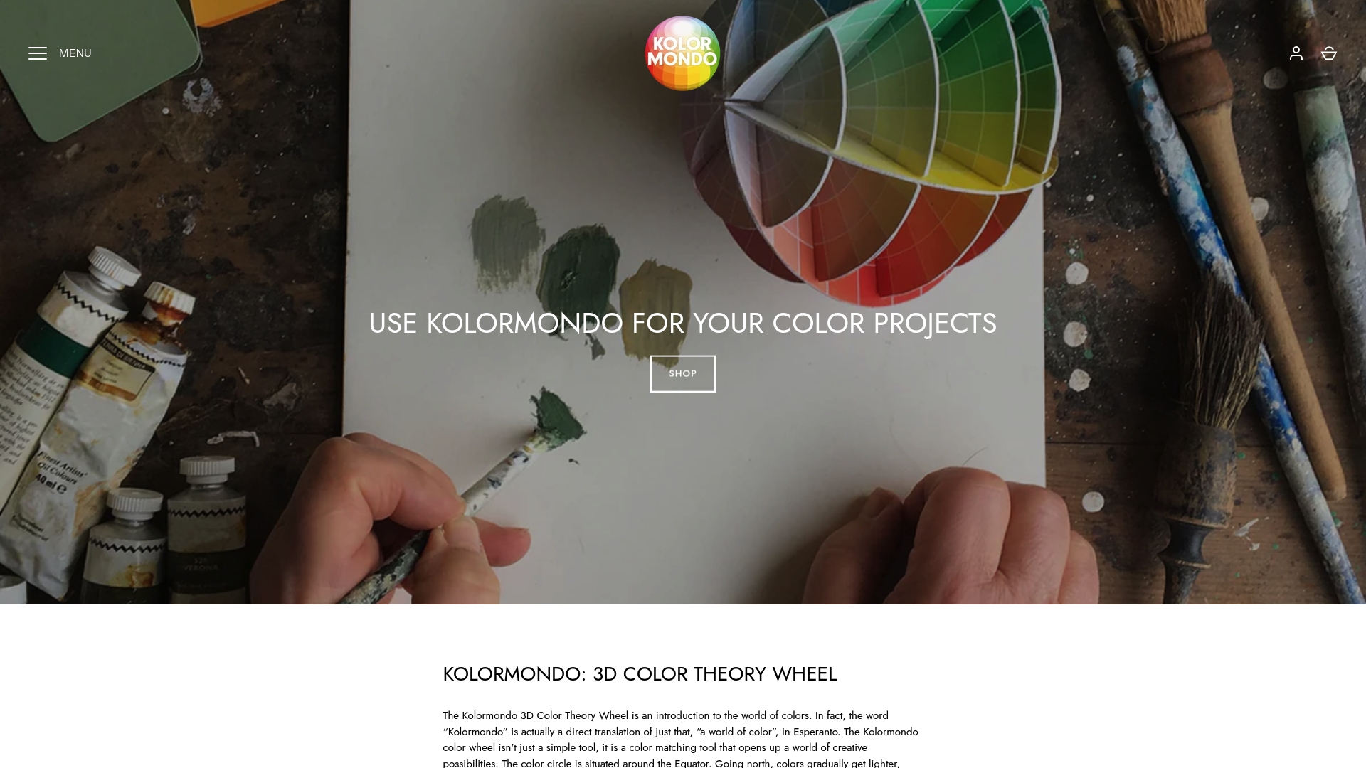
Elevate Your Colour Mastery with Kolormondo’s 3D Colour Tools
Many designers struggle to fully grasp the complex relationships between hue, saturation, and brightness when relying on traditional flat colour wheels. As the article highlights, understanding colour as a volumetric experience and applying harmony, contrast, and psychology can be challenging without hands-on tools that make these concepts tangible. That is where Kolormondo’s innovative 3D colour globe stands apart, bringing colour theory to life with a dynamic, spatial approach designed to deepen your insight and refine your design decisions.
Unlock a new level of expertise by exploring our Educational material and lesson plans - Kolormondo to get started or join immersive Lectures and Workshops about color - Kolormondo tailored to your journey. Master colour interactions with a tactile tool embraced by educators and professionals alike. Visit Kolormondo.com now to experience a revolutionary way to understand colour and transform your creative projects today.
Frequently Asked Questions
How can I understand colour relationships in a three-dimensional context?
To grasp colour relationships more effectively, study three-dimensional colour models that represent colour as a volumetric experience. Invest dedicated time exploring these models to enhance your understanding of hue, saturation, and brightness interactions.
What are effective colour harmony strategies for professional design?
Incorporate colour harmony techniques like complementary, analogous, and triadic colours to create balanced designs. Experiment with these strategies in small test compositions to see how they impact your overall visual message.
How can I use contrast to improve my designs?
To leverage contrast, ensure distinct differences in colours, sizes, and textures within your compositions. Create contrast studies by varying elements and assessing how these changes influence visual hierarchy and viewer engagement.
What lighting considerations should I take into account for colour perception?
Consider the impact of colour temperature, illuminance levels, and the type of light sources on how colours appear. Always test colour selections under various lighting conditions to ensure that your designs maintain their integrity across environments.
How can I apply colour psychology to influence audience emotions?
To influence emotions, select colours based on their psychological associations, such as red for excitement and blue for calmness. Create emotional colour palettes by aligning your choices with specific communicative goals and testing them against audience expectations.
Which physical colour tools should I use for testing combinations?
Utilise physical colour tools like swatch books and three-dimensional colour globes to explore colour relationships more accurately than digital models allow. Systematically document your findings across different environments to refine your selection process.
Recommended
Find similar articles
color selection tips for designers
