
Over 80 percent of british artists and designers still rely on traditional two dimensional colour wheels to guide their work, yet this classic method only scratches the surface of chromatic relationships. Understanding colour is more than memorising flat charts—it shapes how creative professionals use hue, light, and contrast in everything from art to fashion. Exploring the difference between two dimensional and three dimensional colour wheels reveals a smarter way to grasp colour complexities, offering tools that bring clarity and deeper insight to british creators.
Table of Contents
- 1. Understanding The Basics: 2D Vs 3D Colour Wheels
- 2. How The Kolormondo Globe Enhances Colour Perception
- 3. Comparing Traditional Charts With 3D Models In Education
- 4. Discovering Colour Relationships: Harmony And Contrast
- 5. Practical Uses In Art, Fashion, And Interior Design
- 6. Choosing The Right Colour Wheel For Your Needs
- 7. Integrating Tactile Colour Tools Into Creative Practice
Quick Summary
| Takeaway | Explanation |
|---|---|
| 1. 3D Colour Wheels Enhance Understanding | Three-dimensional colour models provide a more intuitive understanding of colour relationships compared to traditional flat wheels. |
| 2. Kolormondo Globe Offers Interactive Learning | The Kolormondo globe allows users to explore colour blending and transitions spatially, enriching artistic insights. |
| 3. Tactile Tools Aid Colour Comprehension | Physical interaction with colour tools bridges theory and practice, fostering a deeper understanding of colour dynamics. |
| 4. Advanced Colour Theory Benefits Various Fields | Mastering colour theory can transform creative outputs in art, fashion, and interior design by influencing emotions and perceptions. |
| 5. Choosing the Right Colour Wheel is Essential | Selecting a colour wheel aligned with your professional needs enhances precision and effectiveness in colour utilisation. |
1. Understanding the Basics: 2D vs 3D Colour Wheels
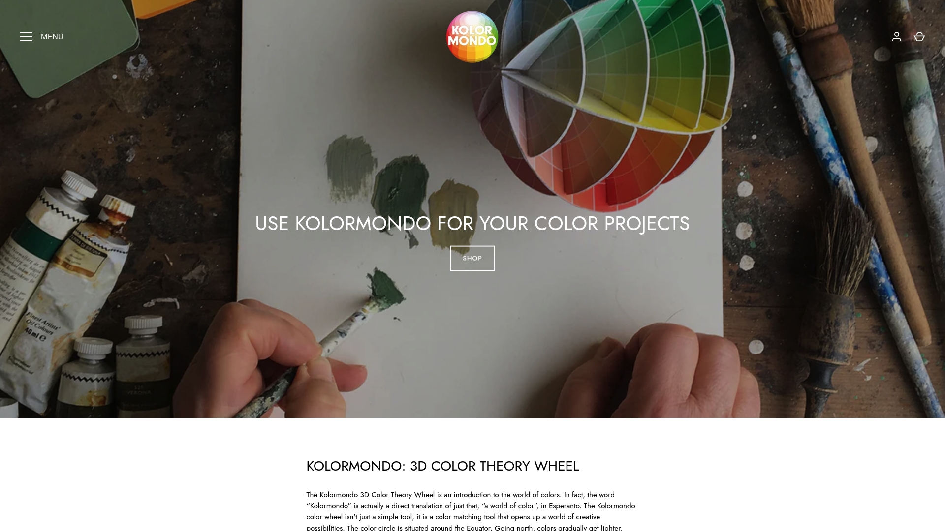
Traditional colour theory has long relied on flat, two-dimensional colour wheels to explain colour relationships, but a revolutionary approach is changing how artists and designers understand chromatic interactions. Visualising colour in three dimensions offers a more comprehensive and intuitive method of comprehending colour dynamics.
In traditional 2D colour wheels, colours are arranged in a circular format, typically showing primary, secondary, and tertiary colours. These flat representations limit our understanding by compressing colour relationships into a single plane. Colour connections are complex, and a two-dimensional model cannot fully capture the nuanced interactions between hue, saturation, and brightness.
A 3D colour wheel, by contrast, introduces depth and spatial relationships. This innovative approach allows you to see colours as interconnected volumes rather than simple points on a circle. By representing colours as spherical or globe-like structures, designers gain a more holistic view of colour theory.
Practically speaking, a 3D colour wheel helps you understand:
- Colour Gradation: How colours transition and blend in multiple dimensions
- Saturation Variations: The intensity of colours across different depths
- Luminosity Interactions: How light and dark variations impact colour perception
According to research from the Annenberg Learner, constructing a 3D colour wheel provides deeper insights into colour theory that traditional flat models cannot achieve. This method transforms colour understanding from a two-dimensional concept to a rich, multifaceted exploration.
For artists, designers, and colour enthusiasts, adopting a 3D perspective means moving beyond basic colour matching into a more sophisticated realm of chromatic understanding. Whether you are creating digital art, designing interiors, or developing brand colour palettes, a three-dimensional approach offers unprecedented clarity and precision.
2. How the Kolormondo Globe Enhances Colour Perception
Colour perception is far more complex than simply recognising individual hues, and understanding how colours interact requires a truly innovative approach. Exploring different colour reference tools reveals why three dimensional models like the Kolormondo globe are transforming artistic and design practices.
Traditional colour wheels flatten the rich complexity of chromatic relationships into a single plane, limiting our understanding of how colours genuinely interconnect. The Kolormondo globe breaks through these limitations by presenting colours as spatial, interconnected volumes that reveal subtle transitions and relationships impossible to perceive in two dimensional representations.
Spatial colour understanding means experiencing colours not just as isolated points, but as dynamic, interconnected elements. When you rotate a 3D colour globe, you witness how colours blend, shift, and interact across multiple perspectives. This spatial approach provides designers and artists with unprecedented insights into colour harmony, contrast, and nuanced chromatic relationships.
Practical benefits of using a 3D colour globe include:
- Enhanced Colour Mixing Accuracy: Understanding exact colour transitions
- Improved Design Intuition: Visualising complex colour interactions
- Precise Colour Selection: Identifying complementary and analogous colours with greater precision
For visual artists, graphic designers, interior decorators, and colour professionals, the Kolormondo globe offers a revolutionary tool that transforms theoretical colour knowledge into tangible, interactive learning. Comparing different colour globe options allows you to select the perfect reference that matches your specific creative needs.
By moving beyond flat colour representations, you unlock a more profound understanding of chromatic relationships that can elevate your artistic and design capabilities.
3. Comparing Traditional Charts with 3D Models in Education
Educational colour theory has long been confined to two dimensional representations, limiting students ability to truly understand colour relationships. The role of colour theory in painting reveals why moving beyond traditional flat charts is crucial for comprehensive learning.
Traditional colour charts present colours as static points on a circular diagram, reducing the rich complexity of chromatic interactions to a simplistic linear model. These flat representations fail to capture the nuanced spatial relationships between different hues, saturations, and brightness levels that are fundamental to understanding colour dynamics.
Three dimensional colour models transform educational approaches by offering an immersive, interactive learning experience. According to Annenberg Learner, constructing a 3D colour wheel provides hands on learning that traditional charts cannot match.
Key educational advantages of 3D colour models include:
- Spatial Understanding: Visualising colour interactions across multiple dimensions
- Interactive Learning: Physically rotating and exploring colour relationships
- Deeper Comprehension: Revealing subtle colour transitions impossible in 2D charts
For art educators, design instructors, and creative professionals, 3D colour globes offer a revolutionary teaching tool. Students can now literally hold and manipulate colour relationships, transforming abstract theory into tangible understanding. This approach moves colour education from passive observation to active exploration.
By embracing three dimensional colour representations, educational institutions can provide students with a more intuitive, comprehensive approach to understanding colour theory that goes far beyond traditional flat chart limitations.
4. Discovering Colour Relationships: Harmony and Contrast
Colour relationships form the foundation of compelling visual design, revealing how different hues interact to create emotional and aesthetic impact. Understanding the language of colour provides artists and designers with powerful tools for creative expression.
Colour harmony emerges when colours work together seamlessly, creating a sense of balance and visual comfort. This occurs through specific relationships like complementary colours positioned opposite each other on the colour wheel, analogous colours sitting adjacent to one another, or triadic colour schemes that form balanced triangular relationships.
Contrast represents the dynamic counterpoint to harmony creating visual tension and drawing viewer attention. By strategically combining colours with different levels of brightness, saturation, and temperature, designers can create powerful visual statements that guide the eye and communicate specific emotional experiences.
Practical colour relationship strategies include:
- Complementary Contrast: Using opposite colours to create maximum visual energy
- Analogous Blending: Creating soft transitions using neighbouring colours
- Triadic Balance: Developing complex colour schemes using three equidistant colours
Master colour wheel blending techniques reveal how professional artists manipulate these relationships. By understanding these principles, you can transform your design work from ordinary to extraordinary, using colour not just as a visual element but as a powerful communication tool.
Remember that colour relationships are not just theoretical concepts but living, dynamic interactions that can evoke profound emotional responses and guide viewer perceptions.
5. Practical Uses in Art, Fashion, and Interior Design
Colour theory transcends theoretical concepts, serving as a powerful tool across creative disciplines. Colour theory and psychology in fashion demonstrates how strategic colour selection can transform artistic and design practices.
Creative professionals use colour understanding to communicate emotions, create visual impact, and guide viewer perceptions across multiple domains. In art, colours become emotional languages. Fashion designers craft narrative experiences through chromatic choices. Interior designers manipulate spatial perceptions using precise colour relationships.
Practical applications reveal the versatility of advanced colour theory:
- Art: Creating emotional depth and visual narrative
- Fashion: Designing collections that communicate mood and style
- Interior Design: Manipulating spatial perception and atmosphere
The role of colour in architectural design illustrates how professionals use colour as a strategic tool beyond aesthetic considerations. Architects and designers understand that colours are not merely decorative elements but powerful communication instruments that influence human psychology and experience.
By mastering colour relationships, creative professionals can transform blank canvases, clothing collections, and interior spaces into compelling visual narratives that resonate deeply with human emotions and perceptual experiences.
6. Choosing the Right Colour Wheel for Your Needs
Selecting the appropriate colour wheel requires understanding your specific creative or professional requirements. Exploring the best colour theory aids for artists reveals the nuanced differences between various colour representation models.
Professional colour tools range from simple two dimensional charts to complex three dimensional globes, each offering unique advantages for different creative disciplines. Your selection should depend on your specific field of work whether you are a painter, graphic designer, hairstylist, or interior decorator.
Consider these key factors when choosing a colour wheel:
- Professional Domain: Different fields require different levels of colour complexity
- Learning Style: Visual learners benefit from interactive three dimensional models
- Precision Requirements: Some disciplines demand extremely accurate colour relationships
Professional hairstylists understand how critical precise colour understanding can be when working with hair colour tones. Similarly, graphic designers need tools that reveal subtle chromatic transitions and relationships.
Ultimately, the right colour wheel transforms from a simple reference tool into a sophisticated instrument for creative expression, helping professionals communicate visual narratives with unprecedented precision and emotional depth.
7. Integrating Tactile Colour Tools into Creative Practice
Tactile colour tools transform abstract colour theory into tangible learning experiences, bridging the gap between conceptual understanding and practical application. Personal colour analysis demonstrates how physical interaction can deepen colour comprehension.
Hands on learning allows creative professionals to move beyond two dimensional representations, experiencing colour as a dynamic, multidimensional phenomenon. By physically manipulating colour tools, artists and designers can develop a more intuitive understanding of chromatic relationships that digital screens or flat charts cannot replicate.
Strategies for integrating tactile colour tools include:
- Workshop Exploration: Conduct practical colour mixing sessions
- Studio Integration: Keep physical colour references within workspace
- Collaborative Learning: Share tactile colour experiences with peers
- Experimental Practice: Use three dimensional colour models for inspiration
The power of tactile colour tools lies in their ability to engage multiple sensory pathways. Unlike digital representations, physical globes and wheels allow you to rotate, examine, and interact with colours in ways that reveal nuanced relationships and unexpected interactions.
Creative professionals who embrace these tactile approaches transform colour understanding from an intellectual exercise into a rich, immersive experience that informs and inspires their artistic practice.
Below is a comprehensive table summarising the differences and advantages of using 2D versus 3D colour representations, as discussed in the article.
| Aspect | 2D Colour Wheels | 3D Colour Models |
|---|---|---|
| Visual Representation | Colours arranged in a circular format, typically showing primary, secondary, and tertiary colours. | Colours presented as spherical structures, allowing a holistic view. |
| Colour Interactions | Limited understanding due to compression into a single plane. | Highlights complex hue, saturation, and brightness relationships. |
| Practical Benefits | Basic colour matching and theoretical understanding. | Enhanced gradation, saturation variations, and luminosity insights. |
| Educational Use | Static understanding, limited interactive learning. | Facilitates spatial understanding and interactive learning. |
| Design Applications | Standard tool for fundamental colour relationships. | Enables precise colour mixing, improved design intuition, and richer creative expression. |
| Creative Fields | Suitable for basic art and design applications. | Ideal for professionals in art, fashion, and interior design seeking deeper colour comprehension. |
Elevate Your Colour Understanding with Innovative Tools
Struggling with traditional 2D colour wheels and seeking a deeper grasp of colour relationships in art and design The “7 Key Colour Wheel Comparison List Tips” highlights the challenge of fully capturing hue, saturation, and brightness on flat charts Kolormondo offers a unique solution with its revolutionary 3D colour globes that bring colour theory to life through tangible, interactive exploration Inspired by these tips our Color Globe and color sphere - Kolormondo showcase how spatial colour understanding can transform your creative process and teaching methods
Discover how tactile colour tools enable you to visualise complex colour harmony and contrast while improving colour mixing accuracy and design intuition Don’t settle for conventional charts when you can experience a 3D colour learning journey tailored for artists educators and designers Ready to deepen your chromatic knowledge and enhance your artistic precision Visit Kolormondo today and explore our Educational material and lesson plans - Kolormondo to get started on mastering colour theory beyond the ordinary
Frequently Asked Questions
How do I choose the right colour wheel for my art or design project?
Selecting the appropriate colour wheel involves understanding the specific requirements of your creative field. Consider the level of colour complexity you need and whether you prefer a visual, interactive model or a traditional chart.
What are the primary differences between 2D and 3D colour wheels?
2D colour wheels present colours on a flat surface, limiting the understanding of colour relationships. In contrast, 3D colour wheels offer a spatial view that depicts colours as interconnected volumes, enhancing comprehension of transitions and interactions.
How can I use a colour wheel to improve my colour mixing accuracy?
A colour wheel aids in recognising complementary and analogous colours, allowing for more precise mixing. To enhance your accuracy, practice mixing colours based on their positions on the wheel, observing how they blend and transition.
What are the educational benefits of using 3D colour models in teaching?
3D colour models provide an interactive learning experience that helps students visualise colour relationships in multiple dimensions. Incorporate these models into lessons to encourage hands-on exploration and a deeper understanding of colour dynamics.
How can understanding colour harmony and contrast enhance my design work?
By mastering colour harmony, you create visually appealing combinations, while understanding contrast allows you to evoke specific emotions. Apply these principles in your projects to develop stronger visual narratives that resonate with viewers.
What practical applications does colour theory have in interior design?
Colour theory helps interior designers manipulate spatial perception and atmosphere through colour choices. Assess your colour palette carefully to create desired moods and enhance the functionality of spaces.
Recommended
Find similar articles
color wheel comparison list
