
Most British classrooms introduce the colour wheel as a foundation for understanding art, yet many beginners overlook how critical proper preparation is to the process. Missing even a single supply can disrupt your flow and hinder creative exploration. By starting with the right materials and workspace, you set yourself up for success. With over 80 percent of art educators noting smoother lessons when essentials are gathered first, this guide will help you master the British approach for building the perfect colour wheel.
Table of Contents
- Step 1: Gather Essential Materials for Colour Wheel Creation
- Step 2: Prepare the Workspace and Organise Colour Sources
- Step 3: Mix and Apply Primary Colours Accurately
- Step 4: Blend and Fill in Secondary and Tertiary Colours
- Step 5: Verify Colour Placement and Adjust for Harmony
- Step 6: Display or Use the Completed Colour Wheel
Quick Summary
| Key Point | Explanation |
|---|---|
| 1. Gather essential materials first | Collect primary colours, brushes, and a painting surface to ensure a smooth creative process. |
| 2. Organise your workspace effectively | Create a clean environment with proper lighting to facilitate colour exploration and ensure easy access to supplies. |
| 3. Master precise colour mixing techniques | Blend primary colours systematically to create secondary and tertiary hues, maintaining brush cleanliness for clarity. |
| 4. Verify colour placement for harmony | Assess your colour wheel for smooth transitions and balance; make adjustments to enhance visual coherence. |
| 5. Display and utilise your colour wheel | Use your finished wheel as a reference for colour selection and artistic projects, ensuring it inspires future creativity. |
Step 1: Gather Essential Materials for Colour Wheel Creation
In this crucial first step, you will collect all the necessary materials to begin your colour wheel creation journey. Preparation is key to ensuring a smooth and enjoyable artistic process.
For your colour wheel project, you will need a comprehensive set of art supplies. Workshop materials recommended by art educators include a range of painting mediums such as oil, acrylic, watercolour, or gouache paints. Select three primary colours red, blue, and yellow as your foundational pigments. Additional supplies include several paintbrushes of varying sizes, mixing cups for blending colours, and a suitable painting surface like canvas or watercolour paper.
To construct an engaging three-dimensional colour wheel, consider using white paper plates as your base. Paper clips can help secure sections, while your carefully selected paints will enable you to map out primary, secondary, and tertiary colour relationships. Make certain your workspace is well-lit and covered with protective materials to manage potential paint spills.
Pro tip: Always have paper towels and water nearby for quick colour mixing and brush cleaning, which will help maintain the clarity and precision of your colour wheel creation.
Step 2: Prepare the Workspace and Organise Colour Sources
In this critical stage of your colour wheel creation, you will transform your workspace into an organised environment that supports artistic exploration and precision. Thoughtful preparation sets the foundation for a successful colour theory exercise.
Colour theory experts recommend creating a dedicated workspace that allows systematic organisation of your colour sources. Begin by covering your work surface with a protective material like a large sheet of white paper or a plastic drop cloth. Arrange your primary colour paints red, blue, and yellow in a triangle formation, with white and black paint nearby for creating tints and shades. Place your mixing palette, clean water, brushes, and paper towels within easy reach to facilitate smooth colour exploration.
Consider creating a preliminary colour arrangement by gathering household objects in similar colour families. This exercise helps train your eye to recognise subtle colour variations and relationships. Lay out a large white paper or template as your base, which will help you maintain symmetry and precision while developing your colour wheel. Ensure your workspace has excellent natural or artificial lighting to accurately perceive colour nuances.
Pro tip: Keep a colour mixing chart nearby to record your pigment combinations, helping you track your progress and remember successful colour blending techniques.
Step 3: Mix and Apply Primary Colours Accurately
In this crucial stage of colour wheel creation, you will master the fundamental technique of blending primary colours to create a comprehensive spectrum of hues. Understanding precise colour mixing is essential for developing your artistic skills and creating visually harmonious compositions.
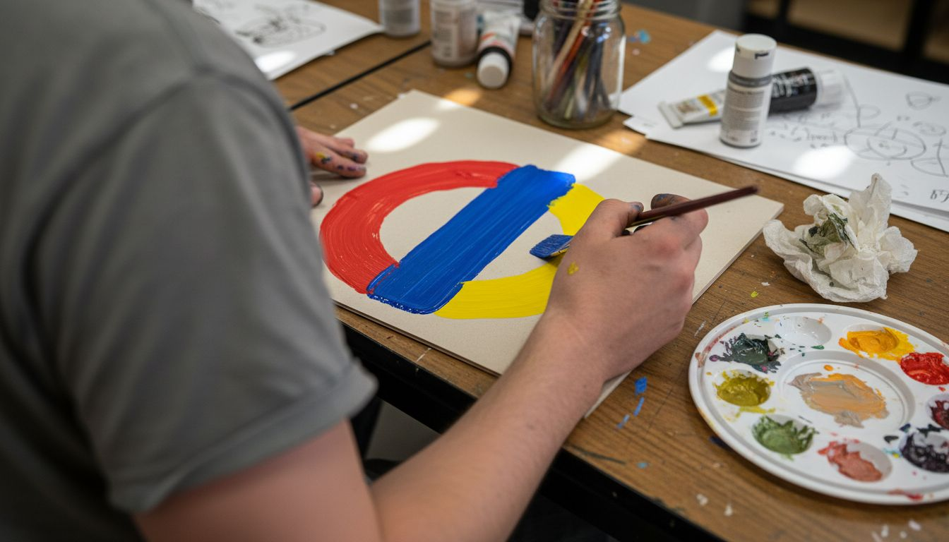
Colour theory experts emphasise systematic mixing of primary colours to generate secondary and tertiary colours. Begin with your pure red, blue, and yellow pigments. Start by mixing equal parts of two primary colours to create vibrant secondary colours: red and blue produce violet, blue and yellow generate green, while red and yellow combine to form orange. Use a clean mixing palette and thoroughly clean your brushes between colour combinations to maintain colour purity.
When applying your mixed colours, use smooth brushstrokes and maintain consistent paint thickness. Apply each colour deliberately, allowing slight overlap to demonstrate the transitional relationship between different hues. Your goal is to create a seamless colour progression that illustrates the intricate connections between primary, secondary, and tertiary colours. Experiment with different proportions to understand how slight variations in pigment ratios can dramatically alter the resulting colour.
Pro tip: Always mix slightly more paint than you anticipate needing to ensure colour consistency across your entire colour wheel project.
Step 4: Blend and Fill in Secondary and Tertiary Colours
In this pivotal stage of colour wheel creation, you will transform your primary colours into a rich and nuanced spectrum of secondary and tertiary hues. Understanding the intricate process of colour blending will elevate your artistic capabilities and visual comprehension.
Hands-on colour mixing techniques reveal the magic of creating new colours through strategic pigment combinations. Begin by mixing your secondary colours: blend equal parts of red and blue to create violet, blue and yellow to generate green, and red and yellow to form orange. For tertiary colours, introduce subtle variations by adjusting the proportions of primary colours. For instance, mix more blue into green to create blue-green, or add extra red to orange to craft red-orange.
As you fill your colour wheel, focus on creating smooth gradients that demonstrate the subtle transitions between hues. Apply each mixed colour with consistent brush pressure, allowing slight overlaps to showcase the interconnected nature of the colour spectrum. Pay careful attention to the proportion of pigments and the purity of your colours. Clean your brush thoroughly between mixtures to prevent unwanted colour contamination and maintain the vibrancy of each unique hue.
Here is a quick reference for the types of colours and how they are created:
| Colour Type | Example Colours | Method of Creation |
|---|---|---|
| Primary | Red, Blue, Yellow | Used as the base colours, not mixed |
| Secondary | Green, Orange, Violet | Mixed from two primary colours |
| Tertiary | Blue-green, Red-orange, Yellow-green | Mixed from a primary and a neighbouring secondary |
Pro tip: Create a small colour mixing reference chart alongside your wheel to record the exact proportions used for each secondary and tertiary colour.
Step 5: Verify Colour Placement and Adjust for Harmony
In this critical refinement stage, you will scrutinise your colour wheel to ensure visual coherence and precise colour relationships. Your keen eye and artistic judgment will transform a simple colour arrangement into a harmonious visual representation.
Verifying the three-dimensional colour placement requires meticulous attention to detail and systematic evaluation. Stand back and observe your colour wheel from multiple angles, checking that each hue transitions smoothly into its neighbouring colours. Assess the visual balance by ensuring no single colour appears too dominant or jarring. Look for subtle gradations between primary, secondary, and tertiary colours that create a natural and pleasing progression.
Carefully examine the proportions and relationships between different colour segments. If you notice any abrupt transitions or colour imbalances, gently remix and reapply paint to soften the boundaries. Pay special attention to complementary colours positioned opposite each other on the wheel, as they should create a harmonious tension rather than visual conflict. Use natural lighting to help you detect subtle variations in tone and intensity, making incremental adjustments that enhance the overall visual flow.
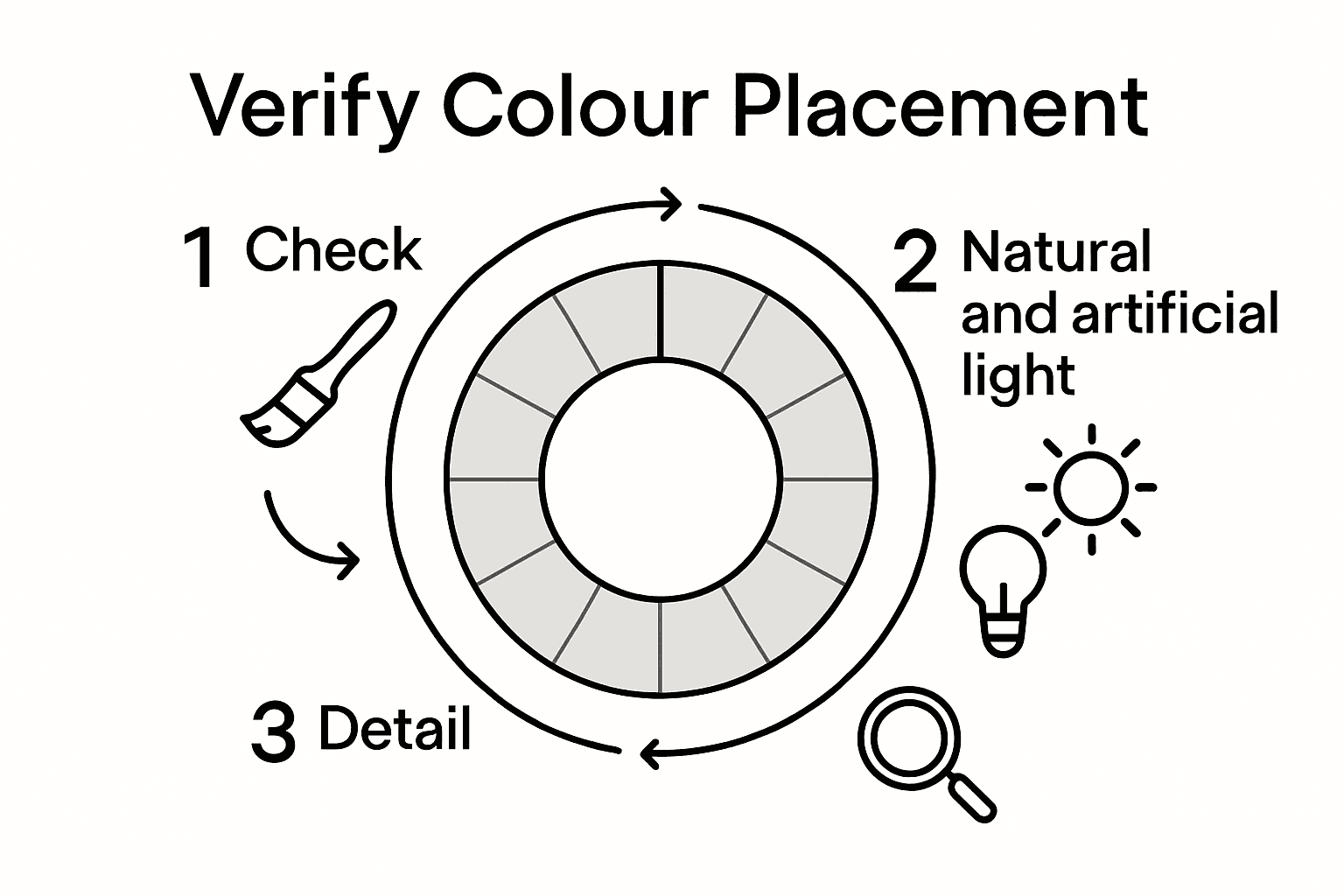
Pro tip: Photograph your colour wheel in different lighting conditions to objectively assess colour harmony and identify areas requiring subtle refinement.
This table highlights common mistakes and tips for a successful colour wheel:
| Potential Issue | Why It Matters | Solution or Tip |
|---|---|---|
| Muddy colours | Reduces vibrancy and clarity | Always clean brushes between mixes |
| Uneven colour transitions | Disrupts wheel harmony | Apply paints with smooth, overlapping strokes |
| Inaccurate proportions | Leads to imbalanced hues | Mix and test small samples before applying |
| Poor lighting | Alters perceived colours | Work under natural or bright LED lights |
Step 6: Display or Use the Completed Colour Wheel
With your meticulously crafted colour wheel now complete, you stand at the threshold of transforming this artistic tool into a valuable resource for creative exploration and learning. This final stage bridges the gap between technical creation and practical application.
Artists and educators recommend displaying colour wheels as visual learning tools that reinforce colour theory principles. Consider mounting your wheel in a well-lit area of your studio or workspace where natural and artificial light can highlight its intricate colour relationships. Frame it professionally or attach it to a sturdy board, ensuring it remains a focal point that inspires future artistic endeavours. Beyond display, your colour wheel becomes an invaluable reference for colour mixing, palette selection, and understanding complex chromatic interactions.
Experiment with practical applications of your colour wheel across various artistic disciplines. Use it as a guide when selecting colour schemes for paintings, graphic design projects, interior decorating, or textile work. Photograph your wheel under different lighting conditions to study how colours interact and transform. For designers and artists, this visual reference can help predict colour harmonies, understand complementary relationships, and make informed chromatic decisions in your creative practice.
Pro tip: Create a digital backup of your colour wheel by taking high-resolution photographs from multiple angles, preserving your work as a future reference tool.
Discover a New Dimension in Colour Learning and Creation
Creating a precise and harmonious colour wheel demands careful mixing, accurate placement, and thoughtful blending of primary, secondary, and tertiary hues. If you have ever felt challenged by the limitations of traditional flat colour charts or struggled to visualise the complex relationships between colours, you are not alone. Many artists and designers seek a more tactile and intuitive way to explore colour theory and achieve flawless colour harmony in their work.
Explore Kolormondo’s innovative 3D colour globes and discover how our unique colour sphere tool transforms your understanding of colour interactions. 
With Kolormondo’s tactile colour globe, you can elevate your colour wheel creation experience by seeing and feeling the vibrant connections between hues from every angle. Designed especially for educators, designers, and artists, our globes provide a hands-on method to blend, analyse, and apply colour principles effortlessly. To deepen your knowledge and teaching practice, visit our Educational material and lesson plans section to find inspiring resources. Take the next step towards mastering colour today at https://kolormondo.com.
Frequently Asked Questions
How do I gather the necessary materials for colour wheel creation?
To create a colour wheel, start by collecting essential art supplies, including red, blue, and yellow paints, brushes, mixing cups, and a painting surface like canvas or watercolour paper. Ensure you have paper plates for a three-dimensional wheel and keep paper towels and water handy for cleaning and mixing.
What should I consider when preparing my workspace for colour wheel creation?
When preparing your workspace, cover the surface with a protective material and arrange your primary colours in a triangle formation. Keep your mixing palette, clean water, and brushes within reach to facilitate easy colour exploration.
How do I accurately mix secondary and tertiary colours for my colour wheel?
Accurately mix secondary colours by blending equal parts of two primary colours, such as red and blue for violet. For tertiary colours, adjust the proportions of primary and secondary colours, like adding more blue to green to achieve blue-green, ensuring you clean your brushes between mixes.
What steps should I follow to verify my colour wheel’s placement and harmony?
To verify colour placement, step back and check for smooth transitions between hues and visual balance across the wheel. Adjust any abrupt transitions by remixing and reapplying paint, ensuring complementary colours create a harmonious tension rather than visual disruption.
How can I effectively display or use my completed colour wheel?
Display your completed colour wheel in a well-lit area to highlight its colours and consider framing it for preservation. Use it as a reference for selecting colour schemes in your future projects and photograph it under different lighting conditions to study colour interactions.
What common mistakes should I avoid when creating my colour wheel?
Avoid muddy colours by cleaning brushes thoroughly between mixes, and ensure even colour transitions by applying paints with smooth, overlapping strokes. Take care with proportions to prevent imbalances, and work under good lighting to accurately perceive true colours.
Recommended
Find similar articles
step by step color wheel creation
