
Most british and European designers know that even small workspace changes can dramatically improve colour accuracy. For complex projects, mastering tactile tools like the Kolormondo globe is more than a creative experiment. It is a strategic advantage. Studies show that hands-on colour mixing increases retention of advanced concepts by nearly 60 percent compared to digital methods. Here you will find practical ways to create a workspace that supports both skill-building and creative freedom using the latest tactile resources.
Table of Contents
- Step 1: Prepare Your Workspace For Hands-On Colour Mixing
- Step 2: Explore Colour Relationships Within The Kolormondo Globe
- Step 3: Select And Combine Accurate Base Colours Physically
- Step 4: Adjust Hues And Tones Using Tactile References
- Step 5: Verify Colour Harmony And Consistency For Your Project
Quick Summary
| Key Point | Explanation |
|---|---|
| 1. Create an optimal workspace | A clean, well-lit area with organised tools enhances efficiency and accuracy in colour mixing. |
| 2. Use the Kolormondo globe for exploration | The globe allows physical engagement with colours, revealing spatial relationships not visible in 2D. |
| 3. Select base colours with attention | Identify and experiment with primary colours on the globe to understand their interactions effectively. |
| 4. Adjust hues with tactile feedback | Physically interacting with the globe enables better comprehension of colour nuances through subtle shifts. |
| 5. Verify colour harmony consistently | Regularly check colour combinations from multiple angles to ensure cohesion and aesthetic integrity. |
Step 1: Prepare your workspace for hands-on colour mixing
Preparing a thoughtful workspace is crucial for successful colour mixing. By creating an organised and purposeful environment, you will set yourself up for precision and creative exploration. Professional colour mixing techniques require a strategic approach to workspace preparation.
Start by selecting a clean, well-lit area with a stable surface that allows ample room for your colour mixing materials. Choose a white or neutral-toned surface to help you accurately assess colour variations and prevent background interference. Arrange your pigments, palettes, brushes, and mixing tools in a logical sequence that supports an efficient workflow. Group similar colours together and keep your workspace uncluttered to minimise potential cross-contamination and maintain visual clarity during your colour exploration.
Here’s a summary of workspace essentials for effective colour mixing:
| Workspace Feature | Why It Matters | Tips for Optimal Setup |
|---|---|---|
| Lighting | Enhances colour accuracy | Use natural or daylight bulbs |
| Surface Colour | Prevents distraction | Choose white or neutral surfaces |
| Tools Organisation | Improves workflow | Arrange items by function |
| Cleanliness | Avoids cross-contamination | Wipe surfaces before starting |
Professional Suggestion: Create a dedicated colour mixing zone with consistent lighting and minimal distractions to enhance your creative precision and colour perception.
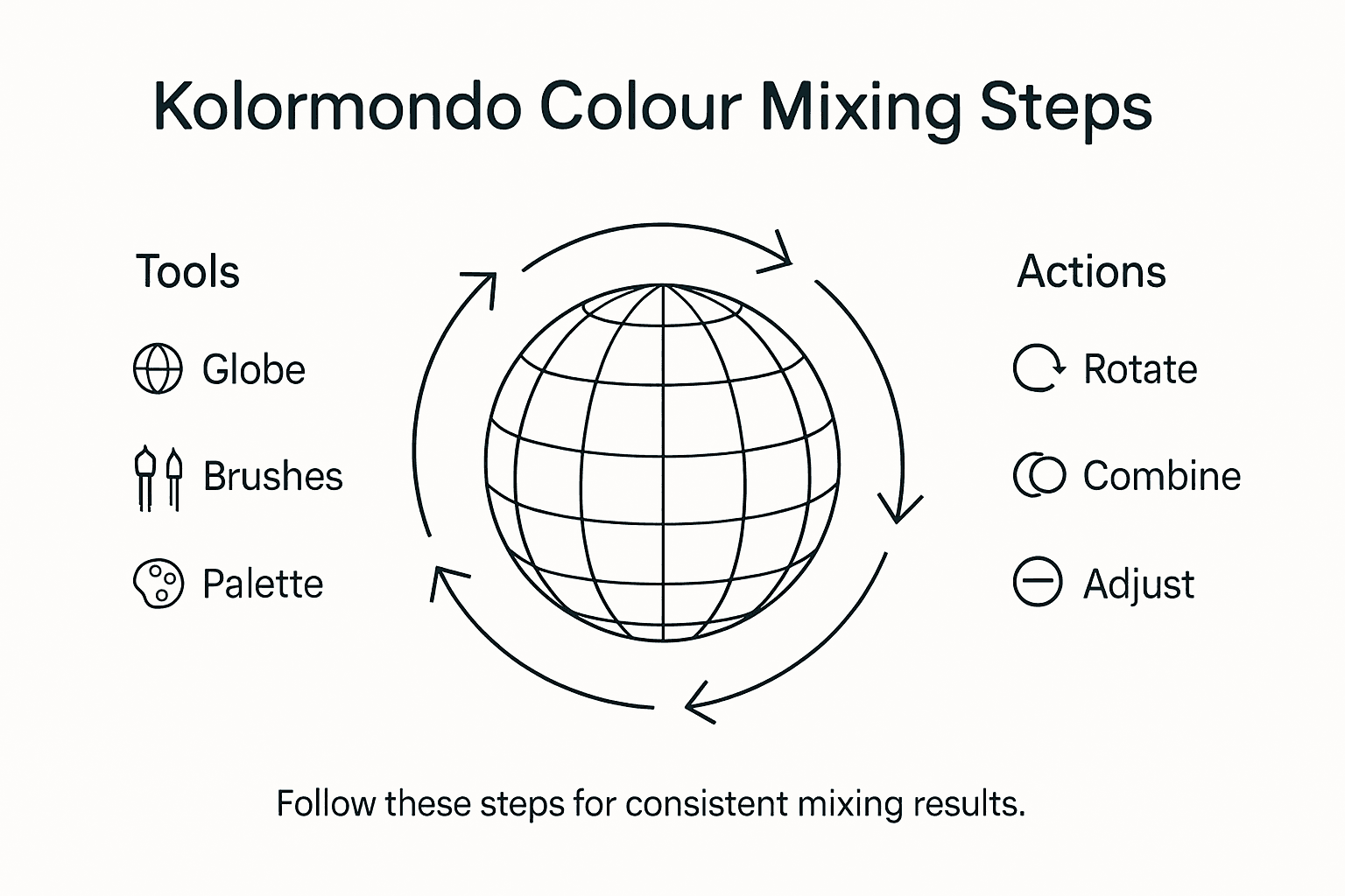
Step 2: Explore colour relationships within the Kolormondo globe
The Kolormondo colour globe offers designers an innovative three-dimensional approach to understanding colour interactions. Visualising colour in 3D transforms traditional flat colour wheel limitations by presenting colours as interconnected spatial relationships you can physically explore.
Begin by rotating the globe and observing how different hues connect and transition. Notice how primary colours form the core structure, with secondary and tertiary colours emerging from their interactions. Pay attention to proximity and distance between colours, which reveal nuanced relationships impossible to perceive on traditional two-dimensional charts. Explore variations in saturation and brightness by examining how colours shift across different planes of the globe, understanding how light and intensity create complex visual narratives.
Compare 2D colour wheels with the Kolormondo globe for exploring colour relationships:
| Aspect | Traditional Colour Wheel | Kolormondo Globe |
|---|---|---|
| Dimensionality | Flat, two-dimensional | Three-dimensional, tactile |
| Colour Transitions | Limited, radial transitions | Smooth, spatial transitions |
| Colour Exploration | Visual, not physical | Physical rotation and touch |
| Relationship Clarity | Less nuanced | Reveals subtle gradations |
Professional Suggestion: Rotate the Kolormondo globe slowly and systematically, studying each colour transition to develop a deeper intuitive understanding of chromatic relationships.
Step 3: Select and combine accurate base colours physically
Selecting and combining base colours requires precision and an understanding of colour relationships. Blending techniques from expert designers reveal that physical manipulation of colours provides deeper insights than digital approximations.
Start by identifying your primary base colours on the Kolormondo globe. Look for pure, saturated hues that will form the foundation of your colour palette. Physically rotate the globe to understand how these base colours interact spatially. Pay careful attention to the proximity of colours and their relative positions. When selecting complementary or analogous colours, use the three-dimensional nature of the globe to observe subtle transitions and potential harmonies. Experiment by positioning your fingers near different colour points to visualise potential combinations before actually mixing pigments.
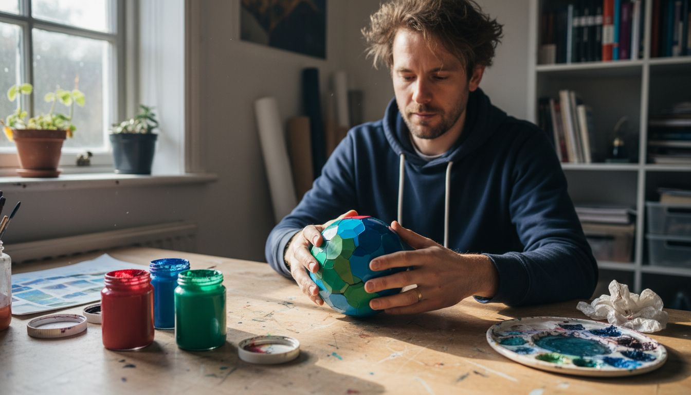
Professional Suggestion: Always handle the Kolormondo globe with clean hands and work on a neutral surface to maintain the integrity of your colour exploration.
Step 4: Adjust hues and tones using tactile references
Mastering hue and tone adjustments requires a nuanced understanding of colour theory and physical interaction. Essential colour theory insights for artists demonstrate that tactile exploration provides deeper comprehension than theoretical study.
When adjusting hues on the Kolormondo globe, focus on subtle rotational movements that reveal intermediate colour transitions. Use your fingertips to trace colour gradients and understand how slight angular shifts modify tone and saturation. Pay attention to the spatial relationships between colours observe how proximity and angle influence perceived colour intensity. Experiment with tilting the globe to observe how light interaction changes colour perception explore the subtle nuances between similar hues by rotating the globe incrementally and noting visual shifts.
Professional Suggestion: Practice colour adjustments under consistent lighting conditions to ensure accurate perception of hue and tone variations.
Step 5: Verify colour harmony and consistency for your project
Verifying colour harmony requires a systematic approach that goes beyond visual intuition. Colour wheel comparison techniques provide designers with structured methods to assess chromatic relationships effectively.
Utilise the Kolormondo globe as your primary reference point for checking colour consistency. Rotate the sphere under different lighting conditions to observe how colours interact and maintain their integrity. Look for subtle shifts in tone and saturation that might compromise your design aesthetic. Pay special attention to the spatial relationships between your chosen colours examine how they transition and complement each other from multiple angles. Create multiple viewing perspectives by tilting and rotating the globe systematically to ensure your colour palette maintains harmony across different orientations and contexts.
Professional Suggestion: Photograph your colour combinations from multiple angles to create a comprehensive visual record of your palette’s consistency and potential variations.
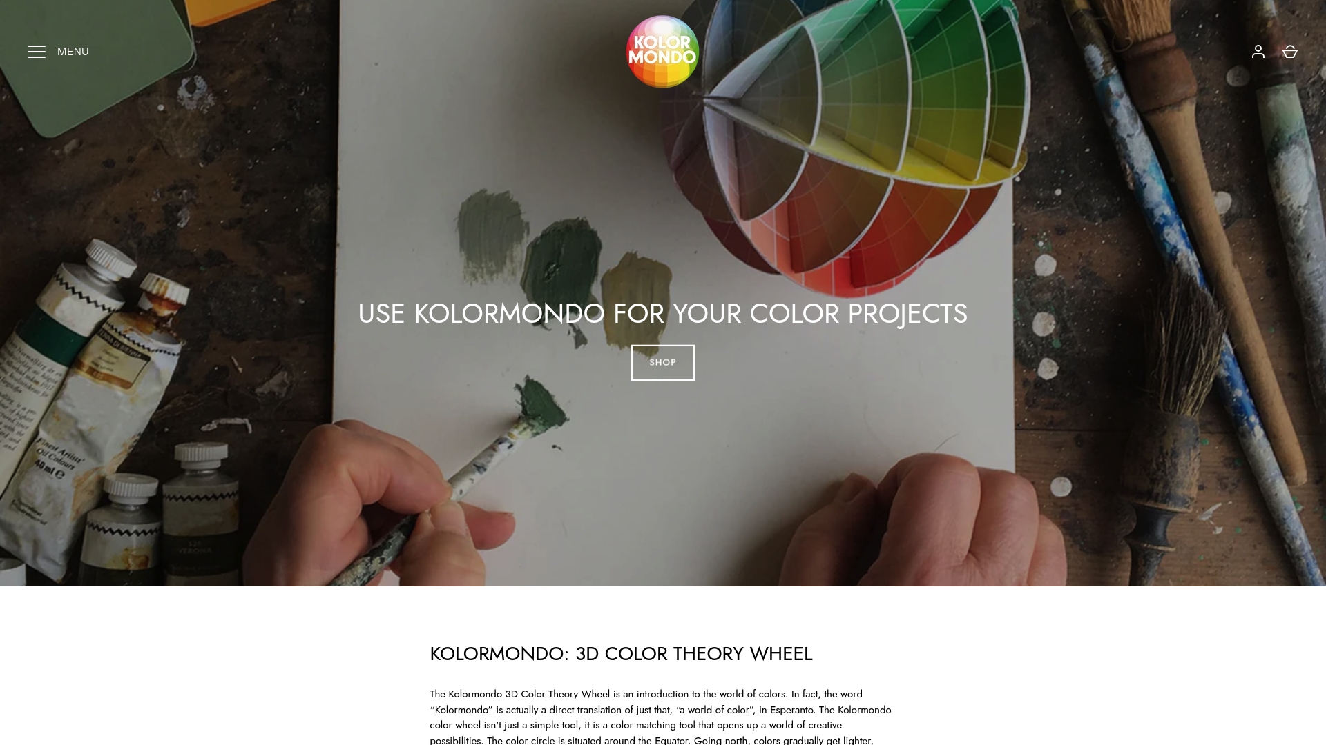
Discover Precision Colour Mixing with the Kolormondo Globe
Struggling to master colour relationships and achieve vibrant, accurate mixes can limit your creative potential. This guide highlights the challenge of understanding hues and tones using traditional flat wheels. With its unique 3D design, the Kolormondo Globe offers a tactile and immersive way to explore colour dynamics in physical space. It empowers designers and educators to see beyond flat transitions and uncover subtle tonal shifts that digital tools often miss.
Experience hands-on learning through the globe’s smooth colour gradients and complex spatial relationships. Enhance your colour harmony checks and pigment blending techniques with a tool built to complement your artistic workflow. Explore detailed resources and teaching aids designed to deepen your colour theory understanding by visiting our Educational material and lesson plans - Kolormondo.
Elevate your design projects now by embracing a 3D perspective on colour. Visit Kolormondo’s main site to discover how this innovative colour globe can transform your mixing precision. To deepen your skills further, consider joining our expert-led Lectures and Workshops about color - Kolormondo. Unlock true colour harmony today.
Frequently Asked Questions
How do I prepare my workspace for colour mixing using Kolormondo?
To prepare your workspace for colour mixing, choose a clean, well-lit area with a stable, neutral-toned surface. Arrange your pigments, palettes, brushes, and tools logically to minimise clutter and facilitate an efficient workflow.
What are the benefits of using the Kolormondo globe for exploring colour relationships?
The Kolormondo globe offers a three-dimensional perspective on colour interactions, allowing you to physically explore connections between hues. Rotate the globe to observe smooth transitions and subtle relationships that traditional flat colour wheels cannot fully articulate.
How can I accurately select and combine base colours using the Kolormondo globe?
Selecting and combining base colours involves identifying pure, saturated hues on the Kolormondo globe and observing their spatial interactions. Physically manipulate the globe to explore complementary and analogous colours before mixing pigments.
What techniques can I use to adjust hues and tones effectively?
To adjust hues and tones, focus on subtle rotational movements of the Kolormondo globe to reveal intermediate transitions. Use your fingertips to trace gradients and observe how slight changes in angle affect tone and saturation.
How can I verify colour harmony and consistency for my design project?
You can verify colour harmony by rotating the Kolormondo globe under different lighting conditions to observe colour interactions. Systematically examine how chosen colours transition and complement one another from multiple perspectives to ensure consistency and aesthetic appeal.
What is the best way to document my colour combinations for future reference?
Photograph your colour combinations from multiple angles to create a comprehensive visual record of your palette’s consistency. This will help you track variations and ensure that you maintain harmony across different projects.
Recommended
Find similar articles
color mixing guide for designers
