
What makes colour theory so powerful for both art educators and design students is its ability to bridge artistic intuition with scientific understanding. Exploring colour interactions helps learners move beyond surface-level aesthetics to uncover how hues shape emotion and communicate meaning, transcending cultural and historical boundaries. This guide offers hands-on tools and insights so you can transform abstract concepts into practical strategies, empowering creative exploration and deeper visual storytelling in every classroom.
Table of Contents
- Defining Colour Theory And Artistic Importance
- Types Of Colour Models And Their Functions
- Core Principles: Hue, Saturation, Brightness
- Practical Uses In Art, Design, And Teaching
- Benefits Of Hands-On Colour Exploration
- Frequent Misconceptions And How To Avoid Them
Key Takeaways
| Point | Details |
|---|---|
| Understanding Colour Theory | Colour theory is essential for artists as it explores how colours interact and evoke emotions, becoming a sophisticated language for visual storytelling. |
| Mastering Colour Models | Familiarity with different colour models, such as RGB and CMYK, is crucial for artists and designers to effectively communicate their visual intents across various platforms. |
| Core Principles of Colour | The core principles of hue, saturation, and brightness play a vital role in creating emotional depth and should be mastered to enhance visual communication. |
| Hands-On Exploration | Engaging in hands-on colour exploration can significantly deepen understanding and foster intuitive skills in colour manipulation, promoting a more impactful artistic practice. |
Defining Colour Theory and Artistic Importance
Colour theory represents a sophisticated framework for understanding how colours interact, communicate, and evoke emotional responses across artistic disciplines. Historically developed through scientific and artistic perspectives, this complex discipline bridges visual perception, emotional psychology, and creative expression.
At its core, colour theory explores several fundamental principles that guide artistic creation:
- How different colours relate and interact
- Emotional and psychological impacts of specific colour combinations
- Methods for creating visual harmony and contrast
- Techniques for communicating mood and narrative through colour selection
The philosophical depth of colour theory extends far beyond simple aesthetic choices. Colour interactions emerge as a nuanced language, where each hue carries potential meanings that transcend cultural and historical boundaries. Artists leverage these intricate relationships to communicate complex narratives without uttering a single word.
Colour theory’s multifaceted nature integrates philosophical, scientific, and artistic perspectives, revealing how colours can transform visual experiences. Influential theorists like Newton, Goethe, and Itten have progressively refined our understanding, demonstrating that colour is not merely a visual attribute but a sophisticated communication tool.
Artistic practitioners understand that mastering colour theory requires both intellectual study and intuitive exploration. This involves comprehending:
- Colour wheel relationships
- Psychological colour associations
- Cultural colour symbolism
- Technical colour mixing techniques
Colour theory transforms artists from mere painters into visual storytellers, enabling them to communicate profound emotions through strategic colour selection.
Pro tip: Begin your colour theory journey by creating a personal colour journal, documenting your emotional and psychological responses to different colour combinations.
Types of Colour Models and Their Functions
Multiple colour models represent sophisticated systems for understanding and manipulating visual spectrum representation across different disciplines. These models provide numerical frameworks that translate complex colour perceptions into standardised communication methods for various professional applications.
The primary colour models artists and designers encounter include:
- RGB Model: Used for digital displays, based on additive colour mixing
- CMYK Model: Utilised in printing processes with subtractive colour mixing
- RYB Model: Traditional artist’s colour model for pigment-based work
- HSV/HSL Models: Designed to align more closely with human colour perception
Each colour model serves unique functional purposes. Colour representation techniques vary significantly depending on the specific requirements of digital, print, or artistic contexts. Digital designers might prefer RGB for screen-based work, while print professionals rely on CMYK to achieve precise colour reproduction.

Technical characteristics distinguish these models. Some prioritise computational efficiency, while others focus on perceptual accuracy. The CIELAB model, for instance, aims to create a mathematically precise representation of human colour perception, making it invaluable for scientific and design applications.
Here’s a quick comparison of the main colour models and their typical applications:
| Colour Model | Primary Use | Method | Unique Benefit |
|---|---|---|---|
| RGB | Digital screens | Additive mixing | Produces vivid colours for displays |
| CMYK | Print production | Subtractive mixing | Ensures accurate colour prints |
| RYB | Traditional art | Pigment mixing | Ideal for fine art with paints |
| HSV/HSL | Design software | Visual adjustments | Mirrors human perception of colour |
| CIELAB | Scientific analysis | Mathematical representation | Offers high perceptual accuracy |
Colour models are not just technical specifications, but sophisticated translation systems that bridge human perception and technological representation.
Pro tip: Experiment with different colour models by converting the same colour across multiple systems to understand their unique interpretative nuances.
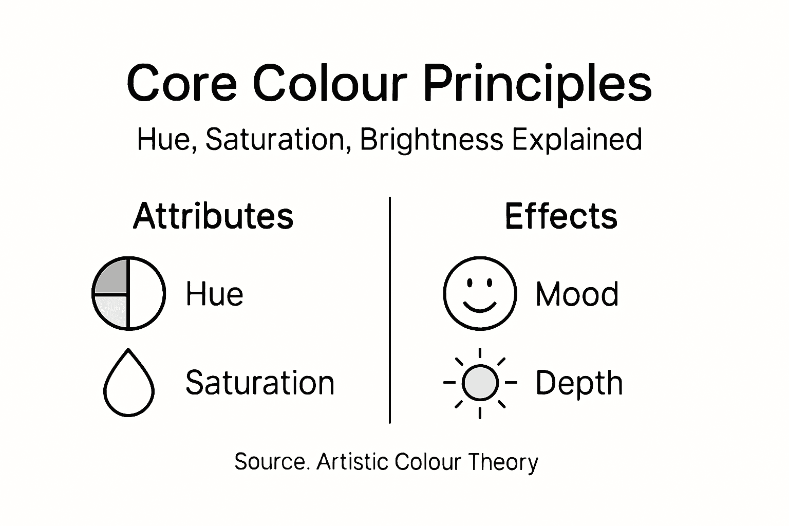
Core Principles: Hue, Saturation, Brightness
Colour properties represent fundamental building blocks that enable artists to create nuanced visual experiences. These three core principles - hue, saturation, and brightness - work together as sophisticated communication tools in visual composition.
Understanding these principles requires exploring their distinct characteristics:
- Hue: The pure colour identity (red, blue, green)
- Saturation: The intensity or purity of the colour
- Brightness: The lightness or darkness of a colour
Each component plays a crucial role in artistic expression. Colour design techniques demonstrate how these independent elements interact to create emotional depth and visual hierarchy. A vibrant red might lose its impact when desaturated, while adjusting brightness can transform a colour’s entire psychological message.
Technical insights reveal the complexity behind these seemingly simple concepts. Hue represents the wavelength of light, saturation describes colour intensity relative to grey, and brightness determines how light or dark a particular shade appears. Artists manipulate these properties to evoke specific emotional responses, create visual balance, and guide viewer perception.
To clarify the differences, here is a summary of hue, saturation, and brightness functions:
| Property | Artistic Impact | Technical Detail | Example Effect |
|---|---|---|---|
| Hue | Sets emotional tone | Linked to light wavelength | Red for intensity, blue for calm |
| Saturation | Adds vibrancy or dullness | Measures distance from grey | High saturation feels energetic |
| Brightness | Guides depth and contrast | Reflects lightness or darkness | Lower brightness creates moodiness |
Mastering hue, saturation, and brightness is like learning a visual language - each adjustment communicates a nuanced emotional message.
Pro tip: Create a personal colour journal documenting how slight variations in hue, saturation, and brightness influence your emotional response to different colour combinations.
Practical Uses in Art, Design, and Teaching
Colour theory applications represent a powerful toolkit for professionals across creative disciplines, transforming abstract concepts into practical strategies for visual communication. Artists, designers, and educators leverage these principles to create compelling visual narratives that resonate deeply with audiences.
The practical applications span multiple domains:
- Artistic Composition: Creating harmonious colour palettes
- Design Strategy: Communicating brand identity and emotional tone
- Educational Tools: Developing systematic approaches to colour understanding
- Visual Communication: Guiding viewer perception and emotional response
In artistic contexts, colour theory provides critical frameworks for understanding how colours interact, mix, and communicate. Painters carefully select colour relationships to evoke specific emotional responses, while graphic designers use these principles to create visually striking brand identities that communicate complex messages without words.
Professional practitioners employ colour theory strategically across various domains. Interior designers use colour psychology to create specific atmospheric experiences, fashion designers craft collections with carefully curated colour narratives, and digital artists manipulate colour relationships to guide viewer attention and emotional engagement.
Colour theory transforms visual communication from mere decoration to a sophisticated language of emotional and psychological expression.
Pro tip: Develop a personal colour reference library documenting how different colour combinations provoke specific emotional and psychological responses in your work.
Benefits of Hands-On Colour Exploration
Experiential learning approaches fundamentally transform colour theory education by engaging students through direct, tactile interaction with colour principles. This immersive methodology moves beyond passive theoretical instruction, encouraging active discovery and deeper comprehension.
Key benefits of hands-on colour exploration include:
- Enhancing cognitive understanding through physical interaction
- Developing intuitive colour manipulation skills
- Stimulating creative problem-solving abilities
- Building muscle memory for colour relationships
- Encouraging experimental and playful learning approaches
Practical engagement allows learners to experience colour dynamics personally, rather than simply reading about abstract concepts. Artists and designers discover nuanced interactions by physically mixing pigments, observing how different hues blend, contrast, and communicate emotional landscapes through direct experimentation.
Sensory learning transforms theoretical knowledge into embodied understanding. By touching, mixing, and manipulating colours directly, students develop a more profound connection with colour theory principles. This approach connects intellectual comprehension with tactile experience, creating more memorable and impactful learning journeys.
Hands-on colour exploration converts abstract theory into lived, sensory knowledge - transforming learners from passive observers to active creators.
Pro tip: Create a personal colour exploration journal documenting your physical experiments, recording unexpected colour interactions and emotional responses.
Frequent Misconceptions and How to Avoid Them
Common colour theory misconceptions emerge from oversimplified understanding and historical limitations in artistic and scientific education. These widespread misunderstandings can significantly hinder an artist’s ability to create nuanced and emotionally resonant visual experiences.
Critical misconceptions artists frequently encounter include:
- Believing all colours can be created from three primary colours
- Assuming a single colour wheel represents all possible colour relationships
- Thinking colour harmony rules are universal and unchanging
- Treating colour theory as a rigid set of prescriptive rules
- Overlooking the contextual nature of colour perception
Scientific perspectives reveal that colour understanding requires sophisticated, multidisciplinary approaches. Primary colour misconceptions often stem from oversimplified models that fail to account for the complex interactions between physics, physiology, and artistic practice.
Contextual understanding becomes crucial in navigating these misconceptions. Colour relationships vary dramatically across different disciplines, cultural contexts, and technological platforms. Artists must develop flexible, adaptive approaches that recognise colour as a dynamic, interpretative experience rather than a fixed set of rules.
Colour theory is not a restrictive framework, but a flexible language of visual communication that evolves with human perception.
Pro tip: Challenge your colour assumptions by experimenting with unexpected colour combinations and documenting their emotional and visual impacts.
Unlock Your Creative Mastery with Kolormondo’s 3D Colour Globe
Understanding colour theory is essential for every artist seeking to communicate complex emotions and achieve visual harmony. This article highlights the challenges artists face when mastering hue, saturation, brightness, and colour relationships. If you want to deepen your intuitive and intellectual grasp of colour beyond traditional flat charts, Kolormondo’s innovative 3D colour globe offers an immersive learning experience that transforms abstract theory into hands-on exploration.
Discover how the Kolormondo globe revolutionises colour education with its tactile and visually engaging design. Explore our Educational material and lesson plans - Kolormondo to integrate practical colour exercises into your creative workflow. For an interactive learning experience, consider our Lectures and Workshops about color - Kolormondo that connect theory with artistic practice. Start your journey to mastering colour communication now by visiting Kolormondo and bringing your creative vision to life.
Frequently Asked Questions
Why is colour theory important for artists?
Colour theory is essential for artists as it helps them understand how colours interact, evoke emotions, and create visual harmony in their work. Mastery of colour theory allows artists to become effective visual storytellers, using strategic colour selection to communicate complex narratives.
What are the core principles of colour that artists should understand?
The core principles of colour that artists should understand include hue, saturation, and brightness. These principles serve as the building blocks for creating nuanced visual experiences and help in conveying specific emotional responses in art.
How can artists practically apply colour theory in their work?
Artists can apply colour theory in their work by creating harmonious colour palettes, experimenting with colour mixing techniques, and considering psychological colour associations. Understanding how colours relate can significantly enhance the impact of their artistic compositions.
What common misconceptions exist about colour theory?
Common misconceptions about colour theory include the belief that all colours can be created from three primary colours and that colour harmony rules are universal and inflexible. It’s important for artists to recognise the dynamic nature of colour perception and how context influences colour relationships.

