
Choosing the right colour codes often sparks confusion, especially when teaching or learning about colour theory in American classrooms. Even skilled designers and educators encounter challenges with colour coding, as subtle differences in perception and representation can dramatically affect comprehension. For those seeking clearer, hands-on solutions, innovative resources like the Kolormondo globe offer a fresh way to explore chromatic interactions and avoid the common mistakes that traditional tools miss.
Table of Contents
- Colour Codes And Common Confusions
- Major Colour Systems: Cmy And Ncs
- How The Kolormondo Globe Organises Colour
- Applications In Art, Design And Teaching
- Comparing 3d Globes With Flat Charts
- Common Mistakes Using Colour Codes
Key Takeaways
| Point | Details |
|---|---|
| Understanding Colour Codes | Colour coding is a complex communication system that requires careful consideration of visual accessibility and psychological impacts. |
| Importance of Colour Accessibility | Approximately 8% of males and 0.5% of females experience colour blindness, making inclusive design essential for effective communication. |
| Choosing the Right Colour Model | Professionals must understand the differences between colour models like CMY and NCS to ensure accurate colour representation across various applications. |
| Common Colour Coding Mistakes | Overusing colours and neglecting contrast can lead to miscommunication; it is vital to test colour palettes for accessibility and clarity. |
Colour codes and common confusions
Colour theory might seem straightforward, but numerous complexities lurk beneath the surface. Colour coding represents a nuanced communication system that extends far beyond simple visual representation. Understanding these intricate systems requires recognising the subtle differences between perception, representation, and interpretation.
Scientific and design communities frequently encounter challenges when selecting appropriate colour palettes. Colour perception variations play a critical role in how information is understood and processed. Several key considerations emerge when working with colour codes:
- Visual accessibility for colour-blind individuals
- Maintaining sufficient contrast between elements
- Using consistent coding schemes
- Selecting complementary colour ranges
- Understanding psychological impacts of specific colour combinations
Professionals must navigate complex terrain when implementing colour codes. Systematic colour palette selection involves carefully considering factors like human perception, technological display capabilities, and contextual appropriateness. Hex codes, RGB values, and CMYK representations offer precise mechanisms for communicating exact colour specifications.
Colour blindness considerations represent a crucial aspect of effective colour coding. Approximately 8% of males and 0.5% of females experience some form of colour vision deficiency, making inclusive design paramount. Strategies like using patterns, textures, and multiple visual cues alongside colour can enhance comprehension.
Pro tip: Always test your colour palette with accessibility tools to ensure maximum visual clarity and inclusiveness for all potential viewers.
Major colour systems: CMY and NCS
Colour systems represent sophisticated frameworks for understanding and communicating visual perception. Colour models like CMY and NCS provide critical tools for professionals across design, science, and artistic disciplines to precisely describe and reproduce colour experiences. Scientific colour mapping techniques demonstrate the complexity of translating human perception into standardised representations.
The Cyan, Magenta, Yellow (CMY) system functions as a fundamental subtractive colour model, primarily used in printing processes. Its core mechanism involves removing specific wavelengths of light through layered pigments:
- Cyan removes red wavelengths
- Magenta removes green wavelengths
- Yellow removes blue wavelengths
In contrast, the Natural Colour System (NCS) takes a radically different approach. Perceptual colour mapping reveals how NCS models colour based on psychological primaries, focusing on how humans actually perceive colour rather than physical light interactions. This system describes colours using six elementary hues: white, black, yellow, red, blue, and green.
Professionals working with colour must understand the nuanced differences between these systems. The CMY model operates on technical printing principles, while the NCS system explores the subjective, perceptual nature of colour experience. These approaches offer complementary perspectives, enabling more sophisticated colour communication across various disciplines.
Here’s a concise comparison of the CMY and NCS colour systems:
| Colour System | Core Principle | Primary Use | Psychological Basis |
|---|---|---|---|
| CMY | Subtractive mixing of pigments | Printing and publishing | Limited—it focuses on physical colour mixing |
| NCS | Describes human colour perception | Design, psychology, education | Strong—it captures how colours are mentally perceived |
Pro tip: Always cross-reference multiple colour systems when precise colour reproduction is critical to your project.
How the Kolormondo globe organises colour
Three-dimensional colour representation transforms our understanding of chromatic relationships by providing an intuitive spatial framework. Perceptually uniform colour mapping enables viewers to comprehend complex colour interactions through a spherical design that transcends traditional two-dimensional colour wheels.
The Kolormondo globe organises colour through several critical design principles:
- Hues are positioned around the globe’s circumference
- Colour intensity increases towards the globe’s centre
- Lighter shades extend upwards
- Darker shades descend towards the bottom
- White and black occupy specific polar regions
By representing colour relationships spatially, the globe allows users to understand colour transitions more intuitively. The three-dimensional model demonstrates how colours blend, contrast, and interact in ways impossible with traditional flat representations. Imagine colours as passengers on a spherical journey, where proximity indicates relationship and distance suggests difference.

Professionals across design, art, and scientific disciplines can leverage this innovative approach to colour organisation. The globe’s spatial arrangement reveals nuanced colour connections that traditional colour wheels obscure, offering a more holistic understanding of chromatic complexity. Its methodology bridges theoretical colour models with practical visual learning, making abstract colour theory tangibly comprehensible.
Pro tip: Rotate the globe slowly to discover unexpected colour relationships and transitions.
Applications in art, design and teaching
Colour theory transcends traditional boundaries, offering profound insights across multiple disciplines. Scientific colour mapping techniques demonstrate how structured colour understanding revolutionises visual communication in art, design, and educational environments.
Key applications of advanced colour systems include:
- Precise colour communication in graphic design
- Enhanced visual storytelling for artists
- Improved colour theory instruction for educators
- Scientific illustration with consistent colour representation
- Accessibility design for colour-vision differences
In artistic contexts, the three-dimensional colour approach provides unprecedented insights into chromatic relationships. Consistent visual communication strategies enable creators to develop more nuanced and intentional colour palettes, bridging theoretical understanding with practical application. Artists can now explore colour interactions with remarkable depth, understanding subtle transitions and relationships impossible to perceive through traditional two-dimensional models.
Educators find particular value in these advanced colour systems. By demonstrating colour relationships spatially, instructors can transform abstract colour theory into tangible, interactive learning experiences. Design professionals leverage these tools to communicate complex colour concepts rapidly, ensuring precise understanding across diverse teams and projects.
Pro tip: Experiment with multiple colour perspectives to develop a more comprehensive understanding of chromatic interactions.
Comparing 3D globes with flat charts
Colour representation fundamentally transforms when moving from two-dimensional charts to three-dimensional globes. Colour perception research reveals profound limitations in traditional flat colour charts that become immediately apparent when compared with spatial models.
Key differences between 3D globes and flat charts include:
- Continuous colour transitions
- Accurate spatial relationships
- Holistic colour perception
- Enhanced visual depth
- More intuitive colour understanding
Flat charts compress complex colour relationships into rigid, linear arrangements, losing critical nuances of chromatic interactions. Advanced colour mapping techniques demonstrate how three-dimensional representations capture subtle gradients and perceptual shifts impossible in two-dimensional formats. Imagine colour as a living, breathing ecosystem rather than a static, fragmented landscape.
Professionals across design, science, and education increasingly recognise the limitations of traditional colour wheels. Three-dimensional globes provide a more authentic representation of colour relationships, showing how hues blend, contrast, and transform in ways that flat charts fundamentally cannot represent. The spatial approach allows for a more intuitive understanding of colour complexity, revealing interconnections that were previously hidden.
Pro tip: Rotate a 3D colour globe to discover unexpected colour relationships that flat charts could never reveal.
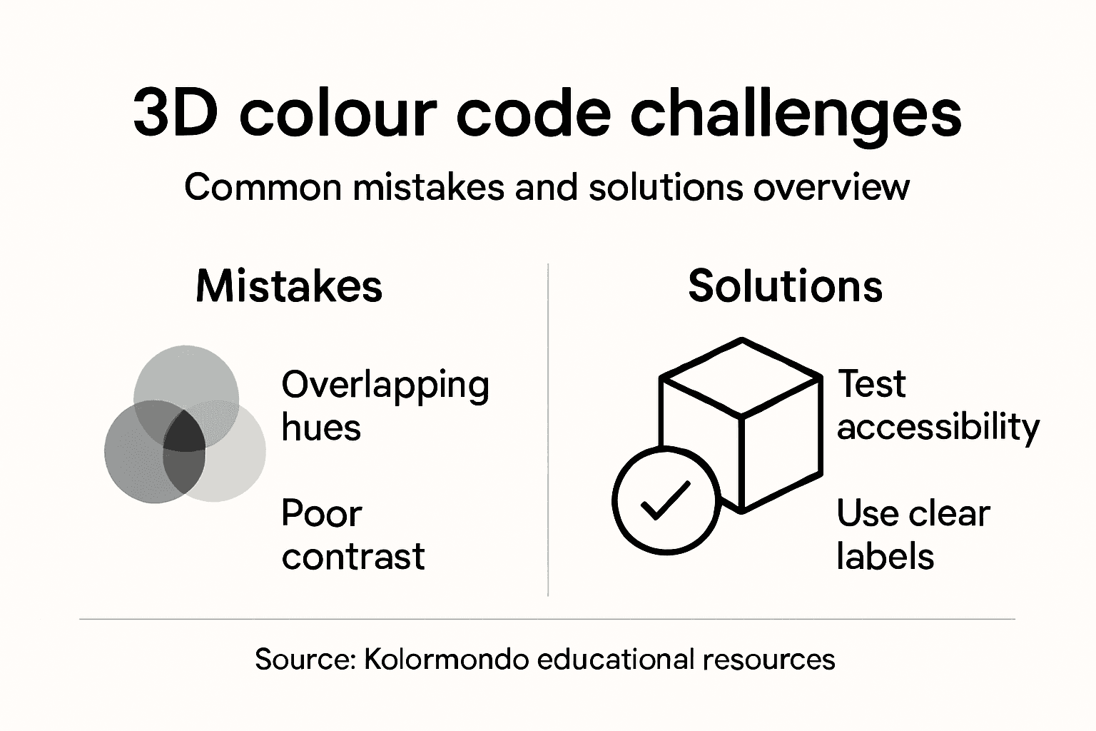
Common mistakes using colour codes
Colour codes represent complex communication systems that demand precision and thoughtful application. Scientific colour communication errors reveal numerous pitfalls that professionals frequently encounter when working with colour representations.
Common mistakes in colour coding include:
- Overusing multiple colours
- Neglecting colour vision accessibility
- Creating insufficient colour contrast
- Inconsistent colour application
- Ignoring perceptual colour relationships
- Using problematic colour combinations
Colour vision accessibility represents a critical consideration often overlooked by designers and researchers. Colour blind friendly design strategies demonstrate that approximately 8% of males and 0.5% of females experience some form of colour vision deficiency. This means standard colour codes can become illegible or misleading for a significant population.
Professionals must understand that colour codes are not merely aesthetic choices but complex communication tools. Effective colour coding requires systematic approaches that consider perceptual diversity, contrast requirements, and contextual appropriateness. Failing to address these nuanced considerations can result in miscommunication, reduced comprehension, and potentially exclusionary design practices.
To help avoid common mistakes, consider the following colour coding pitfalls and their consequences:
| Mistake | Potential Impact | Recommended Solution |
|---|---|---|
| Overcomplicating palette | Confuses audience, reduces clarity | Limit to essential hues |
| Poor contrast | Reduces readability for all users | Test with contrast tools |
| Ignoring accessibility | Excludes colour-blind individuals | Adopt pattern and text cues |
Pro tip: Always test your colour palette with accessibility tools and simulate different vision types before finalising your design.
Discover Colour Codes in 3D with Kolormondo’s Innovative Tools
Understanding the complexities of colour theory and navigating various colour systems can feel overwhelming. The article highlights common challenges like grasping perceptual colour relationships, ensuring colour vision accessibility and overcoming the limitations of flat colour charts. Kolormondo offers a hands-on solution that brings colour codes to life through the unique 3D Kolormondo globe. This innovative colour sphere empowers educators, designers and artists to explore hues and their interactions in a spatial, intuitive way far beyond traditional methods.

Ready to transform your colour experience today? Explore our Color Globe and color sphere - Kolormondo collection for tactile, visually stunning teaching aids and design objects. Dive deeper with tailored Educational material and lesson plans - Kolormondo designed to make colour theory tangible and engaging. Start your journey at Kolormondo.com and revolutionise how you understand and communicate colour codes in three dimensions.
Frequently Asked Questions
What are colour codes and why are they important?
Colour codes are systems used to communicate and represent colours in various contexts, such as design and printing. They help ensure that colours are translated accurately and consistently, allowing for effective visual communication.
How does colour blindness affect the use of colour codes?
Approximately 8% of males and 0.5% of females experience colour vision deficiency. This poses challenges in colour coding, as specific colour combinations may be illegible or misleading for these individuals. To mitigate this, incorporating patterns and textures alongside colour is crucial.
What are the differences between CMY and NCS colour systems?
The CMY (Cyan, Magenta, Yellow) colour system is a subtractive model primarily used in printing, where specific pigments remove certain wavelengths of light. In contrast, the NCS (Natural Colour System) describes colour based on human perception, focusing on how colours are viewed psychologically. This makes NCS more relevant in design and educational contexts.
How do 3D colour globes enhance understanding of colour relationships?
3D colour globes, like the Kolormondo globe, use a spherical representation to organise colours, facilitating a more intuitive understanding of colour relationships. They illustrate how colours blend, contrast, and interact in a way that traditional flat charts cannot, enhancing visual perception and comprehension.
Recommended
Find similar articles
understanding color codes
